Quote: ">Changing the background from black to a dark gray
>Using a slightly brighter red
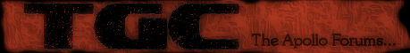
>Make the logo a bit lighter, only a tad
>Give the logo text a dark thin outline
>Disconnecting the Search box and floating it about 5 pixels from each edge and get rid of that random silver line.
>You have used sharp bevel edges on all your corners apart from the search button and search text field. The search button should follow the same pattern with the sharp edges
>As tha_rami said, the button text is a little off, it is very noticeable.
>The tab buttons need a little make over also , you have added the gloss to the top, but they may look better with a thin 1-2px segment missing around the edges of them."
Thanks, I'll try and see what I can do.
Quote: "only bad thing is the buttons, the text doesn't seem to center correctly."
Yea, I wasn't too worried about how centered it was as I knew it would be centered in the final, but I'll get that centered for you guys to take a look at.
Quote: "I like that template. Is it easily customizable? Are you making it available to others or is it for your personal use only?"
Well, I actually was making it for personal use. If you really like it I suppose I'll add a link to download the psd. It shouldn't be too hard to customize. I like to make many changes to everything. xD
Quote: "That's a generic thing people copy & paste on templates and do-nothing pages. I've seen that exact text hundreds of times."
Yea, I got the text from
http://www.lipsum.com/. It's meant to keep you from being distracted by the text and focus more on the design. I can see it wan 't that effective.

Quote: "Yes, I agree, anything that is red and has a star in it must immediately suggest the USSR rather than the red colour scheme you were aiming for. How could you not realise that a red theme instantly has USSR connotations? "
Lol, well the start is my "logo" and red is a pretty important color. So I guess It'll be a hit with visitors from Russia then?

Quote: "It looks very amateurish but it's a good start if you are new to this. Put it online, then just keep re-doing it. You'll find that after you'll make a billion designs, you will start to see the faulty trends repeating in your work, and you will begin to iron them out."
Thanks for the advise, have any more on what exactly clarifies it as "amateurish"?
Thanks for the comments and ideas everyone, I'll edit it up later today and post it back up.

Edit:
Quote: ">The tab buttons need a little make over also , you have added the gloss to the top, but they may look better with a thin 1-2px segment missing around the edges of them."
I don't quite get that. Are you saying remove the gloss and put a "hole" in the outer edge of the tabs?
Edit2:
Besides the tabs, here is the "new" version :