Sorry your browser is not supported!

You are using an outdated browser that does not support modern web technologies, in order to use this site please update to a new browser.

Browsers supported include Chrome, FireFox, Safari, Opera, Internet Explorer 10+ or Microsoft Edge.

FPSC Classic Models and Media / Mont's - Mega Media Pack v1 W.I.P (56k warning)

Author
Message
MonT
18
Years of Service
User Offline
Joined: 29th Oct 2006
Location: In your house, waiting for nightime
Posted: 3rd Aug 2007 06:12 Edited at: 3rd Aug 2007 06:30
Ok,

Ive been working on a set of entities, segments, and overlays most of which are sci-fi based.

All models and textures are made completely from scratch, without any use of reference images or modified textures. All textures come in a clean UV map for easy editing, and most make use of normal/bump maps.

Im planning to have around 60 scenery entities in this pack, 20 overlays, 8 characters (sci-fi themed), about 4 music tracks, and 15 segments (excluding the multiple ceilings and floors to go with them)

I have not decided a price for the pack yet, however i can assure you that it will not reach any higher than a sum of 12.00 USD.

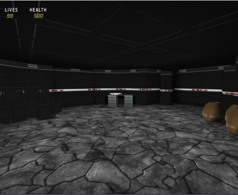
Here is a small sample of some of the packs items, please note that the table holding the pizza box is a stock item, and is not included in this pack, the table was used for display purposes only

Also, while i was testing the map media, i was using the model pack 5 deagle weapon to test the "destructible" media. So i wish to make it quite clear that that Also, will not be included.

Image Below:

[img][/img]


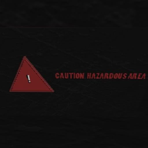
And another of a sign in the pack

Image Below:


C&C welcome, and i hope this pack attracts a fair amount of viewers


"It's just disappointing that less people are encouraged to make their own stuff" - Butters
game lover
17
Years of Service
User Offline
Joined: 27th Apr 2007
Location:
Posted: 3rd Aug 2007 08:36
Not bad

We all want to be awesome, but does awesome want to be us?
Strelok
18
Years of Service
User Offline
Joined: 16th Oct 2006
Location: In your cupboard.
Posted: 3rd Aug 2007 12:53
This pack looking good , more screenshoots will be nice.
Like overview of all obj that will attract people.

And good luck with your pack.

User of : Windows 95 pentium 1 (0.5 ghz 64 RAM)
Geforce 2 (64 mb)
Roger Wilco
19
Years of Service
User Offline
Joined: 6th Jul 2005
Location: In the Shadow of Chernobyl
Posted: 3rd Aug 2007 13:01
Looks cool, though I'd edit that wall-texture a bit if I were you. The white line going through the middle gives it a bit too much contrast, both in color and style somewhat. More screenshots to judge from would be nice.

Isn't it a pity, now isn't it a shame?
How we break each other's hearts, and cause each other pain
- All Things Must Pass with George Harrison
MonT
18
Years of Service
User Offline
Joined: 29th Oct 2006
Location: In your house, waiting for nightime
Posted: 3rd Aug 2007 23:25
@ Roger Wilco
Quote: "Looks cool, though I'd edit that wall-texture a bit if I were you."


Thanks for the suggestion, i think what i may actually end up doing, is creating a clone segment in which the white line is replaced with a darker one, this way giving the user a variation of the same segment.

@game lover

Thanks, im glad to hear you like it

@Oleg
Like you suggested in your comment, when all the packs media is put together, i plan on compiling all the screens from it into one of those "photoshop-pack-ads" that you see in packs like Locricans "School days", or Duplex's Urban pack.

Once i have a few more things FPSC ready, ill post some more screens, which should be fairly soon.

- - -

Glad to see some interest in this pack.

MonT

"It's just disappointing that less people are encouraged to make their own stuff" - Butters
Silent Thunder
18
Years of Service
User Offline
Joined: 6th Feb 2006
Location: The Ship
Posted: 3rd Aug 2007 23:41
I really like how those segments are looking.


Click on the picture to order your copy today!
MonT
18
Years of Service
User Offline
Joined: 29th Oct 2006
Location: In your house, waiting for nightime
Posted: 4th Aug 2007 03:06
Quote: "I really like how those segments are looking."


Thanks,

I use the gimp to make the b+w texture layout, photoshop to color in the layout and add some effects, and then load back into gimp for image mapping.

Ill have some more previews shortly

"It's just disappointing that less people are encouraged to make their own stuff" - Butters
MonT
18
Years of Service
User Offline
Joined: 29th Oct 2006
Location: In your house, waiting for nightime
Posted: 4th Aug 2007 08:50
Alright, after taking into consideration a few of the suggestions offered by forum members who reply'ed to this thread, i have a few more previews of some of the new content i just finished for the pack

Image of the new, darker sci-fi segment (variation 2)

I also put the trashcan entity in this preview


= = =
Here is an updated texture on the ceramic pot


= = = =
Did someone order pizza?


= = = =
Coding games is hard work...


= = = =
What fps is complete without some blood?


= = = =

Some boxes and sign


= = =

And lastly, the conveyor belt (doom3'ish-style)


Comments and criticism welcome.

"It's just disappointing that less people are encouraged to make their own stuff" - Butters
Smitho
18
Years of Service
User Offline
Joined: 23rd Feb 2006
Location: Blackpool, England
Posted: 4th Aug 2007 11:30
Its hard to give constructive crit, with the level being so dark..
The table (with laptop etc) just looks like youve attempted to UVmap it, and forgot to texture.
Would be good to see an overview of stuff with all the darkness!

Negrul1
17
Years of Service
User Offline
Joined: 31st Jan 2007
Location: Repairing Black Mesa
Posted: 4th Aug 2007 23:25
i like the laptop, but it is to dark

(\__/)
(O.o )
(> < ) This is Bunny. Copy Bunny into your signature to help him on his way to world domination!
MonT
18
Years of Service
User Offline
Joined: 29th Oct 2006
Location: In your house, waiting for nightime
Posted: 5th Aug 2007 07:16
Quote: "The table (with laptop etc) just looks like youve attempted to UVmap it, and forgot to texture."
\

I can see what you mean, however i made the texture like that. I was intending to make it in a way to give it a 3d look, guess ill have to fix that up.

Thanks for pointing that out

@ Negrul1,

The intention i had when designing the textures for this pack was to make them very dark in their feel, as i was going for an almost doom3'ish theme to the pack.

I will most likely add some lighter variations to most of the objects before the pack is complete.

"It's just disappointing that less people are encouraged to make their own stuff" - Butters
pak4life
17
Years of Service
User Offline
Joined: 7th Aug 2007
Location: Turn Around...No The other way...4Get it
Posted: 8th Aug 2007 00:30
Looks good the computer good get more texture and will there be different colours other than black?
And Looks great so far keep it up...

Login to post a reply

Server time is: 2024-11-26 04:13:58
Your offset time is: 2024-11-26 04:13:58