Sorry your browser is not supported!

You are using an outdated browser that does not support modern web technologies, in order to use this site please update to a new browser.

Browsers supported include Chrome, FireFox, Safari, Opera, Internet Explorer 10+ or Microsoft Edge.

3 Dimensional Chat / house model

Author
Message
hessiess
17
Years of Service
User Offline
Joined: 30th Mar 2007
Location: pc!
Posted: 6th Oct 2007 13:49 Edited at: 6th Oct 2007 13:53
im making a house interior, currently have the living room and the beginning of the stair room

ive been working on it for ages(about 6 months). it could do with having more misalanias junk, to make it look more lived in.

any comments?


it is support to be early in the morning(quite dark) if it looks like the middle of the day then your monitor is calibrated wrongly

learn blender, you will never regret it.

Attachments

Login to view attachments
Penfold
20
Years of Service
User Offline
Joined: 3rd Dec 2003
Location: RED postbox houses of parliment
Posted: 6th Oct 2007 15:29
Youch, unless this is 80's or earlier british housing, please get the decorators in, the wall paper is *urgh*. Change it to a nice floral design or something at the very least.

Other than the wallpaper everything looks good.

'Ooh 'eck chief'...'crumbs'
AndrewT
17
Years of Service
User Offline
Joined: 11th Feb 2007
Location: MI, USA
Posted: 6th Oct 2007 16:13
Ya it needs some different wallpaper. But the furniture looks very nice.

Check out my ***FREE MEDIA*** at http://www.thorwall3d.com/!!!!!!!!!!!!!!!!!!!
hessiess
17
Years of Service
User Offline
Joined: 30th Mar 2007
Location: pc!
Posted: 6th Oct 2007 16:33 Edited at: 6th Oct 2007 16:41
Quote: "Youch, unless this is 80's or earlier british housing, please get the decorators in, the wall paper is *urgh*. Change it to a nice floral design or something at the very least.

Other than the wallpaper everything looks good."

Quote: "
Ya it needs some different wallpaper. But the furniture looks very nice."


whats wrong with the walpaper?, i like it.
I say exactly the same thing about anything new, its just so plain

anyway, here's the start of the staircase room


and here's a video of it rendering
http://www.youtube.com/watch?v=Jgdyt-MvTvY

learn blender, you will never regret it.

Attachments

Login to view attachments
Blobby 101
18
Years of Service
User Offline
Joined: 17th Jun 2006
Location: England, UK
Posted: 6th Oct 2007 19:47
Quote: "misalanias"

that must be the most original spelling of miscellaneous I've ever seen!

anyway it looks good, kinda like a grandpa's house or something. somewhere where an old person lives. i guess it's just the wallpaper being out-of-date.


thanks to deathead for the sig!
http://istuff.freepay.com/?r=40618251 - please sign up.
Alucard94
17
Years of Service
User Offline
Joined: 9th Jul 2007
Location: Stockholm, Sweden.
Posted: 6th Oct 2007 22:07
Please just TAKE OFF THE DAMN WALLPAPER I love your work but serously(sorry for bashing) it looks so damn epileptic!! I can't appriceate the rooms detail with that color bomb right infrom of my eyes!!!!!

I model I clean and I cook for you... AND I STILL DONT GET A COOKIE!!?!!?!?!!?!??
AndrewT
17
Years of Service
User Offline
Joined: 11th Feb 2007
Location: MI, USA
Posted: 6th Oct 2007 23:30
Yeah, seriously, staring at that wallpaper is like burning my eyes out of their sockets. But other than that, it's nice!

Check out my ***FREE MEDIA*** at http://www.thorwall3d.com/!!!!!!!!!!!!!!!!!!!
Penfold
20
Years of Service
User Offline
Joined: 3rd Dec 2003
Location: RED postbox houses of parliment
Posted: 6th Oct 2007 23:49
Quote: "whats wrong with the walpaper?, i like it.
I say exactly the same thing about anything new, its just so plain "


You don't need to find anything new, just find something to match the nice floor you have. Take a look at a wallpaper site or something and borrow a sample, or make it an original on the sample.

You could even try bump mapping a plain white background to get a nice flocked effect. (please not I said flocked, not......)

Seriously though that wallpaper is real bad, I don't think I've ever seen anywhere with anything like it. (If someone happens to have this wallpaper out there, sorry).

As stated above from Alucard its a bit too much and it takes your eyes off the wonderful funrniture etc (and you really don't want that).

'Ooh 'eck chief'...'crumbs'
Seppuku Arts
Moderator
20
Years of Service
User Offline
Joined: 18th Aug 2004
Location: Cambridgeshire, England
Posted: 7th Oct 2007 01:27
What's wrong with it? don't make me bring out Trinny and Susanna and answer that question, because I really cannot stand those two, they irritate the hell out of me... Sorry I digress.

Each to their own in their sense of design and style...however, in terms of interior design too much clashes and interior designers would tell you that's a no no, it doesn't have mood, rather more of a headache...

That's if this is a professional 3D visualisation design piece, truth is, people like designs like that, people think it looks good and well you can't rule that out to say if this were for a game or a movie. Personally, if I had to sit down and discuss current affairs with tea and crumpets in that room, I'd run into the wall head first. But, this is the sort of thing I imagine the Russian family's house is like in the book I am reading.

Perhaps for the sake of rendering, something a bit more eye friendly, I don't know.

Anyway, good models, I would say one thing about the wood texture, it just doesn't feel realistically put, take a look at those wood items in photographs and compare, personally something less stretched and not so 'busy' looking comes to mind - perhaps darkened with varnish.

I shot the sheriff
hessiess
17
Years of Service
User Offline
Joined: 30th Mar 2007
Location: pc!
Posted: 7th Oct 2007 02:32 Edited at: 7th Oct 2007 02:36
this thred shows how the modal has progressed

http://blenderartists.org/forum/showthread.php?t=97753

il try to find another texture, good ones are very hard to find, and im hopeless at making them

Quote: "I would say one thing about the wood texture, it just doesn't feel realistically put, take a look at those wood items in photographs and compare, personally something less stretched and not so 'busy' looking comes to mind - perhaps darkened with varnish."


i know the chairs look bad, wood textures arent something ive got the hang of yet. ive re textured the settees more times than i care to remember, and they still look rubbish

ive re-dun the lighting rig for atlest 10th time, and am currently rendering an animation test, 4 munites pur frame, and 169 frames, its going to take a wile

learn blender, you will never regret it.

hessiess
17
Years of Service
User Offline
Joined: 30th Mar 2007
Location: pc!
Posted: 7th Oct 2007 11:34 Edited at: 7th Oct 2007 11:46
this one any better?


learn blender, you will never regret it.

Attachments

Login to view attachments
Penfold
20
Years of Service
User Offline
Joined: 3rd Dec 2003
Location: RED postbox houses of parliment
Posted: 7th Oct 2007 11:54
Slightly less burning on the eyes. This will do until you find better. When you look at the picture you no longer have to force yourself not to look at the walls.

'Ooh 'eck chief'...'crumbs'
hessiess
17
Years of Service
User Offline
Joined: 30th Mar 2007
Location: pc!
Posted: 7th Oct 2007 13:58 Edited at: 7th Oct 2007 14:01
another render


learn blender, you will never regret it.

Attachments

Login to view attachments
Pyramid Games Ltd
17
Years of Service
User Offline
Joined: 23rd Aug 2007
Location: Line 21, DBP
Posted: 7th Oct 2007 16:35
Quote: "Please just TAKE OFF THE DAMN WALLPAPER I love your work but serously(sorry for bashing) it looks so damn epileptic!! I can't appriceate the rooms detail with that color bomb right infrom of my eyes!!!!!"


Woah! Calm down it was just a wallpaper.

Looks wonderful btw.

bitJericho
22
Years of Service
User Offline
Joined: 9th Oct 2002
Location: United States
Posted: 7th Oct 2007 18:52
Seriously, you have no taste in wallpaper :/

Check out this site for ideas:

http://discountdecorator.com/Wallpaper.asp


The greatest multiplayer text adventure ever...
hessiess
17
Years of Service
User Offline
Joined: 30th Mar 2007
Location: pc!
Posted: 7th Oct 2007 23:28 Edited at: 7th Oct 2007 23:43
animation test, lots of errors, but that's the whole point of doing an animation test

this took all day to render

learn blender, you will never regret it.

Attachments

Login to view attachments
5Louiz
18
Years of Service
User Offline
Joined: 15th Nov 2006
Location: Brasil
Posted: 8th Oct 2007 15:40 Edited at: 8th Oct 2007 17:03
Firstly, you are doing a nice work. It is an interesting scene, old and rustic.

Edit:
I do not like details on the walls, but I think that both of those wallpapers fit well in a rustic house.

I have some things to point and opinion. The stairs look too high for my taste. There is an UVMap fail in the left of the passage. [dubious grammar] The edges common to the walls and the ceiling look sharp. I miss the effect created by GI or AO, or ogee.

Wood workshop will help you to make wood textures.

"The difference between stupidity and genius is that genius has its limits." - Albert Einstein
hessiess
17
Years of Service
User Offline
Joined: 30th Mar 2007
Location: pc!
Posted: 29th Oct 2007 20:53 Edited at: 29th Oct 2007 20:55
adjusted the AO and added my human modal into it


learn blender, you will never regret it.

Attachments

Login to view attachments
Alucard94
17
Years of Service
User Offline
Joined: 9th Jul 2007
Location: Stockholm, Sweden.
Posted: 30th Oct 2007 10:47
there is some sort of texture issue on the humans left arm

I model I clean and I cook for you... AND I STILL DONT GET A COOKIE!!?!!?!?!!?!??
hessiess
17
Years of Service
User Offline
Joined: 30th Mar 2007
Location: pc!
Posted: 30th Oct 2007 16:24
Quote: "there is some sort of texture issue on the humans left arm"


i know, the rig isent finished, the arms go threw the clothes. i was using it to check the dimensions of the furniture is correct

learn blender, you will never regret it.
Alucard94
17
Years of Service
User Offline
Joined: 9th Jul 2007
Location: Stockholm, Sweden.
Posted: 30th Oct 2007 16:41
okay

I model I clean and I cook for you... AND I STILL DONT GET A COOKIE!!?!!?!?!!?!??
hessiess
17
Years of Service
User Offline
Joined: 30th Mar 2007
Location: pc!
Posted: 31st Oct 2007 18:38 Edited at: 31st Oct 2007 18:39
a door.


learn blender, you will never regret it.

Attachments

Login to view attachments
Alucard94
17
Years of Service
User Offline
Joined: 9th Jul 2007
Location: Stockholm, Sweden.
Posted: 31st Oct 2007 23:37
Now that's just awesome...

I model I clean and I cook for you... AND I STILL DONT GET A COOKIE!!?!!?!?!!?!??
hessiess
17
Years of Service
User Offline
Joined: 30th Mar 2007
Location: pc!
Posted: 1st Nov 2007 02:06 Edited at: 1st Nov 2007 02:08
Quote: "Now that's just awesome..."

thankyou

textured it, comments?


learn blender, you will never regret it.

Attachments

Login to view attachments
Alucard94
17
Years of Service
User Offline
Joined: 9th Jul 2007
Location: Stockholm, Sweden.
Posted: 1st Nov 2007 11:43
*clapping hands* Dude awesome... just awesome

I model I clean and I cook for you... AND I STILL DONT GET A COOKIE!!?!!?!?!!?!??
Insanity Complex
19
Years of Service
User Offline
Joined: 16th Sep 2005
Location: Home
Posted: 1st Nov 2007 13:34
That's a very pretty door


Libervurto
18
Years of Service
User Offline
Joined: 30th Jun 2006
Location: On Toast
Posted: 2nd Nov 2007 01:35
Wow you are awesome!
The door is the best thing yet Great texture
I like the pine table texture too, and the chairs look much better in their new reddish-brown colour.
You just need new wallpaper now
Intrigued to see what you are gonna do with those stairs.
Are you going to use this stuff in a game?

"You must be someone's friend to make comments about them." - MySpace lied.
hessiess
17
Years of Service
User Offline
Joined: 30th Mar 2007
Location: pc!
Posted: 2nd Nov 2007 02:55 Edited at: 2nd Nov 2007 02:57
Quote: "Intrigued to see what you are gonna do with those stairs."

more fancy woodwork probably

Quote: "Are you going to use this stuff in a game?"


everything i have been working on myself is all part of one huge project, so huge that im never lickly to finish it. im trying to make a hower and a half ish long film, with a total budget of £0. i am not going to storyboard it, my drawing is far to slow. so its mostly going to be made up as i go along although i have part of the script.

its based on a story i wrote, wizard land the beginning, wazard land is a separate universe that contains 5 massive planets, 2 of witch are garbage dumps. the planets randomly orbit around eatch outher, and there are only ever 1000 people in the universe. the main charictor is called hessiess(hess-I-ess), witch is were my webname comes from

i wont say anything more about it until i have more to show

i have made an animation of the door opening, avi is attached

learn blender, you will never regret it.

Attachments

Login to view attachments
hessiess
17
Years of Service
User Offline
Joined: 30th Mar 2007
Location: pc!
Posted: 2nd Nov 2007 19:13
door in the room. the current lighting rig makes it look very flat.

learn blender, you will never regret it.

Attachments

Login to view attachments
hessiess
17
Years of Service
User Offline
Joined: 30th Mar 2007
Location: pc!
Posted: 2nd Nov 2007 19:14


learn blender, you will never regret it.
Deathead
18
Years of Service
User Offline
Joined: 14th Oct 2006
Location:
Posted: 2nd Nov 2007 21:05
Quote: "so huge that im never lickly to finish it."

Seadome is dead btw Tha_rami annouced it in his seadome thread. Might aswell make it in FPSC if he wants it to not be a huge project.

Libervurto
18
Years of Service
User Offline
Joined: 30th Jun 2006
Location: On Toast
Posted: 2nd Nov 2007 21:49
the handle's shadow shouldn't be directly underneath like that.
It's quite thick for an interior door.
Looks good though

"You must be someone's friend to make comments about them." - MySpace lied.
hessiess
17
Years of Service
User Offline
Joined: 30th Mar 2007
Location: pc!
Posted: 2nd Nov 2007 22:53
Quote: "Quote: "so huge that im never lickly to finish it."
Seadome is dead btw Tha_rami annouced it in his seadome thread. Might aswell make it in FPSC if he wants it to not be a huge project."


no, tha_rami dus not say its dead, he is just announcing the game engine change.
the work in this thread has nothing to do with sea dome.

learn blender, you will never regret it.
Alucard94
17
Years of Service
User Offline
Joined: 9th Jul 2007
Location: Stockholm, Sweden.
Posted: 3rd Nov 2007 09:52
You are a master! *bows in front of computerscreen*

I model I clean and I cook for you... AND I STILL DONT GET A COOKIE!!?!!?!?!!?!??
hessiess
17
Years of Service
User Offline
Joined: 30th Mar 2007
Location: pc!
Posted: 3rd Nov 2007 13:30 Edited at: 3rd Nov 2007 13:31
Quote: "You are a master! *bows in front of computerscreen*"


no i am not, i cannot do photorealistic renders yet, and my texture making is poor.

worked on the stairs.


learn blender, you will never regret it.

Attachments

Login to view attachments
hessiess
17
Years of Service
User Offline
Joined: 30th Mar 2007
Location: pc!
Posted: 4th Nov 2007 12:48 Edited at: 4th Nov 2007 12:49
almost completed staircase


learn blender, you will never regret it.

Attachments

Login to view attachments
hessiess
17
Years of Service
User Offline
Joined: 30th Mar 2007
Location: pc!
Posted: 8th Nov 2007 22:29 Edited at: 8th Nov 2007 22:47
if anybody actually cares, I've worked on the furniture textures


learn blender, you will never regret it.

Attachments

Login to view attachments
Kieran
18
Years of Service
User Offline
Joined: 6th Aug 2006
Location: Hamilton, New Zealand
Posted: 9th Nov 2007 08:51
Simply amazing.....

I can't find ANYTHING wrong with any of the things i've seen above, not even the wallpaper, it's all great.
Especially that door

The only thing that would ever be a problem would be the poly count but who cares, its great work.

Visit The Aex.Uni Forums

hessiess
17
Years of Service
User Offline
Joined: 30th Mar 2007
Location: pc!
Posted: 16th Nov 2007 12:18 Edited at: 16th Nov 2007 12:20
Quote: "Simply amazing.....

I can't find ANYTHING wrong with any of the things i've seen above, not even the wallpaper, it's all great.
Especially that door

The only thing that would ever be a problem would be the poly count but who cares, its great work."


thank you. glad to find somebody else who likes dark pattend wallpaper

made upstairs


learn blender, you will never regret it.

Attachments

Login to view attachments
SimSmall
20
Years of Service
User Offline
Joined: 7th Aug 2004
Location: United Kingdom
Posted: 17th Nov 2007 12:40
Quote: "and my texture making is poor"


You think that's bad texturing? I'm not even going to show you what I'm - erm, "capable" of...
hessiess
17
Years of Service
User Offline
Joined: 30th Mar 2007
Location: pc!
Posted: 17th Nov 2007 13:51 Edited at: 17th Nov 2007 13:52
^ i did not make the textures, just applied them. there arnt meany good textures on the internet so i end up reusing them allot, witch results in a less realistic look.

most of the texturing is simple project from view port uv maps

learn blender, you will never regret it.
hessiess
17
Years of Service
User Offline
Joined: 30th Mar 2007
Location: pc!
Posted: 17th Nov 2007 17:34 Edited at: 17th Nov 2007 17:35
twecked lighting, changed wallpaper, textured staircase


learn blender, you will never regret it.

Attachments

Login to view attachments
Xlaydos
20
Years of Service
User Offline
Joined: 26th Mar 2004
Location:
Posted: 17th Nov 2007 17:50
Thats a much nicer wallpaper , house is looking good now, maybe the ceiling texture could be a bit yellower to match the surroundings
Alucard94
17
Years of Service
User Offline
Joined: 9th Jul 2007
Location: Stockholm, Sweden.
Posted: 17th Nov 2007 17:59
Dude aweeeessssooooommmmeeee!!!!! The new wallpaper is the perfect fit! One thing though, this might just be me though, The lamp screen(dunno how it is spelled) looks a little odd, I would love seeing a big chandelier (is that how you spell it?) up there, although it might be close to impossible to do I think it would really fit the scene

Let's see how many peoples at BLAAAAAAAAAAAAAAAAAAAAAAAHHHHHH.... scared you there eh?
Quote: ""One day I realised that people on the whole are idiots""
- Raven
hessiess
17
Years of Service
User Offline
Joined: 30th Mar 2007
Location: pc!
Posted: 17th Nov 2007 23:33 Edited at: 17th Nov 2007 23:37
Quote: "Thats a much nicer wallpaper , house is looking good now, maybe the ceiling texture could be a bit yellower to match the surroundings"


the ceiling is the one thing i haven't decided what to do with, currently its just default gray, when i find a texture i like i'l change it.

Quote: "The lamp screen(dunno how it is spelled) looks a little odd, I would love seeing a big chandelier (is that how you spell it?) up there, although it might be close to impossible to do I think it would really fit the scene."


the light is just a simple proxy mesh, i have no intention of ceeping it. i was experimenting macing stuff glow using the compositor, i think it makes the image look more interesting.

i dont know if that spelling is correct, but i know what you mean

depending on the exact type, a chandelier could be modeld quite quickly using arrays, dupliverts and paths. i don't think it would fit the scene that well becouse the ceilings are actually quite lo (for the piriod im trying to model), you would bang your head on it regualy, lol

i am thinking of using wall lights, becouse of the lo celing

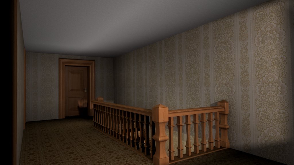
textured upstairs


learn blender, you will never regret it.

Attachments

Login to view attachments
SimSmall
20
Years of Service
User Offline
Joined: 7th Aug 2004
Location: United Kingdom
Posted: 20th Nov 2007 20:33
Have you changed the height of those stairs? Before I thought they were just too steep, and now they look like you won't need rock-climbing gear just to get up them.

Other than that, perhaps a little cupboard under the stairs? (Most staircases in houses on the ground floor have one, either that or they have a another staircase that leads to a cellar)

Login to post a reply

Server time is: 2024-11-26 02:34:15
Your offset time is: 2024-11-26 02:34:15