Sorry your browser is not supported!

You are using an outdated browser that does not support modern web technologies, in order to use this site please update to a new browser.

Browsers supported include Chrome, FireFox, Safari, Opera, Internet Explorer 10+ or Microsoft Edge.

3 Dimensional Chat / [WIP] Second Human Model

Author
Message
DB PROgrammer
17
Years of Service
User Offline
Joined: 9th Feb 2007
Location: Nowhere But Everywhere
Posted: 2nd Jan 2008 10:39 Edited at: 2nd Jan 2008 10:45
I am currently working on a human model for my game and would like some C&C on it. Remember this is a work in progress so no flaming


Things I know are wrong:
He's missing his head, hands and feet
His chest seems to have a crease in it
Probably a little to many polys in legs
Not enough polys in arms

Alucard94
17
Years of Service
User Offline
Joined: 9th Jul 2007
Location: Stockholm, Sweden.
Posted: 2nd Jan 2008 12:24
Better than any human I could ever do...

DB PROgrammer
17
Years of Service
User Offline
Joined: 9th Feb 2007
Location: Nowhere But Everywhere
Posted: 2nd Jan 2008 15:56 Edited at: 2nd Jan 2008 15:59
Update:


Fixed the chest, arms and legs
Next is feet!

I'd really like some C&C as I know this is not the best it can be! That sentance was on acedent, lol!

RUCCUS
19
Years of Service
User Offline
Joined: 11th Dec 2004
Location: Canada
Posted: 2nd Jan 2008 16:37
You need to rotate the edgeloops all over the body to follow proper muscle flow better. The arms are too big and not very anatomically correct, and the chest has some weird valleys in it. But for a 2nd attempt its pretty good.

wind27382
18
Years of Service
User Offline
Joined: 10th Feb 2006
Location:
Posted: 3rd Jan 2008 03:01
really good for a second attempt but the edge loop is all wrong. you will have to do alot of tweaking in order to get it right

wind
DB PROgrammer
17
Years of Service
User Offline
Joined: 9th Feb 2007
Location: Nowhere But Everywhere
Posted: 3rd Jan 2008 04:11
I don't want to sound like a noob but I am.

Quote: "the edge loop is all wrong."


What do you mean. I'm clueless

Deathead
18
Years of Service
User Offline
Joined: 14th Oct 2006
Location:
Posted: 3rd Jan 2008 04:24
Thats not a noobish question.. I don't have a clue see and I have been modelling for a good 3 years now.

[href=http://www.freewebs.com/ignitestudios/]

[/href]
DB PROgrammer
17
Years of Service
User Offline
Joined: 9th Feb 2007
Location: Nowhere But Everywhere
Posted: 3rd Jan 2008 06:15
Update:

Ok, I have started adding a little detail to the model.


And I have started creating the head.


I know the head isn't very good but im trying to find a good tutorial. If anyone knows about any good tutorials for making heads please post here.

Yskonyn
21
Years of Service
User Offline
Joined: 19th Dec 2002
Location: Netherlands
Posted: 3rd Jan 2008 10:05
Very nice attempt for only a few tries! Good job!
My 2 cents:

Your arms are a little too 'cillindric' and they are too fat in relation to the rest of the body. I would change that and I think you could make the legs just a little bit longer to make the proportions look better, unless your feet are going to include boots of some sort, then its ok I think.

Keep it up!


Yskonyn - (Ploughing through Hands On DBP Programming Vol. 1)
"It's better to wish down here you were up, then to wish up there you were down."
RUCCUS
19
Years of Service
User Offline
Joined: 11th Dec 2004
Location: Canada
Posted: 3rd Jan 2008 16:28
Take a look at this tutorial.

You'll see what we mean by your edgeloops not following the contours of the muscles properly. Here is an image from the tutorial to show what we mean:


Notice how the edge loops (edge loops are the "rings" of edges) aren't perfectly straight, they've been rotated to follow the proper muscle structures. This makes for a smoother looking mesh, and a much easier mesh to animate / rig.

DB PROgrammer
17
Years of Service
User Offline
Joined: 9th Feb 2007
Location: Nowhere But Everywhere
Posted: 3rd Jan 2008 18:14
@Yskonyn
Quote: "Your arms are a little too 'cillindric' and they are too fat in relation to the rest of the body."


Ok I'll try making them a little smaller.

Quote: "I think you could make the legs just a little bit longer to make the proportions look better, unless your feet are going to include boots of some sort, then its ok I think."


Yes it's going to have boots.

@RUCCUS
Thanks for explaining that to me, i'll try to fix it on the next update.

DB PROgrammer
17
Years of Service
User Offline
Joined: 9th Feb 2007
Location: Nowhere But Everywhere
Posted: 3rd Jan 2008 19:37
Update:


I have tried to fix the edge loops and have added hands and boots.

RUCCUS
19
Years of Service
User Offline
Joined: 11th Dec 2004
Location: Canada
Posted: 3rd Jan 2008 20:06
They still need a lot of work but you're improving.

Another thing you should really do (and a lot of professional modelers do this ALL the time) is to study the human anatomy. Find some pictures off google of a muscle-view of the human. There are a few good ones out there.

Yskonyn
21
Years of Service
User Offline
Joined: 19th Dec 2002
Location: Netherlands
Posted: 3rd Jan 2008 20:37
Getting better while you go!
The arms overflow into the hands are bit weird. Look at you own arms, they don't go from fat in the shoulder to small bij the hands. That's also what RUCCUS means by looking at human anatomy.
But overall you're getting there!


(Ploughing through Hands On DBP Programming Vol. 1)
RUCCUS
19
Years of Service
User Offline
Joined: 11th Dec 2004
Location: Canada
Posted: 3rd Jan 2008 21:03 Edited at: 3rd Jan 2008 21:06
I did a really quick draw-over of how ou could slightly improve your loops:
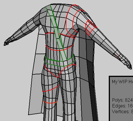


But it really is something that comes with looking at / studying the human muscle anatomy, and modeling more and more. Im sure you'll get it soon if this is only your second attempt at a human.

Aside from that, the feet need to be smaller and the transition from the angle to the foot needs to be defined a lot more, especially on the front. Your shoulders need to be slightly smaller, you need a little more muscle definition in the middle of the arm to make it look less like a cylinder, and your wrists need to be defined more because right now it looks like he doesn't have any. The crotch has some bad edge loops, its too much of a grid, but that will come with time.

I really recommend taking a look at the tutorial I linked when you're done this model, and trying again from scratch, Im sure the outcome will be a lot better.

Finally, from now on you should really make an effort to use concept art. If you have a front and side view of your model, lined up perfectly in your modeler (Wings 3D can do this, Right Click > Image Plain > Browse for your reference image), it will be a lot easier to match the anatomy, assuming the reference image is correct.

Attachments

Login to view attachments
DB PROgrammer
17
Years of Service
User Offline
Joined: 9th Feb 2007
Location: Nowhere But Everywhere
Posted: 3rd Jan 2008 22:03
@Yskonyn
Quote: "The arms overflow into the hands are bit weird."


Its because I forgot to define the wrists its fixed.

@RUCCUS

Quote: "I did a really quick draw-over of how ou could slightly improve your loops"


Thanks Ruccus I'll try to fix the edge loops.

Quote: "Finally, from now on you should really make an effort to use concept art."


I am using this for refrance


Yskonyn
21
Years of Service
User Offline
Joined: 19th Dec 2002
Location: Netherlands
Posted: 3rd Jan 2008 22:24
Nice ref pics. Did you draw that yourself or was it a download?


(Ploughing through Hands On DBP Programming Vol. 1)
RUCCUS
19
Years of Service
User Offline
Joined: 11th Dec 2004
Location: Canada
Posted: 3rd Jan 2008 22:35
I think those were made by Oddmind.

DB PROgrammer
17
Years of Service
User Offline
Joined: 9th Feb 2007
Location: Nowhere But Everywhere
Posted: 4th Jan 2008 02:15
Yes they where downloaded. Are they the right perportions?

JimB
22
Years of Service
User Offline
Joined: 21st Sep 2002
Location: UK
Posted: 4th Jan 2008 08:33 Edited at: 4th Jan 2008 08:35
RUCCUS
19
Years of Service
User Offline
Joined: 11th Dec 2004
Location: Canada
Posted: 4th Jan 2008 15:22
The reference images are definitely the right proportions, just your model isnt . But it will come with practice.

How did you model it? Box modeling or cylinder modeling?

DB PROgrammer
17
Years of Service
User Offline
Joined: 9th Feb 2007
Location: Nowhere But Everywhere
Posted: 4th Jan 2008 22:18
Update:


@JimB
Thanks JimB.

@RUCCUS
I use box modeling.

RUCCUS
19
Years of Service
User Offline
Joined: 11th Dec 2004
Location: Canada
Posted: 4th Jan 2008 22:49
One of the big problems with box modeling is you lose your edge loops really quickly, whereas with cylinder modeling its very easy to keep the loops in-tact. The tutorial I linked to teaches how to use cylinder modeling.

DB PROgrammer
17
Years of Service
User Offline
Joined: 9th Feb 2007
Location: Nowhere But Everywhere
Posted: 5th Jan 2008 00:11
I'll try that on my next model Ruccus, but I want to complete this one.

Dr Parsnips
17
Years of Service
User Offline
Joined: 14th Jul 2007
Location: London
Posted: 5th Jan 2008 00:23
Great model, looks really good! is it supposed to be some sort of pirate, thats the impression i get any way. did you use a tutorial for this? if so which tutorial? thanks!

HMMMMMMM
DB PROgrammer
17
Years of Service
User Offline
Joined: 9th Feb 2007
Location: Nowhere But Everywhere
Posted: 5th Jan 2008 01:33
Quote: "Great model, looks really good!"


Thanks!

Quote: "is it supposed to be some sort of pirate, thats the impression i get any way."


Yes it is supposed to be a pirate.

Quote: "did you use a tutorial for this? if so which tutorial? "


No, I didn't use any tutorials to make it. But if you do want a tutorial to make a human look at the one Ruccus linked to above, it looks good.

JimB
22
Years of Service
User Offline
Joined: 21st Sep 2002
Location: UK
Posted: 5th Jan 2008 08:49
DB PROgrammer
17
Years of Service
User Offline
Joined: 9th Feb 2007
Location: Nowhere But Everywhere
Posted: 6th Jan 2008 20:46
Looks nice JimB

DB PROgrammer
17
Years of Service
User Offline
Joined: 9th Feb 2007
Location: Nowhere But Everywhere
Posted: 7th Jan 2008 05:45
Update:


All I have done is added a head to the model. If anyone knows any good tutorials for making head please post here.

Commander in Chief
18
Years of Service
User Offline
Joined: 15th Apr 2006
Location: Carbondale, PA, USA
Posted: 14th Jan 2008 03:37
The head is off proportion. The nose is too long, the eyes need to be lower. Look at a picture of a bald person and you'll notice the the forehead is actually quite large on most people. The eye sockets are a bit too large, try scaling them down a bit. Also, the top of the shoes should not be so high in the middle. (unless they're a woman's boots)

Hardware: nVidia GeForce 8500GT 256mb, 240gb HD Space, Dual Pentium 4 CPU 2.80GHz's, 512mb RAM, Realtek HD Audio
Software: 3Ds Max 9, Adobe Photoshop CS, Adobe AfterEffects CS3

Login to post a reply

Server time is: 2024-11-26 00:29:14
Your offset time is: 2024-11-26 00:29:14