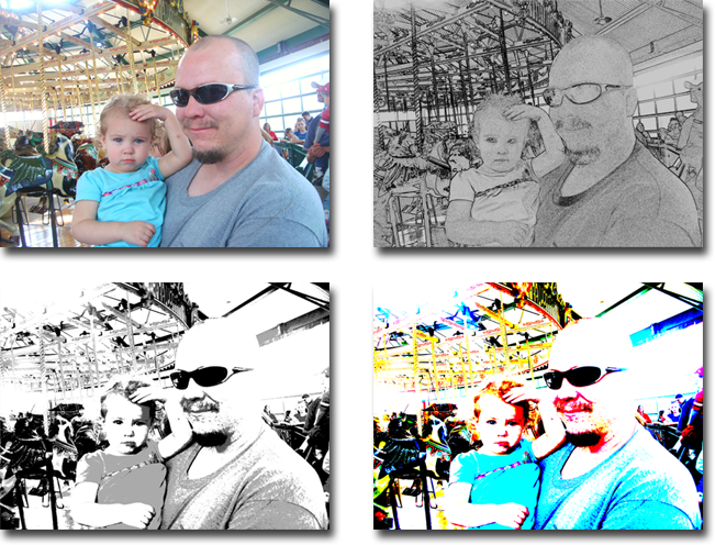
not a bad start; the filters are pretty good. right now the app doesn't do anything most free photo editors do so i'm assuming you're doing this for fun/the challenge and while i do get some seriously long load times (upwards of 30 seconds from the thumbnail pic selector page to finally displaying the image (ie, the Loading Image... page)?) and preview times, it's functional at this point so congrats for that.
i'm sure you already have a long list of tools you'll want to add so i won't bother suggesting those. instead, i'll mention my desire for the thumbnail page to show bigger thumbnails (maybe expand when i hover over them?) because, in my experience when working with images in general, i create many versons with different tweaks applied and with the current thumbnail sizes, i won't be able to distinguish 1 from another. to help with this, i'd like the thumbnails to be larger AND either the images filename (and time/date?) printed below it OR the filename/info to hover over top of the image when i move the mouse pointer over it.
i'd also like to see "project" folders that the user can create to keep organized on large projects. this can be as simple as the ability to create folders and perhaps import batches of photos from 1 location to the current project folder.
actually, i think the best thing, really, since this is a "custom" app would be to ask your GF what she would like to see in this app that would help her do what she wants/needs to do

one other concern i have is the fact that your GUI overlay occupies way too much of the screen @ roughly 450-500 pixels wide (overall) and the full height of the screen. it's negating any benefit i'm supposed to have on the 1680x1050 desktop i use.
overall, good start and i'm impressed with the filters so far and look forward seeing this evolve

oh, quick question: are you using "faked" grayscale color averages (ie (R+G+B)/3 ) or (the standard) 30% red, 59% green, 11% blue weights on your "Black and White" filter? (i'd change this to "Grayscale" vs "B/W", btw) this method will produce much more "vivid" grayscale images and it's something i see a lotta homebrewers overlook. i didn't check your conversion myself since it's easier to ask here but converting the photo you've included, it comes out pretty "washed out" which made me think about this

and, afterthought: i want to mention that i think the long "load times" might be a vista issue. are you using vista and do you experience the long load and preview times we are?
finally, here's a screenshot of results for the rest of us:

thanks for sharing!
