Sorry your browser is not supported!

You are using an outdated browser that does not support modern web technologies, in order to use this site please update to a new browser.

Browsers supported include Chrome, FireFox, Safari, Opera, Internet Explorer 10+ or Microsoft Edge.

3 Dimensional Chat / Scene compo wip

Author
Message
Ortu
DBPro Master
17
Years of Service
User Offline
Joined: 21st Nov 2007
Location: Austin, TX
Posted: 16th Nov 2009 02:17
Well, I'm just about finished with my entry now and I find myself faced with a choice. Here is what I've already shown in the compo thread:


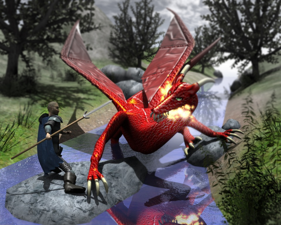
And here are the two possible finishes. I can't decide if the motion blur of the dragon's strike is an improvement over the still or not. It's not 'quite' what I had in mind but it's close I think.

Any ideas?


Quik
16
Years of Service
User Offline
Joined: 3rd Jul 2008
Location: Equestria!
Posted: 16th Nov 2009 03:22
would be almost impossible for the dragon to give a pounch in that pose, imho it looks better without the blurr, as it doesnt really look like he have even pounched, also it looks cooler if he stands there looking, the blurr is just annoying


[Q]uik, Quiker than most
Beast E Gargoyle
17
Years of Service
User Offline
Joined: 15th Feb 2007
Location: Sunny San Diego, CA
Posted: 17th Nov 2009 20:07
The render looks good. Some comments I like the motion blur, it makes it seem like you tried harder with the image than just making models/ texturing and say hey check this out. The last idea is the white end tip on the wing needs to begone unless you change the model itself so the wing area their would be a natural bone sticking out.

Cheers,

Beastegargoyle

My online game portfolio and work samples [a href]www.jaredgingerich.com[/a href]
Ortu
DBPro Master
17
Years of Service
User Offline
Joined: 21st Nov 2007
Location: Austin, TX
Posted: 18th Nov 2009 02:31
doh, those white tips are just a spot I missed in the texturing. Thanks for the catch.


nackidno
17
Years of Service
User Offline
Joined: 3rd Feb 2007
Location: Där solen aldrig skiner
Posted: 18th Nov 2009 11:45
you might want to smooth the shadows. It would look a little better in my opinion.

RUCCUS
19
Years of Service
User Offline
Joined: 11th Dec 2004
Location: Canada
Posted: 18th Nov 2009 15:39 Edited at: 18th Nov 2009 15:42
My crits:

- Dragons eyes are starring blankly into space instead of towards the knight. The dragon's eye brows could be slanted down a bit as well to add some emotion.

- Theres too much saturation in the scene overall. In real life there are small water particles and dust particles in the air that cause things to lose their saturation as they go farther into the background. If your 3D editor has a fog setting this could be used to get the effect, otherwise throw it in photoshop and tone down the background having places in the extreme background almost completely desaturated. A gaussian blur in the background would help as well, to bring focus into the foreground and the main scene.

- The composition overall is pretty basic in terms of placement. You've centred the two characters right in the middle of the scene. Its almost always best to use the Rule of Thirds (look it up on wikipedia). Position the dragon to the farther right, the knight also far right past the middle point of the image, and add some more scenery to the left, to move the viewer's eye through the scene.

- The knight's head is a little round IMO. But thats a matter of modelling skill.

- Reflections in the water would add some more believability.

- In terms of the motion blur, it looks a little cheesy. If you are going to use it, go all out, blurring parts of the dragon's head and the knight's arms as well.

- But most of all the character's poses are pretty awkward and uncomfortable. I understand you're going for a sense of motion but its not working to me in this scene. Id recommend either having the knight mid-air as if he were jumping towards the dragon, with his sword in both hands showing him about to make the final slice. Or have the knight putting his weight on his back leg, his back arched away from the dragon holding his sword in front of his face awaiting the large blast of fire about to his him.

Thats my opinion. The idea is there, it just needs some work. Here is a very quick mock-up of some of the ideas I've mentioned, (obviously I couldn't change the character poses and whatnot).


As you can see simple things like the background desaturation and blur already make a huge difference in where the eyes focus on the scene.

Attachments

Login to view attachments
Quik
16
Years of Service
User Offline
Joined: 3rd Jul 2008
Location: Equestria!
Posted: 18th Nov 2009 16:02
btw: why does he look crippled? is he supposed to look that way? ^^


[Q]uik, Quiker than most
Ortu
DBPro Master
17
Years of Service
User Offline
Joined: 21st Nov 2007
Location: Austin, TX
Posted: 19th Nov 2009 08:28
@nackidno by smooth the shadows do you mean soften the edges? The sun is set to just about noon. Direct outdoor exposure should have a fairly sharp, clean edge, although the shadows cast by the leaves probably ought to be a bit less substantial.

@Quik I think alot of the posing awkwardness is because the scene is an animated sequence in my head and I was trying to convey the idea of the sequence as a whole boiled down to a single instant... really tricky to do. I realize now that I probably should have built the concept around a still image from the start

His leg pose and weight distribution looks a bit better from another angle:


The scene is supposed to be the result of the dragon leaping from the rocks in the middle left distance, swinging down his claws as he lands with the hunter twisting away and swinging his leg back out of the way.

@RUCCUS You've given me alot of things to consider. You're absolutely right about the eyes: I got in a hurry and got careless no excuse for it.

The water actually does have reflections already, though the color is being blended more to the water tone and so they seem very washed out. More vibrancy does look more interesting, particularly the contrast of red on blue

I understand what you're saying about the desaturation, though I think realistically it doesn't wash out quite so much as your example. I know you didn't put alot of time into it though.

Before the pics, I had tried a gaussian blur in the far distance but couldn't get a transition that I was happy with so I decided just to leave it out altogether. I'll keep working on it.

I think if I were to do it over again, I'd drop the dragon's leap and set him to a pose with arm upraised just before a strike rather than having just completing it. The hunter's weight would be centered more in a low crouch.

Thanks for all the comments guys!


Quik
16
Years of Service
User Offline
Joined: 3rd Jul 2008
Location: Equestria!
Posted: 19th Nov 2009 08:39 Edited at: 19th Nov 2009 08:42
Quote: "The scene is supposed to be the result of the dragon leaping from the rocks in the middle left distance, swinging down his claws as he lands with the hunter twisting away and swinging his leg back out of the way."


to me, it really does look like the dragon is just staying there, which isnt bad, just telling, if you want more movement maybe make it so the claw is in the middle of the swing or something like that.
the scene itself isnt bad, its rather good, just saying some proposions are a bit of =P

edit: and yes, the leg looks better from another view^^


[Q]uik, Quiker than most
Master Man Of Justice
16
Years of Service
User Offline
Joined: 13th Feb 2008
Location: Between Insanity and Intelligence
Posted: 20th Nov 2009 04:17
i think you should take that little black dot out of the eyes maybe? it would look better. just a ghostly green like you have it.

(>">*BAM* <("< 2 words: Mon, tage (>">*BAM*<("<
Ortu
DBPro Master
17
Years of Service
User Offline
Joined: 21st Nov 2007
Location: Austin, TX
Posted: 21st Nov 2009 21:11
It's hard to see out of eyes that have no pupils

anyways completely apart from the competition, just for my own improvement, I did some re-working and I think this new render came out much better:


Not entirely happy with the cape now that it is more in the sunlight you can see some odd bumps... I tried to sculpt in the folds of the cloth, not something I have really had much practice on and it didn't come out entirely even. I usually just texture them in, soooo I know it needs more practice


Master Man Of Justice
16
Years of Service
User Offline
Joined: 13th Feb 2008
Location: Between Insanity and Intelligence
Posted: 21st Nov 2009 23:27 Edited at: 22nd Nov 2009 02:47
ok, im just saying it would cooler, but if you want to keep the pupils i would give him bigger ones *Edit on my help request* i am using ms3d and i get it now doh!

( > " ) > * BAM * < ( " < ) 2words:Mon-tage ( > " ) > *BAM* < ( " < )
Amyrildora
15
Years of Service
User Offline
Joined: 7th May 2009
Location: In your mind
Posted: 22nd Nov 2009 02:37 Edited at: 22nd Nov 2009 05:16
I like the latest render...very nice man The eyes seem a bit off still though..

Give into The Night!
RUCCUS
19
Years of Service
User Offline
Joined: 11th Dec 2004
Location: Canada
Posted: 22nd Nov 2009 05:09
Lol now the eyes are looking too far to the left, it looks like the dragon is staring at the grass and being scared . The best way to achieve this is to model the eyes seperately as spheres, that you can then rotate to point directly at the character.
Master Man Of Justice
16
Years of Service
User Offline
Joined: 13th Feb 2008
Location: Between Insanity and Intelligence
Posted: 22nd Nov 2009 14:16
Quote: "it looks like the dragon is staring at the grass and being scared "

True

( > " ) > * BAM * < ( " < ) 2words:Mon-tage ( > " ) > *BAM* < ( " < )
Quik
16
Years of Service
User Offline
Joined: 3rd Jul 2008
Location: Equestria!
Posted: 22nd Nov 2009 15:07
Quote: "it looks like the dragon is staring at the grass and being scared "

TRUEXD
new scene is a lot better though ^^


[Q]uik, Quiker than most
Ortu
DBPro Master
17
Years of Service
User Offline
Joined: 21st Nov 2007
Location: Austin, TX
Posted: 22nd Nov 2009 18:36
Quote: "The best way to achieve this is to model the eyes seperately as spheres, that you can then rotate to point directly at the character."


That's exactly what I did. They are constrained to track the hunter.


...ah I just realized what is going on. The hunter slid away from his object center when posing, and the eye constraint follows the center not the mesh. I need to reposition the hunter mesh relative to it's center within his pose.


Master Man Of Justice
16
Years of Service
User Offline
Joined: 13th Feb 2008
Location: Between Insanity and Intelligence
Posted: 22nd Nov 2009 22:10
oh yeah ortu i dont think i mentioned this but your doing a very good job

( > " ) > * BAM * < ( " < ) 2words:Mon-tage ( > " ) > *BAM* < ( " < )
Ortu
DBPro Master
17
Years of Service
User Offline
Joined: 21st Nov 2007
Location: Austin, TX
Posted: 23rd Nov 2009 01:00
Thanks!


Master Man Of Justice
16
Years of Service
User Offline
Joined: 13th Feb 2008
Location: Between Insanity and Intelligence
Posted: 23rd Nov 2009 05:23
wish i could character model like that. the best character i can make is a robot

( > " ) > * BAM * < ( " < ) 2words:Mon-tage ( > " ) > *BAM* < ( " < )

Login to post a reply

Server time is: 2024-11-24 19:20:58
Your offset time is: 2024-11-24 19:20:58