Sorry your browser is not supported!

You are using an outdated browser that does not support modern web technologies, in order to use this site please update to a new browser.

Browsers supported include Chrome, FireFox, Safari, Opera, Internet Explorer 10+ or Microsoft Edge.

3 Dimensional Chat / mazz426's new work

Author
Message
Mazz426
16
Years of Service
User Offline
Joined: 4th Feb 2008
Location: Edinburgh
Posted: 20th Dec 2009 12:34 Edited at: 20th Dec 2009 14:00
hello again, its been a while since i was on these forums.

i have recently compared the work i have done in z brush to what the z brush centeral users had been doing, which is all a hundred times better than what i do, but i have been following some user advice and tutorials and have come up with some new models, the following one i made to test a process that a user uses to create a skin like texture, i also followed a presentation tutorial so that my work would look more professional.

"Alien head" -


Attachments

Login to view attachments
Mazz426
16
Years of Service
User Offline
Joined: 4th Feb 2008
Location: Edinburgh
Posted: 20th Dec 2009 13:02 Edited at: 20th Dec 2009 13:03
also heres a new one, i did this, mabey 3 days ago and from here on shall be my base for all my humanoid models, i used the 'super average man' ztool as a proportional guide.

i think it turned out rather well, but what do you think on both pieces, C&C is welcome

"z sphere base" -


Attachments

Login to view attachments
Mazz426
16
Years of Service
User Offline
Joined: 4th Feb 2008
Location: Edinburgh
Posted: 20th Dec 2009 15:07 Edited at: 20th Dec 2009 15:08
heres yet again a new model which i just finished, I've used the above base and the skin system, all thats left now is to texture it, i also don't have a name for it, so if anyone can think of anything let me know

"alien 1" -


Attachments

Login to view attachments
Nexar
15
Years of Service
User Offline
Joined: 6th Nov 2009
Location: Sweden, Mjölby
Posted: 20th Dec 2009 15:32
Wow, i really like that alien looking character (mostly becouse i like those type of legs) and i almost thought it said mazz426's new york!

Hassan
15
Years of Service
User Offline
Joined: 4th May 2009
Location: <script> alert(1); </script>
Posted: 20th Dec 2009 15:56
looks good, but the last model looks a bit "flat"

Mazz426
16
Years of Service
User Offline
Joined: 4th Feb 2008
Location: Edinburgh
Posted: 20th Dec 2009 16:46 Edited at: 20th Dec 2009 16:47
thanks for the comments guys

hassan@ could you please elaborate, do you mean the render or do you mean the model itself, as once you mentioned it i to realised that it seems a lot more flat than it acctually is, i'll prived a better angle once its finished

anyway here is what i just finished

"alien head (2)" -


Attachments

Login to view attachments
Nexar
15
Years of Service
User Offline
Joined: 6th Nov 2009
Location: Sweden, Mjölby
Posted: 20th Dec 2009 16:49
Reminds me of Nute Gunray!

Asteric
16
Years of Service
User Offline
Joined: 1st Jan 2008
Location: Geordie Land
Posted: 20th Dec 2009 16:50
Nice, the over exaggerated fov makes it look tiny though.

Your signature has been erased by a mod - Please reduce it to 600x120 maximum size
Quik
16
Years of Service
User Offline
Joined: 3rd Jul 2008
Location: Equestria!
Posted: 20th Dec 2009 17:00
that dude is really REALLY going to brake his legs.....

nice though^^


[Q]uik, Quiker than most
Mazz426
16
Years of Service
User Offline
Joined: 4th Feb 2008
Location: Edinburgh
Posted: 20th Dec 2009 17:43 Edited at: 20th Dec 2009 17:43
thanks for the comments

quik@ i forgot to mention that his feet are not yet finished, so hopefully when he is done he wont, brake his legs

anyway here is a WIP scene using the previous head, its going to have a bowl of fruit in the background and mabey a knife or fork, but tell me what you think of it so far

"dinner is served (WIP)" -


Attachments

Login to view attachments
Hassan
15
Years of Service
User Offline
Joined: 4th May 2009
Location: <script> alert(1); </script>
Posted: 20th Dec 2009 18:23
yeah, im sooooooooooo gonna eat that on dinner. =]

Quik
16
Years of Service
User Offline
Joined: 3rd Jul 2008
Location: Equestria!
Posted: 20th Dec 2009 18:48
well, bigger feet or not the legs are way to much pointed back and theyre to thin to hold in that angle.


[Q]uik, Quiker than most
Mazz426
16
Years of Service
User Offline
Joined: 4th Feb 2008
Location: Edinburgh
Posted: 20th Dec 2009 19:38 Edited at: 20th Dec 2009 19:39
well here is the finished scene, i quite like it, so let me know what you think

"dinner is served..." -


Attachments

Login to view attachments
heyufool1
15
Years of Service
User Offline
Joined: 14th Feb 2009
Location: My quiet place
Posted: 20th Dec 2009 20:04
Mmmmm nothing like tomatoes and alien head to finish up the day. Good work!

The penguin faces south
Mazz426
16
Years of Service
User Offline
Joined: 4th Feb 2008
Location: Edinburgh
Posted: 20th Dec 2009 20:16
thanks and i've decided to enter it into the 'ring by any other name' comp so with me luck

Mazz426
16
Years of Service
User Offline
Joined: 4th Feb 2008
Location: Edinburgh
Posted: 21st Dec 2009 12:01 Edited at: 21st Dec 2009 12:02
heres a quick post, its still wip, obviously he has no limbs! but it'll be tetured next then the limbs, the process will make sense when you see the final product.

anyway here it is, this is also using a custom matcap (material) so tell me what you think of both

"fish out of water (wip)" -


Attachments

Login to view attachments
Asteric
16
Years of Service
User Offline
Joined: 1st Jan 2008
Location: Geordie Land
Posted: 21st Dec 2009 12:19
Not bad, i think the anatomy needs revising though.

Your signature has been erased by a mod - Please reduce it to 600x120 maximum size
Mazz426
16
Years of Service
User Offline
Joined: 4th Feb 2008
Location: Edinburgh
Posted: 21st Dec 2009 12:47 Edited at: 21st Dec 2009 12:48
thanks for the comment, really i wasn't trying to get the anatomy correct with this guy, i was really just trying to recreate what i saw in my head, which i did

thanks for the advice though, anyway here is the polypainted model, now just to model the limbs and what not, tell me what you think.

"fish out of water (wip)" -


Attachments

Login to view attachments
Quik
16
Years of Service
User Offline
Joined: 3rd Jul 2008
Location: Equestria!
Posted: 21st Dec 2009 14:50
Quote: "thanks for the comment, really i wasn't trying to get the anatomy correct with this guy, i was really just trying to recreate what i saw in my head"


same excuse as with all other anatomy incorrect models (like every model) u have? =P i really want to see u making a whole human or such sometime, would be great excersize for u.


[Q]uik, Quiker than most
Master Man Of Justice
16
Years of Service
User Offline
Joined: 13th Feb 2008
Location: Between Insanity and Intelligence
Posted: 21st Dec 2009 16:27
please dont make his legs like you usually do they always look like stilts, though it's a style of yours, i would go for something bent outward and normal feet but still it looks amazing

Mazz426
16
Years of Service
User Offline
Joined: 4th Feb 2008
Location: Edinburgh
Posted: 21st Dec 2009 16:30 Edited at: 21st Dec 2009 16:31
quik@

look these models are from my imagination and aren't meant to be human, i was acctually planning to move onto humans after i finnish a "fish out of water". so i do appreciate the advice, and i do agree that they aren't anatomically correct, when compared to humans but these aren't human. but could you please specify whats incorrect e.g. the stomach isn't wide enough or is his chest too big, please let me know and i will correct it as i do want these to be believable

anyway here is an update, i've finished his arms, not much left

"a fish out of water (wip)" -


Attachments

Login to view attachments
Mazz426
16
Years of Service
User Offline
Joined: 4th Feb 2008
Location: Edinburgh
Posted: 21st Dec 2009 16:50 Edited at: 21st Dec 2009 16:54
master man of justice@

don't worry i'm goint to be making legs similat to that of a human

okay i just made this now quite quickly so theres bound to be issues but quik could you let me know if this is more accurate/ works better


Attachments

Login to view attachments
Azunaki
15
Years of Service
User Offline
Joined: 11th Feb 2009
Location:
Posted: 21st Dec 2009 21:10 Edited at: 21st Dec 2009 21:14
i liked the first non-textured one more.it looked like it had a stomach because it looked like a belly button.

the thing with anatomy on aliens is you have flexibility but when ever you try to give it an alien shape you need to have a base human reflection. by that i mean that you need it to be shaped the way a human would with bones. granted even then you have flexibility. take a look at ass effect some of their aliens would be a good reference for shape.

now the main problem i see is the arms they curve like they have an elbow but it doesn't appear like they do.

another thing is the back view looks rather... well the way the rib cage goes makes it appear to have a medical disorder...

try bringing the bulge a ways in or something to make the bulge appear less apparent.

[url]http://myportfolio.x10hosting.com/[url]
visit my site.(still in progress)
Mazz426
16
Years of Service
User Offline
Joined: 4th Feb 2008
Location: Edinburgh
Posted: 21st Dec 2009 21:17
Thanks for the advice, and uh I think you mean 'mass effect'

Asteric
16
Years of Service
User Offline
Joined: 1st Jan 2008
Location: Geordie Land
Posted: 22nd Dec 2009 02:30
Quote: "take a look at ass effect"


Haha, awesome typo strikes again!

Your signature has been erased by a mod - Please reduce it to 600x120 maximum size
Mazz426
16
Years of Service
User Offline
Joined: 4th Feb 2008
Location: Edinburgh
Posted: 22nd Dec 2009 20:19 Edited at: 22nd Dec 2009 20:20
well i've put the fishman on hold and may leave him as just a model, but not sure, anyway here is an incredinly early wip screen of a human anatomy study of the muscle structures of the body, the head shall be done seperately.

"human anatomy study 1 (wip)" -


Attachments

Login to view attachments
Mazz426
16
Years of Service
User Offline
Joined: 4th Feb 2008
Location: Edinburgh
Posted: 22nd Dec 2009 21:38 Edited at: 22nd Dec 2009 21:39
heres a quick update of what i've done since the previous post, and i think its finished and i am rather pleased with how it's tunred out, but C&C welcome so tell me what you think

"human anatomy study 1" -


Attachments

Login to view attachments
Master Man Of Justice
16
Years of Service
User Offline
Joined: 13th Feb 2008
Location: Between Insanity and Intelligence
Posted: 22nd Dec 2009 21:39
wow thats awesome man! A+ for you

Mazz426
16
Years of Service
User Offline
Joined: 4th Feb 2008
Location: Edinburgh
Posted: 23rd Dec 2009 19:32 Edited at: 23rd Dec 2009 19:33
well heres a little update, i decided to polypaint the muscles and i fely like sharing the result, tell me what you think

"anatomical study 1 (textured)" -


Attachments

Login to view attachments
Asteric
16
Years of Service
User Offline
Joined: 1st Jan 2008
Location: Geordie Land
Posted: 23rd Dec 2009 19:57
Nice stuff, only crit is the muscles are too harshly defined, i would smooth them up a wee bit.

Your signature has been erased by a mod - Please reduce it to 600x120 maximum size
Master Man Of Justice
16
Years of Service
User Offline
Joined: 13th Feb 2008
Location: Between Insanity and Intelligence
Posted: 23rd Dec 2009 20:02
dude i just realized. This would make an AWESOME quake 3 bot character !

lazerus
16
Years of Service
User Offline
Joined: 30th Apr 2008
Location:
Posted: 23rd Dec 2009 20:14
Unless he retopologies then it would probably break the quake three engine. Thats the main reason i barely use zbrush anymore, my Rig cant handle Max's run load when i retopologise. I shoud just spilt the mesh lol. Im guessing, what 4th? subdiv?

Have alook around for tutorials on it, thiers plenty of videos ones out thier. I had a ?knome? one on DVD, £50 anit that bad for all of the info and workflow stuff's

As it has already been pointed out, the mucles area a little too defined, to the point were they could esplode lol. Smooth it down a bit and it'll look great.

-Con

Mazz426
16
Years of Service
User Offline
Joined: 4th Feb 2008
Location: Edinburgh
Posted: 23rd Dec 2009 20:46 Edited at: 23rd Dec 2009 22:20
thanks for the comments, lazerus this is acctaully at its 2nd subdiv and is, 151,000 polies, so thats pretty low, for z brush.

anyway yeh i'll probably get one of the new tutorail DVD's with xmas money, but i had a question, where is the retapologise button or whatever as i cant find it.

also the muscles do look very defined in that render, i think i overdid the edge detection for the material

anyway here is a quick post, this took me a most 10 minutes so its very early wip but i rather like it, its meant to be a vampire and i know it looks nothing like one but i was thinking that it drinks blood in the same way that a humming bird drinks/ extracts nectre from flowers. anyway heres the render and C&C welcome as usual

"vampire (wip)" -


Attachments

Login to view attachments
Mazz426
16
Years of Service
User Offline
Joined: 4th Feb 2008
Location: Edinburgh
Posted: 24th Dec 2009 13:25 Edited at: 24th Dec 2009 13:27
well here is a quick update on the vampire character, just some subtle changes, i think i'm ready to go onto fine detailing so exspect a lot of updates soon

also i wanted your opinion on something, is the name drainer more appropriate and better than vampire, let me know

and this is also another custom matcap, i may release a pack on here for our z brush users if you want, let me know

"vampire/ drainer (wip)" -


Attachments

Login to view attachments
Mazz426
16
Years of Service
User Offline
Joined: 4th Feb 2008
Location: Edinburgh
Posted: 24th Dec 2009 20:19 Edited at: 24th Dec 2009 20:20
heres a quick update, he isn't quite finished but close so now i want some advice i have a favourite of these three but i want to know which one you think is the better base material for the texture


Attachments

Login to view attachments
Mazz426
16
Years of Service
User Offline
Joined: 4th Feb 2008
Location: Edinburgh
Posted: 26th Dec 2009 19:54 Edited at: 26th Dec 2009 19:56
not a single post... hmm oh well

heres a quick model i did for fun and practice

"male torso" -


Attachments

Login to view attachments
mike5424
15
Years of Service
User Offline
Joined: 30th Mar 2009
Location:
Posted: 27th Dec 2009 10:03
wow, looking good! But it does look like it needs a six pack

---
Quik
16
Years of Service
User Offline
Joined: 3rd Jul 2008
Location: Equestria!
Posted: 27th Dec 2009 12:51
i dont get why everyone thinks that every male model needs a six pack... oh well

looks awesome his bumpy (ass) is a bit to flat though


[Q]uik, Quiker than most
Mazz426
16
Years of Service
User Offline
Joined: 4th Feb 2008
Location: Edinburgh
Posted: 27th Dec 2009 12:55
quik@

thanks for pointing that out, i'll fix it

mike5424
15
Years of Service
User Offline
Joined: 30th Mar 2009
Location:
Posted: 27th Dec 2009 13:03 Edited at: 27th Dec 2009 13:04
mazz, would you take a look at my "Alien Head" thread? i wanted to know what you thought of it seeing as your the best zbrush modeler i know

EDIT: just noticed, you allready have.

---
Mazz426
16
Years of Service
User Offline
Joined: 4th Feb 2008
Location: Edinburgh
Posted: 27th Dec 2009 13:05
mike5454@

thanks
i have acctually just posted on your thread, feel free to ask any questions on here if you get stuck

Red Eye
16
Years of Service
User Offline
Joined: 15th Oct 2008
Location:
Posted: 27th Dec 2009 13:40
Fact: The greeks made the first good looking male sculpt. It was freaking realistic. But then they realised that if u exagerate the little things on a human body, like muscles or buts, or any thing like that, like more longer arms and legs, it would have the best unrealistic realistic result. Like the people would look and say: WOW! that is nice, but it was unrealistic, tho they felt that it was remake of them. So it had its own gravity towards the people. That makes it Impressive, then a "silly" normal sculpt of a normal person.

Here:
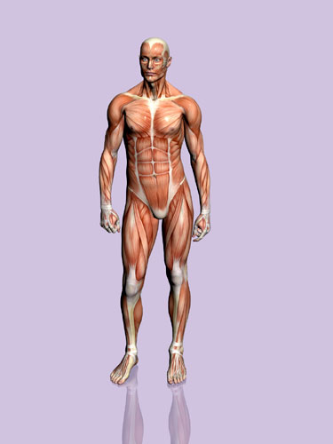


Picture One: Fully Normal Human Body, all in good porpotions. Presenting all the muscles in action.

Picture Two: A full unatural human body. All out of porpotions. Muscles are not well represented.

So... But wich one is the most "attractive" one. I do believe that is the second one. (Also because he is in action, as in the first image the person is acting static, and not doing anything.) In the second image, the human body have strong unatural muscles. And the body is out of porpotions.

---

Just a bit info for you .

Quote: "The most realistic is being unrealistic. - Red Eye"


Mazz426
16
Years of Service
User Offline
Joined: 4th Feb 2008
Location: Edinburgh
Posted: 27th Dec 2009 13:45 Edited at: 27th Dec 2009 13:46
red eye@

thats very interesting, i was recently in italy and when i was looking at those sort of sculptures i always thought that something wasn't correct and now i know what, everything

i agree that the second looks better and i'll try doing what you said with a few models

anyway heres an update on the torso

"male torso" -


Attachments

Login to view attachments
Mazz426
16
Years of Service
User Offline
Joined: 4th Feb 2008
Location: Edinburgh
Posted: 27th Dec 2009 17:23 Edited at: 27th Dec 2009 17:23
heres some development on a texture

"male torso tex" -


Attachments

Login to view attachments
Zuka
16
Years of Service
User Offline
Joined: 21st Apr 2008
Location: They locked me in the insane asylum.
Posted: 28th Dec 2009 09:45 Edited at: 28th Dec 2009 09:46
Could you make a very big space snake for me? Big as in, big enough to swallow Earth whole. Of course, it doesn't have to be THAT detailed. Just make sure it looks threatening and has a lot of spikes on its head. ?

Quik
16
Years of Service
User Offline
Joined: 3rd Jul 2008
Location: Equestria!
Posted: 28th Dec 2009 11:14
still gotta say... the ass is too flat=P


[Q]uik, Quiker than most
Mazz426
16
Years of Service
User Offline
Joined: 4th Feb 2008
Location: Edinburgh
Posted: 28th Dec 2009 19:42 Edited at: 28th Dec 2009 19:42
well heres some further detailing

"male torso" -


Attachments

Login to view attachments
Asteric
16
Years of Service
User Offline
Joined: 1st Jan 2008
Location: Geordie Land
Posted: 28th Dec 2009 19:47
the shoulder muscles/shoulder blades on the back look wrong.

Your signature has been erased by a mod - Please reduce it to 600x120 maximum size
Priske
15
Years of Service
User Offline
Joined: 19th Aug 2009
Location:
Posted: 28th Dec 2009 19:51
I agree with asteric, i think the problem is how close together they are also they might be a tad bit to long.

3D artist
Mazz426
16
Years of Service
User Offline
Joined: 4th Feb 2008
Location: Edinburgh
Posted: 28th Dec 2009 20:18 Edited at: 28th Dec 2009 20:19
well i did this very quickly but is this any better

"male torso" -


Attachments

Login to view attachments

Login to post a reply

Server time is: 2024-11-24 17:53:55
Your offset time is: 2024-11-24 17:53:55