Sorry your browser is not supported!

You are using an outdated browser that does not support modern web technologies, in order to use this site please update to a new browser.

Browsers supported include Chrome, FireFox, Safari, Opera, Internet Explorer 10+ or Microsoft Edge.

3 Dimensional Chat / Port Kalidor - My city model

Author
Message
programing dude
16
Years of Service
User Offline
Joined: 22nd Jul 2008
Location:
Posted: 6th Mar 2010 21:50 Edited at: 6th Mar 2010 22:00
Hi, this is a port city that im gonna use for my game.

The lighting seems weird as the lights will be placed in Darkbasic pro. The textures for the actual city are not final. This is a WIP model.

Here are some screenshots, tell me what you think


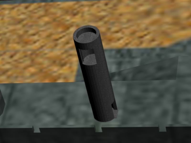
This is one of the few battle towers that will be placed along the outer battlement.
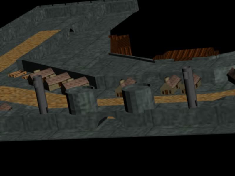


This is the main gate of the city with two larger towers on either side.
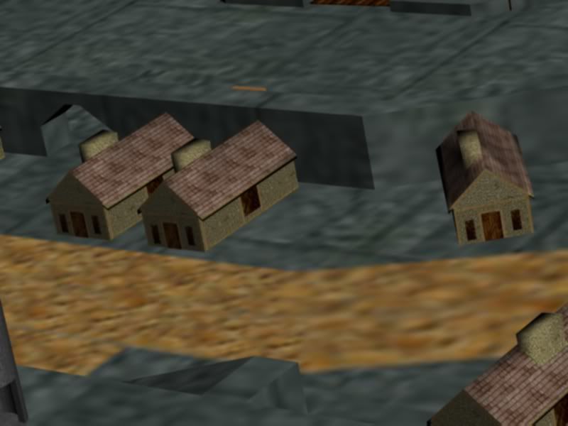


These are a few houses in the outer part of the city.


[img]

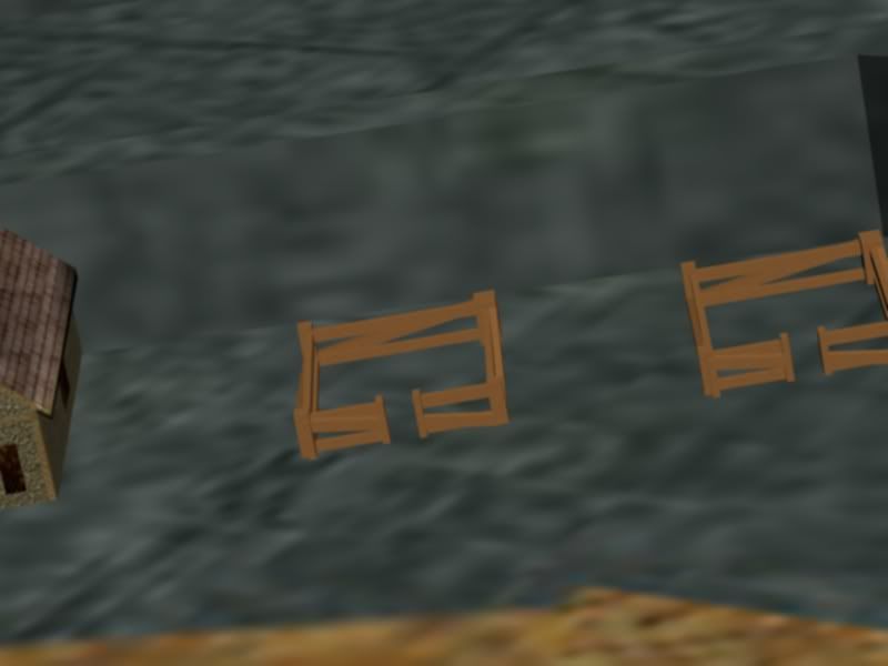
Stables and vendor stand beside the stables. In game you will be able to "rent" a horse, which you can use to get to your destination. When you reach your destination you will automaticly dismount.
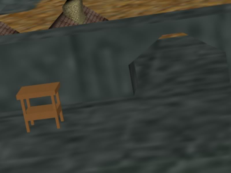


One of three gates leading to the inner city where you may board the boats. Beside the gate is also a vendor stand where you may purchase items.
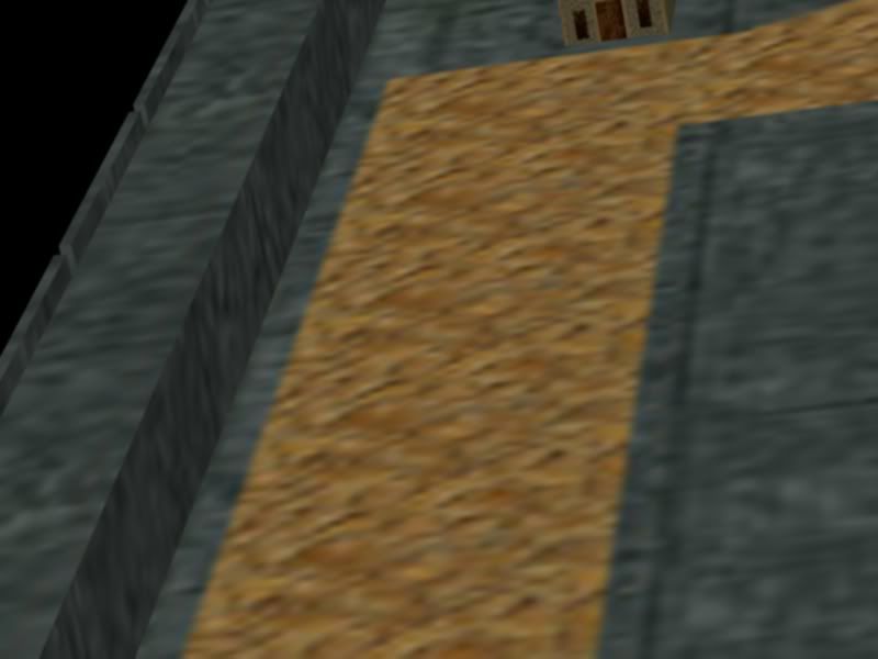


This is the road that takes you from the main gate to the side gates.
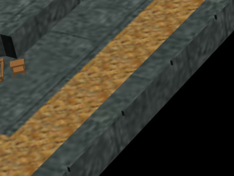


The wall on the right side of the city.
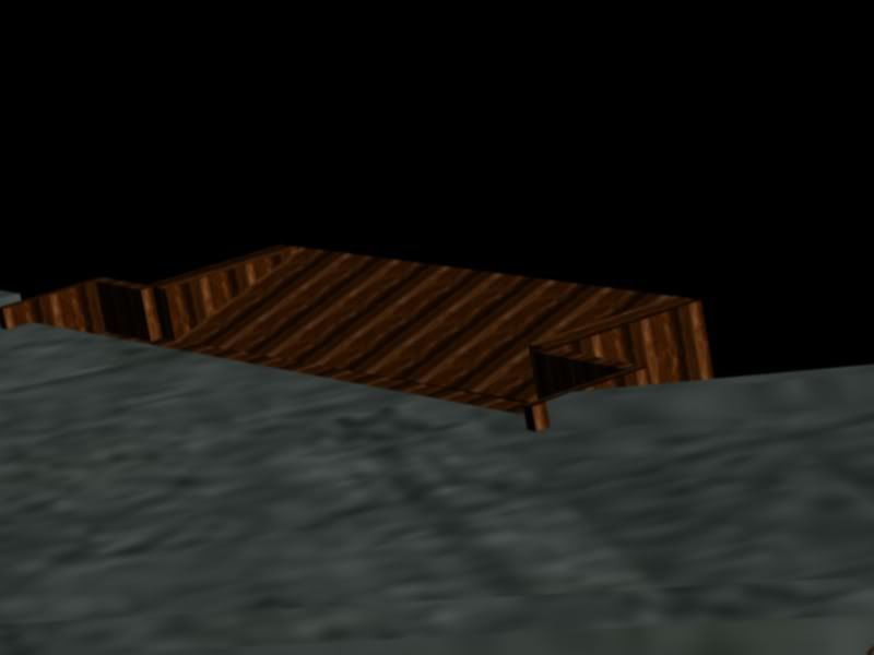


Dock located in the inner part of the city where you can board ships.
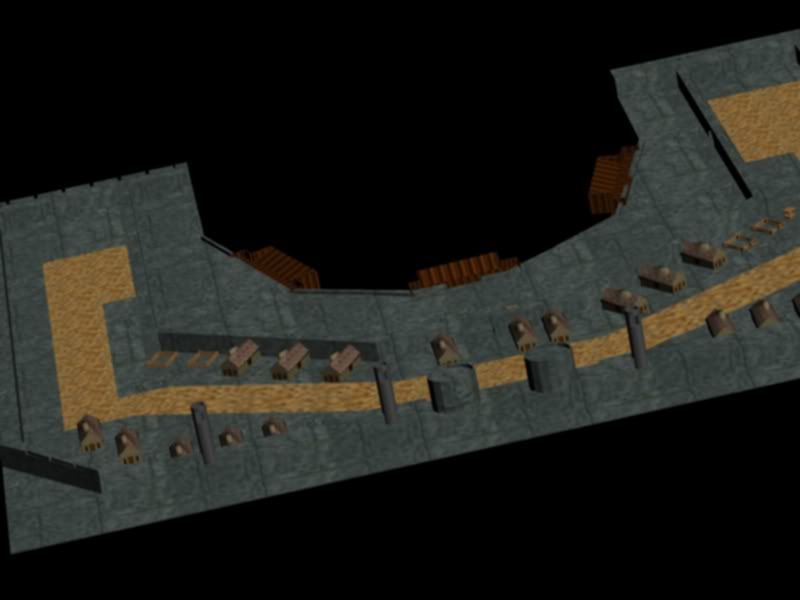


The whole city with the main gate, four battle towers, houses, stables, a road and docks in the inner part of the city.
Azunaki
15
Years of Service
User Offline
Joined: 11th Feb 2009
Location:
Posted: 6th Mar 2010 22:29 Edited at: 6th Mar 2010 22:30
the port looks very odd. you need more variation for the houses and stables. and everything needs better textures then that i just can't get over it. its also far to flat. try making it look more hill like.

and option would be to have the wings be higher or lower and drop off as a cliff.

[url]http://myportfolio.x10hosting.com/[url]
visit my site.(still in progress)
Shaun Of The Dead
15
Years of Service
User Offline
Joined: 28th Jan 2009
Location: Wouldnt you like to know :P
Posted: 6th Mar 2010 22:34
I like the model. But the texture is extraordinary bad quality. Perhaps texturing in a larger UV map would help...

Your signature has been erased by a mod - Neither clever nor funny.
Link102
19
Years of Service
User Offline
Joined: 1st Dec 2004
Location: On your head, weeeeee!
Posted: 6th Mar 2010 22:48
The textures are not to small if you're using the model for a rts type of game, however the tower in pic 1 has WAY to many faces for a model of that detail.

Other than that, nice model, nice texture. A bit more variation would be nice.

programing dude
16
Years of Service
User Offline
Joined: 22nd Jul 2008
Location:
Posted: 7th Mar 2010 01:24
Thnx for pointing out the cons.

Im looking into different medieval house designs. I can't find variations of the building design I want. I have found lots of town house designs but those are more for grander cities.

As I said, this is a WIP model - I do intent to spend a lot more time re-texturing everything.

@Azunaki The whole port is stone based so the "hills" would be underneath and the foundation would be leveled so that the port itself would be flat.

Ill do everything I can to make it better.
EarthD
14
Years of Service
User Offline
Joined: 15th Mar 2010
Location:
Posted: 15th Mar 2010 23:41
You really should get a book or two about UV'ing and texturing, maybe some videos from 3D Buzz or Digital Tutors.

Login to post a reply

Server time is: 2024-11-24 16:06:27
Your offset time is: 2024-11-24 16:06:27