Sorry your browser is not supported!

You are using an outdated browser that does not support modern web technologies, in order to use this site please update to a new browser.

Browsers supported include Chrome, FireFox, Safari, Opera, Internet Explorer 10+ or Microsoft Edge.

3 Dimensional Chat / Bizzare FatCyborg Wip (1024 images fyi)

Author
Message
dragon assasin
17
Years of Service
User Offline
Joined: 29th Aug 2007
Location: Wait did that shadow just move...
Posted: 12th May 2010 20:43 Edited at: 12th May 2010 23:28
Working on this for my animation class, and decided i wanted to model this dude that I came up with. This is only his torso, hes attatched to a mechanized lower half (4 Spider legs) that im still working out how i want to look, ( legs are concepted but not the platform for the body. Hes atleast impart inspired by Johen Vasquez (hope i spelled that right) and part inspired by long periods of no sleep.

Concept
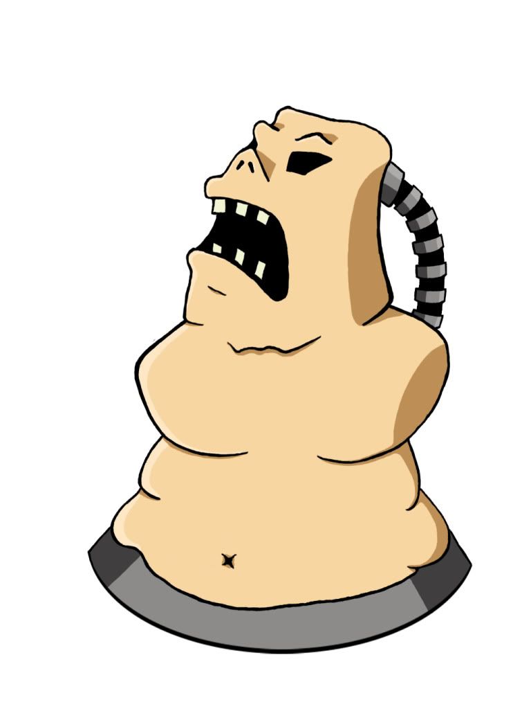


And heres where im at right now, I'm actually stuggleing alot on the head because its a really odd shape. So if you have any suggestions on it im open, Later when i get to my home pc ill post a wire as well as the leg concept. Im still on the fence as to whether or not im going to do anything related to arms, not because i cant but because i kind of like the weird armless torso, Please note I know the concept isn't 100 % right namely with the chest area, i tried to tie that up on the model, but the head is intentionally not anatomically correct.

but anywho heres my current progress
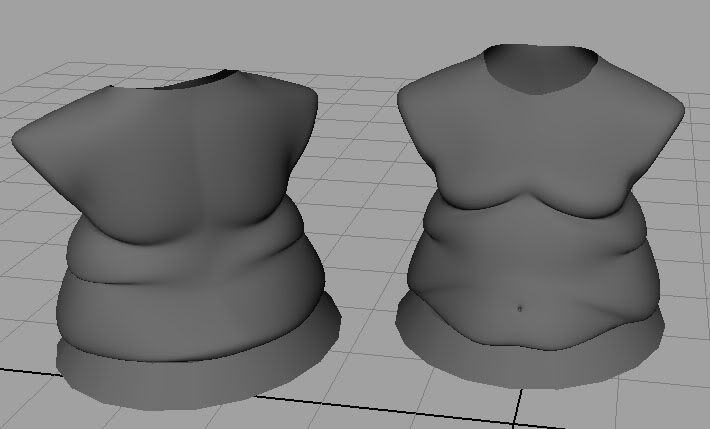

** edit** Wierd.... not taking the image links
** edit of edit ** Thanks CoughMist that was the exact problem, renamed album replacing the spaces with _ .... the one time i dont use _ in the naming conventions and it bites me in the kiester. Good catch.

If i did it once i can do it again (Do you see what i see Sept 09)
Link102
19
Years of Service
User Offline
Joined: 1st Dec 2004
Location: On your head, weeeeee!
Posted: 12th May 2010 21:12 Edited at: 13th May 2010 00:49
use [img ]

David Gervais
Retired Moderator
19
Years of Service
User Offline
Joined: 28th Sep 2005
Location: Montreal, Canada
Posted: 12th May 2010 21:15 Edited at: 12th May 2010 21:15
I did a mod edit check and he is using the [ img ] [ /img ] tags (without the spaces) but still not showing. strange.

Oh well, cut n paste works, looks cool

Cheers!

dragon assasin
17
Years of Service
User Offline
Joined: 29th Aug 2007
Location: Wait did that shadow just move...
Posted: 12th May 2010 21:19
im wondering if its the image size, im sure ive seen larger, but i could be wrong

If i did it once i can do it again (Do you see what i see Sept 09)
zeroSlave
15
Years of Service
User Offline
Joined: 13th Jun 2009
Location: Springfield
Posted: 12th May 2010 21:45
It's the "Game%20art%20Porfolio" That is causing the problem. Need to take the "%20"s out of the actual url for it to work. They are in place of spaces and I've never had luck linking with spaces.

Anyways, cool model so far. I'd be interested in seeing the legs you are conceptualizing. Good, creative stuff!

My green thumb grew the tree my Trojan War horse was crafted from. With roses in our pockets we rally round the tombstones. Ashes to ashes, we all fall down.
Joseph K
User Banned
Posted: 12th May 2010 22:08
You are doing well keep it up.
dragon assasin
17
Years of Service
User Offline
Joined: 29th Aug 2007
Location: Wait did that shadow just move...
Posted: 12th May 2010 23:43
i never got around to the photoshop linework so you can see my bad drawing skills, perspectives off, bad proportioning and such but should give you an idea of the look im going for atleast.


Its still something im working on concept wise, i like the 3 wedge "teeth" on the blade but have been waffling on the ridging that runs along the curve, it leads to alot of awkward geometry that looks weird when you model it, i had an idea when i was on the L today so i will see if that helps the modeling any but if not i'll stick with a more smooth curve.

If i did it once i can do it again (Do you see what i see Sept 09)
Joseph K
User Banned
Posted: 13th May 2010 00:49
What is the creature?
But it looks nice
Asteric
16
Years of Service
User Offline
Joined: 1st Jan 2008
Location: Geordie Land
Posted: 13th May 2010 01:50
Id say throw some more complex mechanics in near the joints, make it more mean. Atm it looks a bit like a toy project, a bit flimsy.

zeroSlave
15
Years of Service
User Offline
Joined: 13th Jun 2009
Location: Springfield
Posted: 13th May 2010 20:52
Thanks for posting the leg concept!

Quote: "Id say throw some more complex mechanics in near the joints, make it more mean. Atm it looks a bit like a toy project, a bit flimsy."


This, and on another note: The front blade looks good, but you should beef up the other two leg segments. They need to look beefier to convey that whoever made this machine had to take into consideration that it was going to be carrying around a lot of weight. Since he has no arms, it would be a shame if one or two of the legs malfunctioned from weight-stress! How would he get around?!?!

My green thumb grew the tree my Trojan War horse was crafted from. With roses in our pockets we rally round the tombstones. Ashes to ashes, we all fall down.
dragon assasin
17
Years of Service
User Offline
Joined: 29th Aug 2007
Location: Wait did that shadow just move...
Posted: 17th May 2010 13:17
yeah i agree they were sort of light on the segments, Im trying to achieve a semi comical sort of character, in sort of the same line of twisted visual appeal of the invader zim / squee series.

I need to find a balance between the look of speed and finesse with the strength and stability to hold him up. All the while not going TOO overboard on the detail (bits and pieces etc) since this is an animation project Im working on and I would like to not bight off more than i can chew like i do every time i get a project assignment.

But ill toy around with some designs and get back to you, my biggest problem right now is getting the darn head, its such a weird shape, without any sort of anatomy (especially the mouth) since its a very stylized human like .... thing....

If i did it once i can do it again (Do you see what i see Sept 09)
dragon assasin
17
Years of Service
User Offline
Joined: 29th Aug 2007
Location: Wait did that shadow just move...
Posted: 28th Jun 2010 05:08 Edited at: 28th Jun 2010 05:09
long time no update, actually left my character model in chicago, so im moving on to another portion of the model for the time being, basically scratched modeling and animating him for the final, maybe i can get him done for my advance final.....

any who Im makeing essentially a giant mech that his body. scrawny legs plug into. here are the arms, no concept scanned in on this one.


and some over coloring, still working out a color for the main body, thinking maybe a navy blue or dark green,

If i did it once i can do it again (Do you see what i see Sept 09)

Login to post a reply

Server time is: 2024-11-24 14:06:47
Your offset time is: 2024-11-24 14:06:47