Sorry your browser is not supported!

You are using an outdated browser that does not support modern web technologies, in order to use this site please update to a new browser.

Browsers supported include Chrome, FireFox, Safari, Opera, Internet Explorer 10+ or Microsoft Edge.

Work in Progress / Tip - WIP

Author
Message
swissolo
14
Years of Service
User Offline
Joined: 9th Jan 2010
Location:
Posted: 11th Oct 2010 23:21 Edited at: 12th Oct 2010 01:51
v0.12


I'm not all that happy with the name, but I still can't think of anything better.

Description...
Tip is a "Tilt box" game where the goal is to get a ball to the exit (currently the really tall things, I haven't actually made real ones yet) That's really it...

v0.12
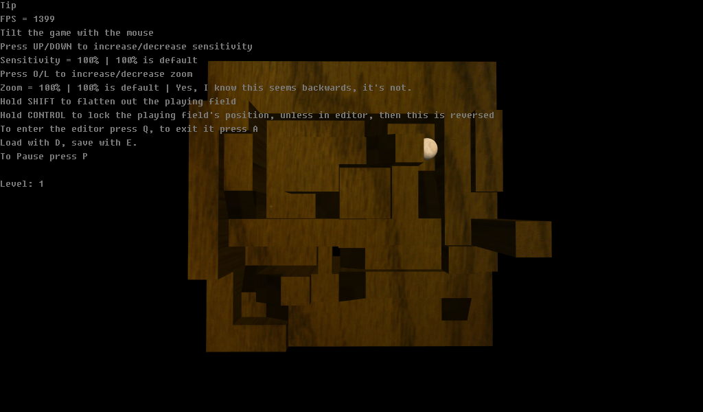

It still would be great to know how the sensitivity and fps are doing on a netbook. . I've opened some options up to stronger computers because I see no reason not to, why limit it?

v0.12
////Current Bugs////
-The first part of the "Death" transition doesn't really work right.
-ramp textures black
-Holding shift for too long causes field to flip!
-base of ramps do not transition.
-Does not show newly saved levels until restart

Sorry, the "menus" are still a mess and the controls are really weird, I haven't gotten to that. Also, the zoom option is only temperary, because I haven't fixed the old levels so they are the correct size. Lastly, if you think the pixture size is too big I can scale it down, I wasn't really quite sure, it is currently at actual size.

swis

Attachments

Login to view attachments
swissolo
14
Years of Service
User Offline
Joined: 9th Jan 2010
Location:
Posted: 11th Oct 2010 23:24
Screenshot

swis

Attachments

Login to view attachments
swissolo
14
Years of Service
User Offline
Joined: 9th Jan 2010
Location:
Posted: 16th Oct 2010 00:32 Edited at: 16th Oct 2010 17:46
Just so everyone knows I've increased the detail of the texture because, well, 128x128 just looks really bad. It will slow the coming of next update, but shouldn't slow the FPS down. This is because the old way was wasteful and has been refined.
Edit: I just noticed that if the game doesn't run at about 1600 FPS, Newton acts completely differntly, not the way I like at all. I'm not sure what to do about it...
I may be wrong, but I feel like the reason almost no one comented was because the game was too much of a mess. It isn't really playable. I'll see if I can fix it, if I can't...
Edit 2: Solved! I just had to make some weird materials and cap the FPS. The game plays differntly, but once I tune it just right I figuire it should be better than before.

swis
baxslash
Valued Member
Bronze Codemaster
17
Years of Service
User Offline
Joined: 26th Dec 2006
Location: Duffield
Posted: 21st Oct 2010 15:00
Glad to see this is still alive swiss!

If you aren't happy with "Tip" what about "Full Tilt"?

MASTER OF PUPPETS
20
Years of Service
User Offline
Joined: 9th Jun 2004
Location: Trapped Under Ice
Posted: 23rd Oct 2010 08:24 Edited at: 23rd Oct 2010 08:30
looks great!
I love the way it feels!
If I may make a suggestion... could there be an option to relocate the camera?
specifically less on the top down and more like "in front" of it ... so i guess for example instead of...
position camera (maze width/2),50,(maze depth/2)
rotate camera -90,0,0
...you could go with...
position camera (maze width/2),50,-50
rotate camera -45,0,0

just thinking it would be nice, and this could help with seeing what angle the board is actually at when over correcting to slow the ball down.

names? are you looking for something simple or epic? I can offer suggestions(not that I am good with names)

why not "Tilt"?

or "Labyrinth" / "DARK Labyrinth"?

just suggestions...

...and as far as the menu thing goes, maybe some of the mediocre stuff ive made can help you... look up "W.I.P. a little editor for a game i have in progress". In there I am working on a GUI system

(and please dont mind me. I am sure you have all this handled better than I could know)

metal is not music but a way of life...all hail to the reigning king METALLICA!!! [EDIT] ...well... up until "Load" came out.
swissolo
14
Years of Service
User Offline
Joined: 9th Jan 2010
Location:
Posted: 24th Nov 2010 22:22 Edited at: 24th Nov 2010 22:30
Originally I had a tilted camera, but I could't tell whether the field was flat or not. I could try it again...

Anyways, work has slowed down, but here's a better texture on the level shown.
[old]

[new]


Edit: Part of fixing the physics was capping the fps, so that's why the fps is 59

swis

Attachments

Login to view attachments
Dark Java Dude 64
Community Leader
14
Years of Service
User Offline
Joined: 21st Sep 2010
Location: Neither here nor there nor anywhere
Posted: 8th Dec 2010 03:42
awesome!!!

Behold the new marble game coming soon: [href"http://forum.thegamecreators.com/?m=forum_view&t=178472&b=8&p=0"]Marbsticle Course [/href]
DigitalFury
14
Years of Service
User Offline
Joined: 30th Jul 2010
Location: United States
Posted: 8th Dec 2010 04:18
I would suggest turning shadows on so you can have a more defined depth.

DigitalFury
swissolo
14
Years of Service
User Offline
Joined: 9th Jan 2010
Location:
Posted: 8th Dec 2010 22:40
The built in shadows? I had them on, but they're a real FPS hog, and this was designed for Netbooks, even though it's starting to drift off that path. I may try to bring it back or "jazz" it up, I'm not sure so far though.

swis
DigitalFury
14
Years of Service
User Offline
Joined: 30th Jul 2010
Location: United States
Posted: 9th Dec 2010 19:38 Edited at: 9th Dec 2010 22:34
DBP shadows aren't that bad. I think you can reduce quality, but I don't think that would help because it is a laptop most likely without a graphics card.

Another idea would be lightmapping. Just download evolves lightmapping from: http://www.evolved-software.com/Code/LightMapper.zip

Another idea is create a dbp light and color it black.

Interesting way to impliment shadows:
http://forum.thegamecreators.com/?m=forum_view&t=177828&b=6

I doubt it will work in full scale.

Another idea is to take the camera image, convert it to a depth map, and blend with the current texture. You might be able to do that with shaders. Image kit has image blending. You might be able to pull off a look of depth using some pre-rendered textures.

If ur looking to "jazz" it up I would suggest neon colors with white borders and a heavy motion blur using sprite alpha. I could wip up an example for ya if you want.

DigitalFury
swissolo
14
Years of Service
User Offline
Joined: 9th Jan 2010
Location:
Posted: 9th Dec 2010 22:48 Edited at: 17th Dec 2010 18:11
I do have Dark lights, but I had a weird problem where it wouldn't apply the maps correctly. I'll look into it anyway. Because the whole world is editable real-time and DL takes a few seconds to render, it may not be the best method. I think the DBP shadows can be run on the CPU also, but that's not good either... I'll figuire it out.

Edit: I'm not cuting this project but I'm going to move to a newer, more interesting one. There's plenty more I can do here, including bigger maps, which helps gameplay, but the game overall seems boring. The work : added fun ratio isn't very good, and the newer project should come along very smoothly.

swis
Dr Tank
15
Years of Service
User Offline
Joined: 1st Apr 2009
Location: Southampton, UK
Posted: 18th Dec 2010 03:08
This is cool. Has potential to be really fun.

I think the ramps are too steep - it's hard to get up them. Also, with the lighting from above, the ramps are almost as dark as the black background. I suggest lighter lighting or wood texture, or a lighter background.

Shadows are very feasible for this : i'd recommend z-buffer shader shadows. However, they are not necessary.

I couldn't find a key in the editor to put a block back to default. (ie no block and no hole- just ground)

Also Couldn't find how to set "goal" square. Not sure how it was determining whether I passed or failed the level - when I got to what looked like the "goal" square on level 1 nothing happened, then I fell off and got to level 2, but I also got to level 2 subsequently falling off other parts of the level.

Framerate was good. 195 fps, with 1st of all options set on loading.
swissolo
14
Years of Service
User Offline
Joined: 9th Jan 2010
Location:
Posted: 18th Dec 2010 21:37 Edited at: 18th Dec 2010 21:39
The ramps take some speed to get up, I haven't really got around to fixing them because they're not textured right either. I guess I had better add some kind of shadows because they seem dearly needed. Unless this version is older than I thought "back-space" should clear a block. The reason for the current lack of "goal" was that newton doesn't support concave objects, so I kept modeling end-blocks that didn't funciton properly. I still have to add that. The level switching idea is that you play a series of 5 levels at a time. If you die you don't have to pound away at one level you can mix it up till you beat all 5.

(Sorry for the weirdly worded response, I was just trying to answer all of your comments/questions )

swis
Silvester
18
Years of Service
User Offline
Joined: 7th Dec 2005
Location: Netherlands
Posted: 19th Dec 2010 00:31
The game is interesting.. But it felt really awkward tilting the board.. Some movements just don't make sense to me, and my automatic reactions to correct the board often made me mess up! But then again I was never any good at this stuff..

Dr Tank
15
Years of Service
User Offline
Joined: 1st Apr 2009
Location: Southampton, UK
Posted: 19th Dec 2010 01:26
You can still have a goal just by using a regular square, designating it as the goal, and then checking yourself whether the ball in in that square, or within some circle centred on the square.

Login to post a reply

Server time is: 2024-11-24 14:51:56
Your offset time is: 2024-11-24 14:51:56