Sorry your browser is not supported!

You are using an outdated browser that does not support modern web technologies, in order to use this site please update to a new browser.

Browsers supported include Chrome, FireFox, Safari, Opera, Internet Explorer 10+ or Microsoft Edge.

3 Dimensional Chat / My (Med-Low Poly) Gunner!! :)

Author
Message
Xenocythe
19
Years of Service
User Offline
Joined: 26th May 2005
Location: You Essay.
Posted: 17th Aug 2006 04:16 Edited at: 17th Aug 2006 04:22
Finally, I'm done my 884 poly gunner for my game (God of Time, WIP Board).

I want feedback, and maybe some suggestions on the texture or guns he should have!


I myself can't wait for the texture, because a good texture can make a medium model look very good right?

Take a look, and be happy


Applyby has Flies in his Eyes.

Attachments

Login to view attachments
QuothTheRaven
22
Years of Service
User Offline
Joined: 2nd Oct 2002
Location: United States
Posted: 17th Aug 2006 09:05
It's near impossible to understand that mesh with one smoothing group covering the entire surface. But from what I can tell, the triangulation of your mesh is pretty non-sensical. How do you expect to bend his legs when there are no actual edges at the kneecaps? The shape of your geometry should really reflect the shape of the underlying muscles, as it will work much smoother with animation.

Manic
22
Years of Service
User Offline
Joined: 27th Aug 2002
Location: Completely off my face...
Posted: 17th Aug 2006 15:12
yes, a good texture can make a low detail model look great, but it needs to be a decent model to start with. I can see folds all over the place and your mesh flow is just weird!

I don't have a sig, live with it.
greenlig
21
Years of Service
User Offline
Joined: 30th Aug 2003
Location: Melbourne
Posted: 17th Aug 2006 15:22
Good start Xeno. BTW, getting roasted by those two guys means you must have SOMETHING decent to start with so dont take it personally.

The mesh is, as mentioned, not very well organised. As mentioned also, try putting loops where the mesh will fold for the animation. Also, it will make texturing easier if the polygons are generally clean.

I'm not trying to plug here( http://forum.thegamecreators.com/xt/xt_apollo_pic.php?i=971002 ), but look at how the Polygons are laid out here. It makes for easier animating and texturing. That said, my model needs a few extra loops too!! I think Manic pointed that out as well haha.

Keep practicing and you WILL get better.

Regards,
Greenlig

Blender3D - GIMP - WINXP - DBPro
Xenocythe
19
Years of Service
User Offline
Joined: 26th May 2005
Location: You Essay.
Posted: 17th Aug 2006 18:01
Yay! Constructive Crit!

I see what you guys mean... I need oddmind in here to make those red outlines on the model

Thanks guys, I'm glad at least its not a horrible model or something.

Although, I have textured and animated most of my models just fine with the mesh pretty un organized and ti turned out just fine. But I'll take your advice, and also hope that oddmind comes along.


Thanks,
Xeno

Applyby has Flies in his Eyes.
Xenocythe
19
Years of Service
User Offline
Joined: 26th May 2005
Location: You Essay.
Posted: 18th Aug 2006 00:36
Anyone else have any comments?

Applyby has Flies in his Eyes.
greenlig
21
Years of Service
User Offline
Joined: 30th Aug 2003
Location: Melbourne
Posted: 18th Aug 2006 11:50
The thing is, its good practice to do a good mesh. The more advanced you get, the more you will realise that having bjorked geometry is VERY hard to deal with. Try facial animation with a goofy mesh. Eeeeeeck.

Regards,
Greenlig

Blender3D - GIMP - WINXP - DBPro
Heckno
20
Years of Service
User Offline
Joined: 8th Sep 2004
Location: Palm Coast, FL
Posted: 18th Aug 2006 17:06
@X:

I have rewritten this post a zillion times already trying to find the best way to help you without sounding too critical of your model...

The problem is your comment about some of your other models turning out just fine is really throwing me off..

How about I give it a score ( 1-10 , 1 being the lowest )

overall - 5
arms - 5
legs - 5
head - 5
etc... 5

it's not great but it's not bad either, if you put a little more time into to round off some of the body parts like the arms & legs and cleaned up those connection areas ( hips & shoulders) I think it would become something worth looking at...

good luck
Xenocythe
19
Years of Service
User Offline
Joined: 26th May 2005
Location: You Essay.
Posted: 19th Aug 2006 22:08


Applyby has Flies in his Eyes.
BiggAdd
Retired Moderator
20
Years of Service
User Offline
Joined: 6th Aug 2004
Location: != null
Posted: 19th Aug 2006 22:34
Looking good so far. Got the shape right. Perhaps you can thicken out the limbs a little? Also the texture for the abbs is a little off and too dark.

But great effort so far! Keep it up.

Oddmind
20
Years of Service
User Offline
Joined: 20th Jun 2004
Location: Atlanta, Georgia
Posted: 19th Aug 2006 22:35
the texture needs some serious work, as well as the geometry. I'm on a laptop right now but i can do you a paintover in a bit.

I can also do the texture if you want.

formerly KrazyJimmy

Prayers for rain...
Xenocythe
19
Years of Service
User Offline
Joined: 26th May 2005
Location: You Essay.
Posted: 19th Aug 2006 22:37
hehehe, that would be great

Applyby has Flies in his Eyes.
QuothTheRaven
22
Years of Service
User Offline
Joined: 2nd Oct 2002
Location: United States
Posted: 20th Aug 2006 02:50
Well to be honest, the texture is terrible, but it does give the model a little more definition. Try taking out pieces of clothing you find from pictures online and shaping them over the texture instead of drawing it in MSPaint or whatever you made it in. Also, a normal map would probably help the detail on this model a lot. Now that you've already textured it, it's probably too late to go back and work on the model, but it's still very odd to look at. The ears are too low on the head, the legs are pretty zany in several ways (the fronts look very flat, shoes are too square), etc.

Xenocythe
19
Years of Service
User Offline
Joined: 26th May 2005
Location: You Essay.
Posted: 20th Aug 2006 03:27
Hmm, yes, thank you raven, I will adjust all this and make a new texture imediately

Well, I'll do it tomorrow

But thank you, I will fix it. As well as the texture, if oddmind makes me one. I can supply the UV map, if you guys want and you can show me what a good texture looks like

Applyby has Flies in his Eyes.
QuothTheRaven
22
Years of Service
User Offline
Joined: 2nd Oct 2002
Location: United States
Posted: 20th Aug 2006 04:53
oddmind isn't going to make you a new texture, he's going to draw over your model to show correct proportions.

(At least, I'm pretty sure that's what you mean od)

Xenocythe
19
Years of Service
User Offline
Joined: 26th May 2005
Location: You Essay.
Posted: 20th Aug 2006 05:08
Quote: "I can also do the texture if you want."


I can't picture what else he would mean by that

Ok, I'll do the texture myself

Applyby has Flies in his Eyes.
Oddmind
20
Years of Service
User Offline
Joined: 20th Jun 2004
Location: Atlanta, Georgia
Posted: 20th Aug 2006 05:21 Edited at: 20th Aug 2006 05:39
no no I'll do it, a diffuse map if you will. But only if you want me to, I suggest using mine as a guideline to do yours, as I'm still working on texturing myself.

I'm cracking out the wacom right now.

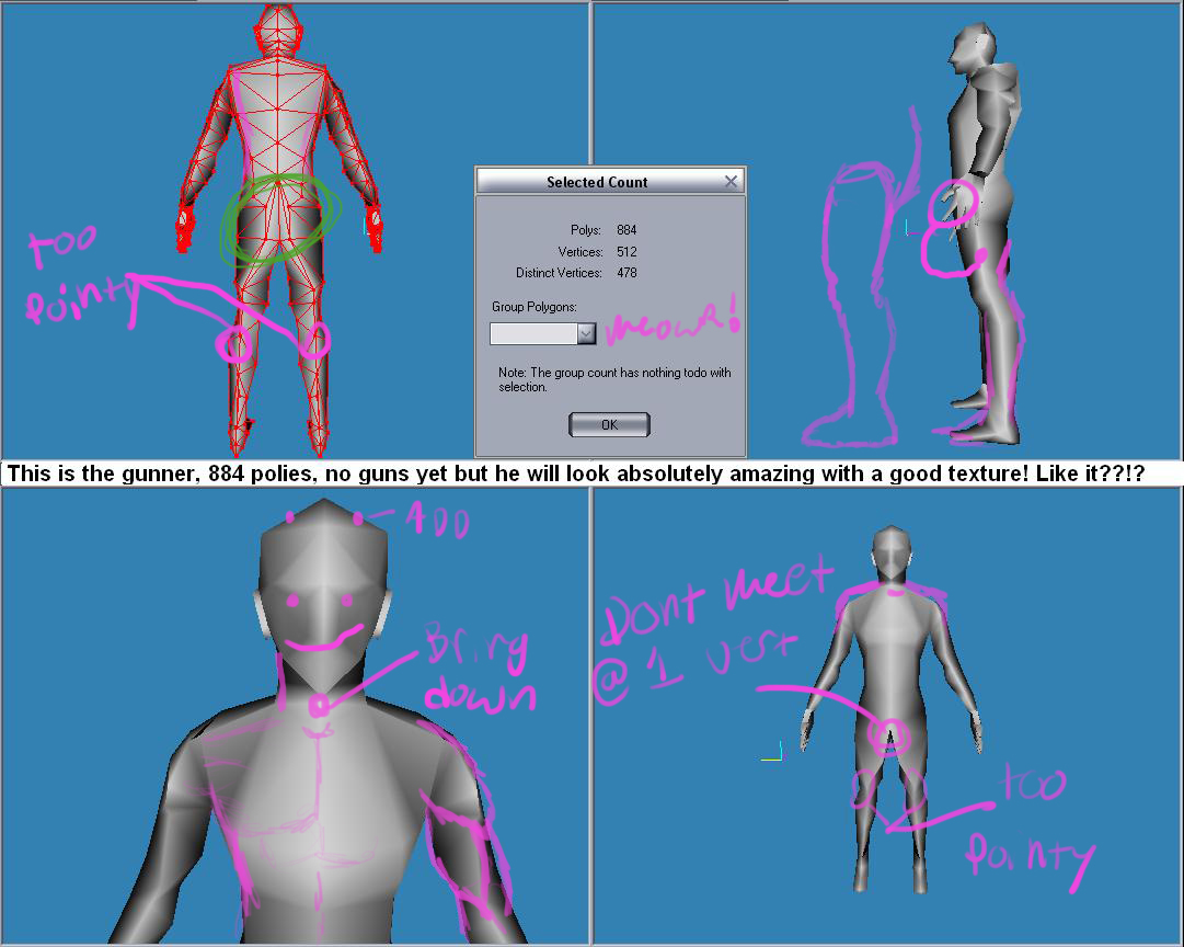
Now that I look at it you've got alot to fix, you might as well build another one, try to use quads (which means no milkshape) because the triangles are turning your model into a big pointy mess.

all of the joints have a crazy amount of polys everywhere that dont really do anything but obstruct even more from animation

fingertips should reach point on thigh marked in purple.

crotch should never meet at a single point.

the chest needs some sorting out

Besides the proportional issues i pointed out I would say make it again for practice, its always much better the second time.
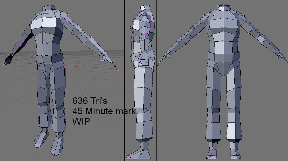
heres a model of a little less polycount (in tris, quads*2) that I am working on right now. just over 700 with the head, if you want you can use this as a reference image if you cant find any others.


formerly KrazyJimmy

Prayers for rain...

Attachments

Login to view attachments
Xenocythe
19
Years of Service
User Offline
Joined: 26th May 2005
Location: You Essay.
Posted: 20th Aug 2006 17:42
Thanks


Yes I would love if you did the textre, it would be great.

Here is the UV map.

Applyby has Flies in his Eyes.

Attachments

Login to view attachments
Chenak
22
Years of Service
User Offline
Joined: 13th Sep 2002
Location: United Kingdom
Posted: 20th Aug 2006 23:15 Edited at: 20th Aug 2006 23:16
That Uv map won't get you anything good, you'll have a lot of stretches and it will look terrible.

This is a UVmap:

I reccommend you use some UV mapping tutorials and have a look at more UVmap references.

Attachments

Login to view attachments
Xenocythe
19
Years of Service
User Offline
Joined: 26th May 2005
Location: You Essay.
Posted: 21st Aug 2006 18:52
Yes I know that that is a UV map.. but I've actually never tried mapping like that. I've always used planar mapping... I guess I'll try and get used to this.

Applyby has Flies in his Eyes.
Oddmind
20
Years of Service
User Offline
Joined: 20th Jun 2004
Location: Atlanta, Georgia
Posted: 22nd Aug 2006 01:43
do it by limb,

hand arm leg foot chest back neck head etc.

they all have a different "Island" as they say.

formerly KrazyJimmy

Prayers for rain...

Login to post a reply

Server time is: 2024-11-26 22:41:45
Your offset time is: 2024-11-26 22:41:45