Sorry your browser is not supported!

You are using an outdated browser that does not support modern web technologies, in order to use this site please update to a new browser.

Browsers supported include Chrome, FireFox, Safari, Opera, Internet Explorer 10+ or Microsoft Edge.

FPSC Classic Models and Media / Lots of Textures for Small price

Author
Message
5hunter6
18
Years of Service
User Offline
Joined: 23rd Jul 2006
Location: Looking at the screen, same as you
Posted: 8th Nov 2006 00:49
I made a texture pack that is $4. There are 46 seamless textures that are free to be edited by you. I have not set up an online store so if you want the pack just email me and I can send you a paypal bill or we can figure out another way. More screenies coming...


$4 for 46 SEAMLESS textures! You know the right choice.

Attachments

Login to view attachments
5hunter6
18
Years of Service
User Offline
Joined: 23rd Jul 2006
Location: Looking at the screen, same as you
Posted: 8th Nov 2006 00:55
Here is a close up of the ceilings...

If you want another closeup just ask and I will provide one


$4 for 46 SEAMLESS textures! You know the right choice.

Attachments

Login to view attachments
Cut scenes
18
Years of Service
User Offline
Joined: 12th Jul 2006
Location: Never leave your back to a door...
Posted: 8th Nov 2006 00:59
Very Verry nice this may come in useful.

"People are easier to search when they're dead."--Captain Barbosa
5hunter6
18
Years of Service
User Offline
Joined: 23rd Jul 2006
Location: Looking at the screen, same as you
Posted: 8th Nov 2006 01:15
Thanks


$4 for 46 SEAMLESS textures! You know the right choice.
Silent Thunder
18
Years of Service
User Offline
Joined: 6th Feb 2006
Location: The Ship
Posted: 8th Nov 2006 01:49
I think $4 is a bit steep for 46 textures, make them into segments.

Reality Forgotten
FPSC Reloaded TGC Backer
18
Years of Service
User Offline
Joined: 28th Dec 2005
Location: Wichita Falls TX
Posted: 8th Nov 2006 02:08
Holy Heck! I agree with Silent Thunder again! These textures are nto worth 4 bucks. I'd give you .50 cents and a pat on the back. They are to clean. Not as they are great looking (clean) but more like not dirty enough (clean). try to make them a bit more realistic. Besides your offering 46 textures of the same type. <--if that made sense than you understand what I am talking about. the colors are to bright. uhm...try to rework them and offer about 150 textures maybe give a couple to the community for free to showcase the ingame quality.

RF

xplosys
18
Years of Service
User Offline
Joined: 5th Jan 2006
Playing: FPSC Multiplayer Games
Posted: 8th Nov 2006 03:45
Like RF said, your textures are too clean and new. Maybe they would work for a maze game or somthing, but not for anything realistic. If they were more true-to-life, the price would be fine.

Best.

The forum provides a means to hide our true identity. Too bad we always screw up and let it be seen.

5hunter6
18
Years of Service
User Offline
Joined: 23rd Jul 2006
Location: Looking at the screen, same as you
Posted: 8th Nov 2006 04:19
Ok i will make some new "dirty" textures.


$4 for 46 SEAMLESS textures! You know the right choice.
5hunter6
18
Years of Service
User Offline
Joined: 23rd Jul 2006
Location: Looking at the screen, same as you
Posted: 9th Nov 2006 00:49 Edited at: 9th Nov 2006 00:50
Here is this a better "dirty" texture. I'm still figuring out how to make it really dirty without getting black so I hope this suits your liking.

It is a optical illusion too. There really are no black spots it just looks like there are if you stare at it.


$4 for 46 SEAMLESS textures! You know the right choice.

Attachments

Login to view attachments
xplosys
18
Years of Service
User Offline
Joined: 5th Jan 2006
Playing: FPSC Multiplayer Games
Posted: 9th Nov 2006 00:56
No, we mean something like this.

The forum provides a means to hide our true identity. Too bad we always screw up and let it be seen.

Attachments

Login to view attachments
Locrian
19
Years of Service
User Offline
Joined: 21st Nov 2005
Location: Burton Mi.
Posted: 9th Nov 2006 01:02 Edited at: 9th Nov 2006 01:05
Hunter I may be wrong, but when he says dirty I think he's talking a grungy, more worn look. Think any new game thats been out in the last few years.

Take my stairway, I just made. It shows no real dirt but certainly shows plenty of signs of ware.
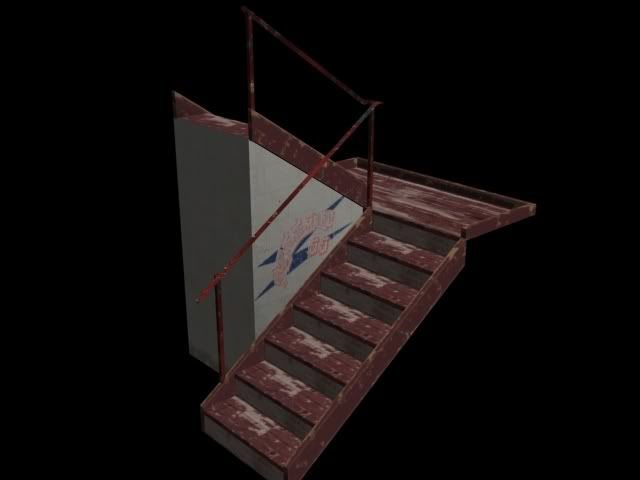

The textures your creating though a great start, are no where near the point of selling. Seems quite a few people all want to sell those packs and make that money. I'm sure I could sell a pack as well but I'm more interested in actually making a game. I suggest mastering your craft by creating enough media for a game. This would give you plenty of practice. Don't be in such a rush to get in peoples pockets. Though fine for personal use there no where near profesional quality.

Good luck
Loc
(EDIT: Cross posted with xplosys)
filya
18
Years of Service
User Offline
Joined: 23rd Aug 2006
Location: USA
Posted: 9th Nov 2006 01:20 Edited at: 9th Nov 2006 01:21
@ xplosys!!
wow! that is one hell of a dirty room. Kinda reminds me of the SAW movie.

edit : I also notices they werent tiled dirty. So, are they just amazing overlays??

-- n00b at playing games...and now at making em too :p --
Locrian
19
Years of Service
User Offline
Joined: 21st Nov 2005
Location: Burton Mi.
Posted: 9th Nov 2006 01:27
It's a pack 5 segment. I think it's a little over done myself.
xplosys
18
Years of Service
User Offline
Joined: 5th Jan 2006
Playing: FPSC Multiplayer Games
Posted: 9th Nov 2006 01:27
@filya

I don't know. Ask Jon. That's from Model Pack 5.

Best.

The forum provides a means to hide our true identity. Too bad we always screw up and let it be seen.

5hunter6
18
Years of Service
User Offline
Joined: 23rd Jul 2006
Location: Looking at the screen, same as you
Posted: 9th Nov 2006 01:33 Edited at: 9th Nov 2006 01:34
@shadow7 how do you make it grungy with photoshop? I have photoshop and i never could figure that out.

Oh and thanks for the comments guys I am trying to make it more grungy

Your signature was too big
5hunter6
18
Years of Service
User Offline
Joined: 23rd Jul 2006
Location: Looking at the screen, same as you
Posted: 9th Nov 2006 02:05
Is this more on the right track of Dirty?

Attachments

Login to view attachments
Airslide
20
Years of Service
User Offline
Joined: 18th Oct 2004
Location: California
Posted: 9th Nov 2006 02:13 Edited at: 9th Nov 2006 02:14
Looks better, try putting it in game with Signs to see how it looks

EDIT: Clarification, Signs is a pogram

Help save Stargate: SG-1! Click Here!
5hunter6
18
Years of Service
User Offline
Joined: 23rd Jul 2006
Location: Looking at the screen, same as you
Posted: 9th Nov 2006 03:15 Edited at: 9th Nov 2006 03:16
@Airslide thanks. I do know that signs is a program

I think I have progressed a little more with my work. I am trying hard still though to get the dirty effect since i don't think i have it yet. It should say
Quote: "it is better right?"


Attachments

Login to view attachments
BULLSHOCK 2
Retired Moderator
19
Years of Service
User Offline
Joined: 14th Jun 2005
Location: Shocking Bulls
Posted: 9th Nov 2006 03:28
I agree withpretty much everyone else on this one, the textures are too perfect, and in real life, nothings perfect...

Just curious, what are you using to make your textures?


http://www.seqoiagames.com/seqoiacorp/
KeithC
Senior Moderator
19
Years of Service
User Offline
Joined: 27th Oct 2005
Location: Michigan
Posted: 9th Nov 2006 04:21
It looks a bit like Genetica.


5hunter6
18
Years of Service
User Offline
Joined: 23rd Jul 2006
Location: Looking at the screen, same as you
Posted: 10th Nov 2006 00:12
Yep Kieth is right. I am using genetica. I am trying to make them more dirty and I am getting better. I just have to make the texture from scratch instead of using a preset.

Full Metal Wolf
18
Years of Service
User Offline
Joined: 9th Jun 2006
Location:
Posted: 10th Nov 2006 22:20 Edited at: 11th Nov 2006 19:46
Sorry, but I HATE guys selling textures..., i have got a lot of better textures for free... so nothing against you, but selling textures is.... [mod edit] silly

Dont worry, take out the pumpgun
stormboy
19
Years of Service
User Offline
Joined: 8th May 2005
Location:
Posted: 11th Nov 2006 00:10
I really like the modernday Dirty wood floor texture, and also the
kitchen ceiling. A few great textures goes a long way.

To get depth you wanna use layers with transparency settings,
but really it's just a lot of trial and error to make the great textures, and, it helps to have a theme of what your trying to achieve.

Attachments

Login to view attachments

Login to post a reply

Server time is: 2024-11-22 23:54:38
Your offset time is: 2024-11-22 23:54:38