Quote: "When looking at the various shapes, I would think the number of sides or points would represent how many bytes that data type has."
Yes, that's something I will try to clarify. I specifically used abstract non-geometric shapes to try to avoid those kinds of interpretations, I guess I need to be more explicit that these are purely abstract representations, in the same way chess pieces don't have any physical properties that determine how they move on the board, a knight is whatever lump I put on the board and call a knight.
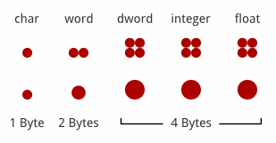
Quote: "Word and DWord look the same to me, what's the difference? Just the color? If the physical size means anything then dword would have to be drawn twice as large as word"
Dword
is twice the size of word. Maybe the colours I used are playing tricks on your eyes.
Quote: "but then all the other 4byte types would need to be the same size as well."
They are. Well, their bounding boxes are the same area, I don't know enough calculus to get it really precise.
[edit]
I think I know what the problem is, by labelling the shapes I made it seem like only those specific shapes could represent those data-types, so it seemed you would have to learn all these shapes to follow the explanation, and that lead people to try to see some logical reason for the shapes being the way they were. An analogy has to be intuitive, if you need to read a primer to understand it then it's a crap analogy; I was worried that this was the case given the majority of the feedback but I think I understand why that happened, I made the analogy seem more complicated that it really is. I was trying to display three different ideas (relative sizes of data-types, shape as a metaphor for the different structures of data-types, colour as a metaphor for assigned values) in one image and that tripped me up.
I am now working on splitting that information up into three images. Here is a snapshot of the relative sizes WIP:

Formerly OBese87.