Sorry your browser is not supported!

You are using an outdated browser that does not support modern web technologies, in order to use this site please update to a new browser.

Browsers supported include Chrome, FireFox, Safari, Opera, Internet Explorer 10+ or Microsoft Edge.

Geek Culture / Optical Illusions

Author
Message
Pincho Paxton
21
Years of Service
User Offline
Joined: 8th Dec 2002
Location:
Posted: 10th Dec 2003 11:03 Edited at: 10th Dec 2003 11:04
Here's another! At first you may only see the angels, but after awhile you may see something else.


Pincho.
Dave J
Retired Moderator
21
Years of Service
User Offline
Joined: 11th Feb 2003
Location: Secret Military Pub, Down Under
Posted: 10th Dec 2003 11:15
Neophyte:

You're just talking crap now, the JPEG compression routine can't even change the colour of a pixel that much. You're saying the A text would have to be a darker grey then the tile, and yet in the final image it's an almost white. That's changing something like RGB(50,50,50) to RGB(200,200,200) when the surrounding pixels are RGB(100,100,100) - I'm sorry but that just can't happen when you compress to a JPEG.

Not to mention the rest of the illusion was left relatively untouched. You're saying that somehow the compression routine changed just the A & B text and left the rest of the image alone? No way.

I don't see why you can't accept the fact that the author just wanted the text inverted.


"Computers are useless they can only give you answers."
Pincho Paxton
21
Years of Service
User Offline
Joined: 8th Dec 2002
Location:
Posted: 10th Dec 2003 11:23
The text it seems is meant to be different colours. I just tested it. So that prooves without doubt that the text is not part of the illusion.

Pincho.
Dave J
Retired Moderator
21
Years of Service
User Offline
Joined: 11th Feb 2003
Location: Secret Military Pub, Down Under
Posted: 10th Dec 2003 11:25
Here's a different image of the same effect. It's also a GIF image with no crappy JPEG compression.


Notice the text inverted like the original?


"Computers are useless they can only give you answers."
Pincho Paxton
21
Years of Service
User Offline
Joined: 8th Dec 2002
Location:
Posted: 10th Dec 2003 11:31
Quote: ""What's the text got to do with it?"

I've already explained this what must be a million times. It is part of the square. "


That's the same as saying....

P1 "What colour is my door?"

P2 "It is Gold!"

P1 "It's not gold it's red???"

P2 "But the letterbox is gold!!! The letterbox is part of the door!"

Pincho.
Kharnor
21
Years of Service
User Offline
Joined: 5th Jul 2003
Location: Australia
Posted: 10th Dec 2003 12:53
Hehe cool pic, pincho. I looked at it and thought.. "Angels? what angels?"

And a very nice summary of this whole argument, too.

OF OF OF OF OF OF OF OF OF OF OF OF OF OF OF OF OF OF OF OF
Ian T
22
Years of Service
User Offline
Joined: 12th Sep 2002
Location: Around
Posted: 10th Dec 2003 17:10
Neophyte's just trying to be a pain as far as I can tell, his arguments don't even make sense. Just ticking people off...

I saw the angels/other things right away, as well as the duck/rabbit, but I couldn't get the stairs to shift from background to foreground.

--Mouse: Famous (Avatarless) Fighting Furball

A very nice %it, indeed.
Chris K
21
Years of Service
User Offline
Joined: 7th Oct 2003
Location: Lake Hylia
Posted: 10th Dec 2003 18:02 Edited at: 10th Dec 2003 18:05
Letters A and B are not meant to be the same colour.
The illusion works with out the letters.
Neophyte is completely wrong.

These colours (from the original illusion) are not and are not meant to be the same colour:


How can you think that they're meant to be the same colour??


^^^^^ It still works without the letters ^^^^^
And, no, the arrows are not meant to be the same colour.


...and like that; he's gone...
Ian T
22
Years of Service
User Offline
Joined: 12th Sep 2002
Location: Around
Posted: 10th Dec 2003 18:07
Yup, it's pretty obvious they're not, and Pincho's letterbox example is an excellent analogy for what Neophyte is doing.

--Mouse: Famous (Avatarless) Fighting Furball

A very nice %it, indeed.
Dave J
Retired Moderator
21
Years of Service
User Offline
Joined: 11th Feb 2003
Location: Secret Military Pub, Down Under
Posted: 11th Dec 2003 00:39
Ok then, now back to the illusions! lol.

Are the horizontal lines straight or curved?


"Computers are useless they can only give you answers."
HZence
21
Years of Service
User Offline
Joined: 9th Mar 2003
Location:
Posted: 11th Dec 2003 00:43
Ow, that makes me queezy, take it away!


Team EOD :: Programmer/Storyboard Assistant
Neophyte
21
Years of Service
User Offline
Joined: 23rd Feb 2003
Location: United States
Posted: 11th Dec 2003 01:06
@Pincho

"Here's another! At first you may only see the angels, but after awhile you may see something else."

Clever. I like that one.

@Exeat

"You're just talking crap now, the JPEG compression routine can't even change the colour of a pixel that much."

HAHAHAHAHAHA. ::Wipes tears from eyes:: That's priceless.

"You're saying the A text would have to be a darker grey then the tile,"

No, I'm not. It can be lighter than the tile and still work.

" and yet in the final image it's an almost white."

No, actually its a soild grey. Zoom in and check the values.

" That's changing something like RGB(50,50,50) to RGB(200,200,200) when the surrounding pixels are RGB(100,100,100) - I'm sorry but that just can't happen when you compress to a JPEG."

True. But that isn't the case here. The surrounding pixels are RGB(107,107,107) and the text is only slightly larger than that. Not anywhere near the 200s like you exagerated. Also the pixels values for the B are in the 70s and 60s. There is probably only one or two values that are in the 50s and those are probably late 50s.

"Not to mention the rest of the illusion was left relatively untouched."

What? You haven't even looked at the rest of the illusion have you.

"You're saying that somehow the compression routine changed just the A & B text and left the rest of the image alone? No way."

No, I didn't. In fact I specifically stated that the tiles were affected as well. Stop putting words into my mouth.

"I don't see why you can't accept the fact that the author just wanted the text inverted."

And I don't see why you can't accept the possiblitly that the JPEG screwed it up.

@Pincho

"The text it seems is meant to be different colours. I just tested it. So that prooves without doubt that the text is not part of the illusion."

Who can you test this when you don't have the original values and the compression setting.

@Exeat

"Here's a different image of the same effect. It's also a GIF image with no crappy JPEG compression."

Yes, I see. But is what is that suppose to prove? That the effect can work without the text being the same color? I've already acknowledged that.

"Notice the text inverted like the original?"

How can you compare it too the original when you don't have it? If you are referring to the JPEG then I think we have already been over why one is darker than the other.

@Pincho

Quote: ""What's the text got to do with it?"

I've already explained this what must be a million times. It is part of the square. ""


"That's the same as saying....

P1 "What colour is my door?"

P2 "It is Gold!"

P1 "It's not gold it's red???"

P2 "But the letterbox is gold!!! The letterbox is part of the door!""

Nice analogy. Except that I never said the text was the same color as the tile. In fact, I said it was different in several posts. Never once, did I suggest or imply that they were the same color. How could one see the text if they were the same color as the tile?

@Mouse

" Neophyte's just trying to be a pain as far as I can tell, his arguments don't even make sense. Just ticking people off..."


What about my arguments doesn't make sense? I swear I need to take a public speaking coarse or something. I've been misinterpreted some many times its unbelieveable.

I'm not trying to be a pain. I sincerely believe that the text is part of the illusion because every variation on this that I've seen has had something other than the tiles as part of the illusion. Yes, the illusion can work without the text. I'm not, nor have I ever suggested otherwise. I'm just pointing out that the text was messed up by the JPEG.

If you could point out what you think doesn't make any sense I would be greatfull becuase I'm tearing out my hair here in frustration trying to figuare out why no one understands me. If this keeps up, I'll probably be bald.

@Chris Knott

"Letters A and B are not meant to be the same colour."

How do you know? Are you a mind reader? I'm basing my conclusions on the fact that other illusions similar to this always use something other than the tiles to demonstrate the illusion(ie The ChessBase example that easily confused posted).

"The illusion works with out the letters."

Agreed. I've said as much previously.

"Neophyte is completely wrong."

Disagree. Besides, if I'm completely wrong, then you are wrong as well because I believe that the illusion can work without the text just like you.

"These colours (from the original illusion) are not and are not meant to be the same colour:"

How can you think that they're meant to be the same colour??"

JPEG compression, the inclusion of something else other than the tiles in every other variation on this illusion that I've seen. The ChessBase example that Easily Confused posted would be an excellant example.

"^^^^^ It still works without the letters ^^^^^"

Yeah, I know. In case you didn't read the whole thread, here's what I said before:
Quote: "
No it wouldn't. A red outline could be used to highlight the two, arrows could point to them, even text based description would suffice like:

Look at the Light Square and in the cylinder's shadow and the Dark Square Outside of it. They are the same color.
"


"And, no, the arrows are not meant to be the same colour."


@Exeat

"Ok then, now back to the illusions! lol."

Thank you for bringing this post back on to topic.

Its getting tiring trying to defend myself constantly over such a simple thing. I wish people would give it a rest.

Anyway...

Is there any orange in this picture?
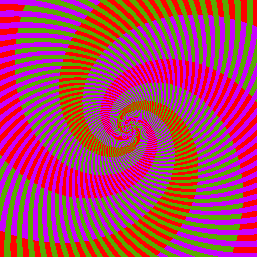

Moving circles.
Dave J
Retired Moderator
21
Years of Service
User Offline
Joined: 11th Feb 2003
Location: Secret Military Pub, Down Under
Posted: 11th Dec 2003 01:11
Quote: "You're saying the A text would have to be a darker grey then the tile,"

No, I'm not. It can be lighter than the tile and still work."


Well then it would have to be lighter then the B tile, and yet still transform it into a darker grey then the surrounding pixels. No matter what the value was, the JPEG compression would have to change a lower value higher then the surrounding pixels which it just can't do.


"Computers are useless they can only give you answers."
HZence
21
Years of Service
User Offline
Joined: 9th Mar 2003
Location:
Posted: 11th Dec 2003 01:14
Quote: "Moving Cirles"


Where do you people get these things..


Team EOD :: Programmer/Storyboard Assistant
Neophyte
21
Years of Service
User Offline
Joined: 23rd Feb 2003
Location: United States
Posted: 11th Dec 2003 01:37
@Exeat

"Well then it would have to be lighter then the B tile, and yet still transform it into a darker grey then the surrounding pixels. No matter what the value was, the JPEG compression would have to change a lower value higher then the surrounding pixels which it just can't do."

Yes it can. The JPEG algorithm is based on how the human eye works if I recall correctly. So of coarse it will mess with with the values of an optical illusion designed to exploit the eye. The B is suppose to look darker than the A when in reality they are the same. Why is it difficult to understand that JPEG would actually make it darker?

@HZence

"Where do you people get these things.."

Yahoo.com. Type in optical illusions.
Dave J
Retired Moderator
21
Years of Service
User Offline
Joined: 11th Feb 2003
Location: Secret Military Pub, Down Under
Posted: 11th Dec 2003 01:51
Quote: "Why is it difficult to understand that JPEG would actually make it darker?"


Because the programmers aren't THAT bad.


"Computers are useless they can only give you answers."
Neophyte
21
Years of Service
User Offline
Joined: 23rd Feb 2003
Location: United States
Posted: 11th Dec 2003 02:03
@Exeat

"Because the programmers aren't THAT bad."

Why would that make them bad? Wouldn't that make them good if they knew how the eye works so well? Arghhh...

You know what? Lets just drop this. Its obvious we aren't going to agree on this no matter what is said.

From here on out, I'm not going to respond to any posts about this issue. I've said my arguments over and over again. If no one agrees fine. As far as I'm concerned, its a dead issue and I'll treat it as such. I hope that you will agree and do the same.
Dave J
Retired Moderator
21
Years of Service
User Offline
Joined: 11th Feb 2003
Location: Secret Military Pub, Down Under
Posted: 11th Dec 2003 02:11
Then why did you ask a question in your post?


"Computers are useless they can only give you answers."
Kharnor
21
Years of Service
User Offline
Joined: 5th Jul 2003
Location: Australia
Posted: 11th Dec 2003 05:06
"Are the horizontal lines straight or curved?"
If they're horizontal, that means they're not curved.

As for those moving circles: WHOA. Nice.

OF OF OF OF OF OF OF OF OF OF OF OF OF OF OF OF OF OF OF OF
CloseToPerfect
21
Years of Service
User Offline
Joined: 20th Dec 2002
Location: United States
Posted: 11th Dec 2003 05:10


Lifes short, try to enjoy it and not take it to seriously!
Dave J
Retired Moderator
21
Years of Service
User Offline
Joined: 11th Feb 2003
Location: Secret Military Pub, Down Under
Posted: 11th Dec 2003 05:19
Quote: ""Are the horizontal lines straight or curved?"
If they're horizontal, that means they're not curved. "


Nice.


"Computers are useless they can only give you answers."
HZence
21
Years of Service
User Offline
Joined: 9th Mar 2003
Location:
Posted: 11th Dec 2003 05:20
wow now THAT is just wierd


Team EOD :: Programmer/Storyboard Assistant
Neophyte
21
Years of Service
User Offline
Joined: 23rd Feb 2003
Location: United States
Posted: 11th Dec 2003 08:02
@Exeat

"Then why did you ask a question in your post?"

I was being rhetorical.

@Kharnor

"If they're horizontal, that means they're not curved."

Clever. I didn't think of that.

"As for those moving circles: WHOA. Nice."

Thanks.

@CloseToPerfect

Good one.

@Everyone

Which line connects to line C? A or B?


Which do you see? The letter E or just black lines?


Which of the top lines on each trapezoid is longer?


Can you figuare out what this picture is of?


The answer can be found here: http://eyetricks.com/1101a.htm

How many diagonal lines are in this picture?


How many shades of green are in this picture?


Which way does the window face?


How many legs does the elephant have?


Who is taller?


Is this a spiral?

Chris K
21
Years of Service
User Offline
Joined: 7th Oct 2003
Location: Lake Hylia
Posted: 11th Dec 2003 10:21 Edited at: 11th Dec 2003 23:45
As this is my thread I'm going to settle this Neophyte thing once and for all.

No-one talk about it.

If Neophyte can explain how the same colour, on the same colour, can turn into different colours that he can explain it to all of us. Until them, no one mention it.


...and like that; he's gone...
Kharnor
21
Years of Service
User Offline
Joined: 5th Jul 2003
Location: Australia
Posted: 11th Dec 2003 12:34
There's twelve shades of green. I counted them in photoshop

OF OF OF OF OF OF OF OF OF OF OF OF OF OF OF OF OF OF OF OF
Sly D
22
Years of Service
User Offline
Joined: 15th Oct 2002
Location:
Posted: 11th Dec 2003 12:48
WOW, nice illusions Neophyte!

A cute looking koala with a WHAT!? THEY can't use Kalashnikovs, can they?
Dave J
Retired Moderator
21
Years of Service
User Offline
Joined: 11th Feb 2003
Location: Secret Military Pub, Down Under
Posted: 11th Dec 2003 12:59
Now that's something you can blame JPEG compression on!


"Computers are useless they can only give you answers."
Critters
21
Years of Service
User Offline
Joined: 11th Apr 2003
Location: United Kingdom
Posted: 11th Dec 2003 13:58
wow, some interesting illusions there guys, shame ive seen the 4th one before

The third one is great! Really baffled me on testing in psp8, kewl

- My online portfolio/under construction
- The Media Base/under construction
Critters
21
Years of Service
User Offline
Joined: 11th Apr 2003
Location: United Kingdom
Posted: 12th Dec 2003 01:01
fraid pinchos had me baffled the most, ace illusion

- My online portfolio/under construction
- The Media Base/under construction
Pincho Paxton
21
Years of Service
User Offline
Joined: 8th Dec 2002
Location:
Posted: 12th Dec 2003 01:05
I like the cow, and the window! I couldn't see that cow at all!

Pincho.
Dave J
Retired Moderator
21
Years of Service
User Offline
Joined: 11th Feb 2003
Location: Secret Military Pub, Down Under
Posted: 12th Dec 2003 01:28
That cow scares me. I wish it would stop staring at me.


"Computers are useless they can only give you answers."
Easily Confused
22
Years of Service
User Offline
Joined: 22nd Oct 2002
Location: U.K. Earth. (turn right at Venus)
Posted: 12th Dec 2003 01:31
Took me ages to see that

Programming anything is an art, and you can't rush art.
Unless your name is Bob Ross, then you can do it in thirty minutes.
Wik
21
Years of Service
User Offline
Joined: 21st May 2003
Location: CT, United States
Posted: 12th Dec 2003 01:46
I like the E one


Chris K
21
Years of Service
User Offline
Joined: 7th Oct 2003
Location: Lake Hylia
Posted: 12th Dec 2003 10:01
Yeah. The E is my favourite.


...and like that; he's gone...
Neophyte
21
Years of Service
User Offline
Joined: 23rd Feb 2003
Location: United States
Posted: 12th Dec 2003 12:45
@Kharnor

"There's twelve shades of green. I counted them in photoshop"


@Cyber_Freak

"WOW, nice illusions Neophyte!"

Thanks.

@Exeat

"Now that's something you can blame JPEG compression on!"


@Neon Blue

"fraid pinchos had me baffled the most, ace illusion"

Drat. Guess I'll have to try harder.

@Pincho

" I couldn't see that cow at all! "

Neither could I. Its so obvious once you know though isn't? I keep wondering how I missed it.

@Easily Confused

"Took me ages to see that "

Don't feel too bad. I never saw it at all until I checked the answer page.

@Wik and Chris Knott

"I like the E one"

"Yeah. The E is my favourite."

Glad you liked it.
Arrow
21
Years of Service
User Offline
Joined: 1st Jan 2003
Location: United States
Posted: 12th Dec 2003 16:30
That cow pic reminds me of the copy machine back in high school.


I've lost 25lb playing Dance Dance Revolution, no really!

Login to post a reply

Server time is: 2024-11-24 12:09:42
Your offset time is: 2024-11-24 12:09:42