Sorry your browser is not supported!

You are using an outdated browser that does not support modern web technologies, in order to use this site please update to a new browser.

Browsers supported include Chrome, FireFox, Safari, Opera, Internet Explorer 10+ or Microsoft Edge.

3 Dimensional Chat / Feedback on Clocktower

Author
Message
Kieran
18
Years of Service
User Offline
Joined: 6th Aug 2006
Location: Hamilton, New Zealand
Posted: 6th Aug 2008 09:30 Edited at: 6th Aug 2008 09:30
Hey I just made a clocktower model for my game. I would like some feedback on it if possible, whats good, whats bad, what needs improvements, how to improve it, etc. Anything neccessary. Apart from the clock face though, I don't have that yet as it will be done programatically. The poly count is 148.

Attachments

Login to view attachments
Not_Maindric
17
Years of Service
User Offline
Joined: 10th Jul 2007
Location: Omaha, NE
Posted: 6th Aug 2008 10:07
Hm.... The texture.. To me, something is not right about it... Try changing it after the base, that may make it better, but not sure. The model looks good though, the texture just throws it off.

Kieran
18
Years of Service
User Offline
Joined: 6th Aug 2006
Location: Hamilton, New Zealand
Posted: 6th Aug 2008 10:31
ty for the feedback, for the texture could you be a bit more specific? I know it doesn't look right, it needs a better texture on the base but I couldn't find one.
Deathead
18
Years of Service
User Offline
Joined: 14th Oct 2006
Location:
Posted: 6th Aug 2008 14:38
Kieran, burn in Ambient Occulision. It makes it look better. It finds the darkest point giving it depth.


Spotaru
17
Years of Service
User Offline
Joined: 3rd Dec 2006
Location: Over the next rise.
Posted: 6th Aug 2008 16:05
The blocks near the bottom are too small. The bottom should use larger blocks to support the weight, with them getting smaller and smaller as you go up the tower.
Game maker wannabe
17
Years of Service
User Offline
Joined: 30th Mar 2007
Location: Dorset, ooh arr!
Posted: 6th Aug 2008 17:49 Edited at: 6th Aug 2008 17:50
I reckon at the base, and spikes on top you should make it metallic.

Omega gamer 89
17
Years of Service
User Offline
Joined: 10th Sep 2007
Location: Pittsburgh, PA
Posted: 6th Aug 2008 21:07
Make the bricks a little darker and the mortar holding them together more defined.

...but I am the ferret king!!!! BWAHAHAHAHAHAHA!!!! tremble before my ferret minions!

Kieran
18
Years of Service
User Offline
Joined: 6th Aug 2006
Location: Hamilton, New Zealand
Posted: 7th Aug 2008 05:48
Quote: "Kieran, burn in Ambient Occulision. It makes it look better. It finds the darkest point giving it depth."

Ok I will try that

Quote: "The blocks near the bottom are too small. The bottom should use larger blocks to support the weight, with them getting smaller and smaller as you go up the tower."

I see what your saying but do you mean have bigger bricks at the bottom or make the tower slant inwards as it goes up?

Quote: "I reckon at the base, and spikes on top you should make it metallic."

It's supposed to be a more older tower, one that was built years ago and has been in the town a long time not quite sure if metallic would fit in with that.

Quote: "Make the bricks a little darker and the mortar holding them together more defined."

Cool ty I will see how it looks

Thanks for all the feedback, I will edit the model and post the new screens when I feel its better.
QuothTheRaven
22
Years of Service
User Offline
Joined: 2nd Oct 2002
Location: United States
Posted: 7th Aug 2008 06:20
The texture is dull and poorly scaled. Depending on the scale of the tower to a person it looks like about two blocks are as tall as a person. There's no life to it either, it's low contrast, and worst of all, it' just one texture. You need to unwrap it so you can give specific sections specific textures, or multitexture it to apply different textures to different faces. Geometry is ok, could be more interesting with some doors or windows, little details. They could also be done with a texture. Also, the clock face probably shouldn't be ovular, as they're pretty much universally round, unless that's a purposeful style you're going for.

Kieran
18
Years of Service
User Offline
Joined: 6th Aug 2006
Location: Hamilton, New Zealand
Posted: 7th Aug 2008 06:32 Edited at: 7th Aug 2008 06:34
Here is the redone clock tower, its still not perfect but just showing how it is so far


Ty Quoth, good advice, I will work on that next

Attachments

Login to view attachments
Osiris
20
Years of Service
User Offline
Joined: 6th Aug 2004
Location: Robbinsdale, MN
Posted: 7th Aug 2008 06:36
How big is that tower? Those blocks look mammoth, try taking that texture you did tiling it ten times instead of 1.

RIP Max-Tuesday, November 2 2007
You will be dearly missed.
Kieran
18
Years of Service
User Offline
Joined: 6th Aug 2006
Location: Hamilton, New Zealand
Posted: 7th Aug 2008 08:12 Edited at: 7th Aug 2008 08:12
Bricks downsized, windows added, doors added, clock rounded.
Here is the result, more feedback still appreciated.

Attachments

Login to view attachments
Omega gamer 89
17
Years of Service
User Offline
Joined: 10th Sep 2007
Location: Pittsburgh, PA
Posted: 7th Aug 2008 08:18
Looking much better. There are only two things I would change:
1) The door looks WAY too big. If it's a clock tower the door should be about 1/10 of that size. ... Come to think of it so should the bricks... I am imagining this thing is supposed to be very large, almost big-Ben scale. If its a clock tower, its got to be huge. otherwise it would just be a clock... statue.. or something...
2) At the bottom part where theres that little pointy part above the door, make that stick out more, so its easier to see. right now it kinda looks like a texture error.

If the good lord had intended us to go outside or have a social life, he wouldn't have invented the internet.
www.threeswordsproductions.com
Kieran
18
Years of Service
User Offline
Joined: 6th Aug 2006
Location: Hamilton, New Zealand
Posted: 7th Aug 2008 08:47
Quote: "1) The door looks WAY too big. If it's a clock tower the door should be about 1/10 of that size. ... Come to think of it so should the bricks... I am imagining this thing is supposed to be very large, almost big-Ben scale. If its a clock tower, its got to be huge. otherwise it would just be a clock... statue.. or something..."


It is for a small town, its not supposed to be that big. It's just a basic, small clock tower. The bricks aren't that huge in the game, but I can't prove it with a screenshot since the player is a placeholder cube.

I will probably make the door slightly smaller though.

Quote: "2) At the bottom part where theres that little pointy part above the door, make that stick out more, so its easier to see. right now it kinda looks like a texture error."


Ok, I have done that now won't post a screen shot yet as its a very minor change
bobochobo
16
Years of Service
User Offline
Joined: 9th Jul 2008
Location: My house, in the middle of my street
Posted: 7th Aug 2008 22:57
Yeah the door looks big and the spikey things should be a different texture, say wood?

Wooobolly dooboly doodoly dooo!
Omega gamer 89
17
Years of Service
User Offline
Joined: 10th Sep 2007
Location: Pittsburgh, PA
Posted: 7th Aug 2008 23:20
Quote: "Yeah the door looks big and the spikey things should be a different texture, say wood?"

Yeah, either wood, metal, or get rid of altogether. They seem like a bit too much.

If the good lord had intended us to go outside or have a social life, he wouldn't have invented the internet.
www.threeswordsproductions.com
RUCCUS
19
Years of Service
User Offline
Joined: 11th Dec 2004
Location: Canada
Posted: 8th Aug 2008 05:33 Edited at: 8th Aug 2008 05:35
You may not want it big but look at the door right now. A typical door is a little taller than an average person. So if an average person is around the size of that door, then they're going to walk into that tower and have... a ladder to get to the clock?

My suggestions (most have already been said):

- Scale down the door. Even if its only 2/3rds of the size, it'd fit much better.

- By the looks of things the UVs on the mid section of the tower are stretched vertically. You may want to consider re-mapping that section (all you need to do is shrink the uv's on the y axis). This will stop the middle bricks from being stretched / blurred so much.

- I'd use some sort of corner-stone on the bottom. Maybe 2 bricks high, just a corner brick piece that looks different from the others, to give it a stronger feeling.

- Age some of the bricks, adding cracks, moss to the bottom bricks, scratches, etc.

- Id use a split, two-door style for this tower, but thats up to you.

- Add some detail to the border of the windows, with bricks. Like a border of smaller bricks.

- Top spikes should be different. Id go with copper, I mean, they had copper roofs back then, and with that you could tie in some nicely aged green coppers at the base of the spikes.

- Possibly worth while to add a gargoyle or some sort of fixture on the top corners just bellow the spikes.

- Finish the clock.

Sid Sinister
19
Years of Service
User Offline
Joined: 10th Jul 2005
Location:
Posted: 8th Aug 2008 05:36
Your proportions are still way off with your tower. You can stack five doors and it would be the size of your tower. Can you do that with a real clock tower? The door needs to be the size of one brick (at the most three) on the latest upload you have. The windows need to be a lot smaller (as big as the door) too. It looks good, just not proportional.

"If I have seen a little further it is by standing on the shoulders of Giants" - Isaac Newton
-Computer Animation Major @Baker.edu-
Osiris
20
Years of Service
User Offline
Joined: 6th Aug 2004
Location: Robbinsdale, MN
Posted: 8th Aug 2008 08:52 Edited at: 8th Aug 2008 08:55
Ok, so I made some "adjustments" to your photo, I think it looks pretty good. I will tell you what I changed and how I did it here:

Before:
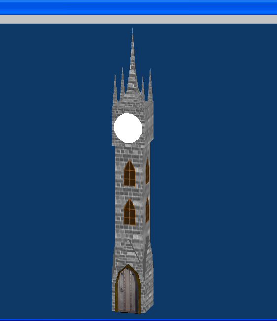

- Added some shadows, I used the dodge tool however you can probably use your modeling program and just bake some shadows on the texture.

- Made the roof copper(ish), I took a nice copper color and painted over your bricks and set the blending mode to 'overlay'. Then I gave to that noble copper look as made famous by the Statue of Liberty, however since its not that old (or at least I assume its not) it wont have completely changed green yet, so i left some of it copper colored. Lastly I added a slight inner glow from the center to shine it up a little.

- Scuffed it up, In the real world nothing stays shiny for long so I added moss and grime to your model, under the windows, leaking off the roof and at the bottom. For this I used a 14 Pixel size splatter brush that came with Photoshop (I am sure The GIMP has something like it as well). After splattering the moss I smudged it with the smudge tool. For the grime leaking off I used a rust color brush, and painted a little under the brushes, the smudged it down, like it was slowly running down. Then having the active colors set to the rust and moss colors I ran the fibers filter to make it sort of rusty moss.

- I re-sized your windows and door, I couldn't actually change the size so that's just a red outlined suggestion.

- Lastly I added some cracks, not sure if you can see them but I used a 1 Pixel black colored brush and painted the cracks. After I painted them I added an downward emboss set to "chisel hard".

Final Result:
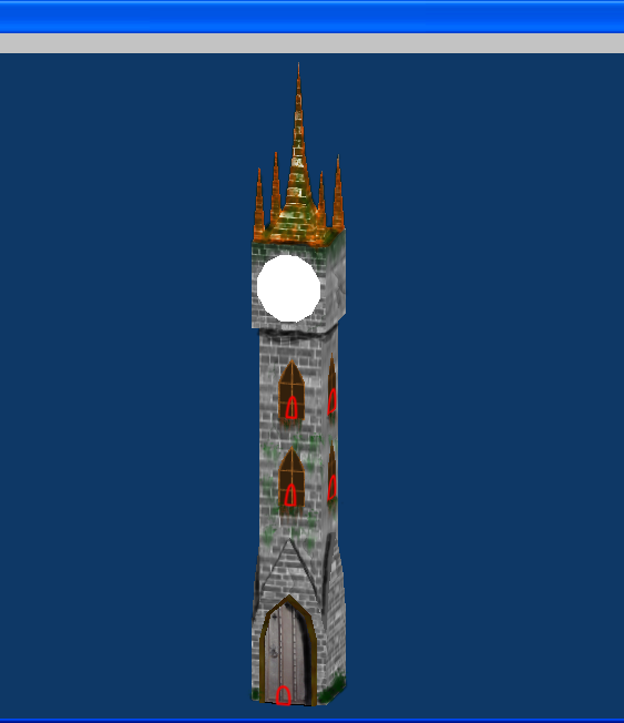

If you have any other questions as to how I did any of this just ask, I also saved the PSD if you wanna have a look at the layers.

P.S.

Make the clock part a circle, or else the hands wont fit right.

RIP Max-Tuesday, November 2 2007
You will be dearly missed.

Attachments

Login to view attachments
Kieran
18
Years of Service
User Offline
Joined: 6th Aug 2006
Location: Hamilton, New Zealand
Posted: 8th Aug 2008 09:04 Edited at: 8th Aug 2008 09:07
Here is the newest update on the clock tower. I don't like the look of the copper spikes so much but I will wait for some feedback on that.


EDIT: this was posted before I saw Osiris' feedback.

Attachments

Login to view attachments
Kieran
18
Years of Service
User Offline
Joined: 6th Aug 2006
Location: Hamilton, New Zealand
Posted: 8th Aug 2008 09:15 Edited at: 8th Aug 2008 09:15
It still seems theres an issue with the size, here is the tower in proportion to the town. The middle building is a 2 story inn.

Attachments

Login to view attachments
Osiris
20
Years of Service
User Offline
Joined: 6th Aug 2004
Location: Robbinsdale, MN
Posted: 8th Aug 2008 09:30
Oh yes, the clock tower should be like ten times bigger than that.

RIP Max-Tuesday, November 2 2007
You will be dearly missed.
Kieran
18
Years of Service
User Offline
Joined: 6th Aug 2006
Location: Hamilton, New Zealand
Posted: 8th Aug 2008 09:41
the camera doesn't allow for that, if it was 10 times bigger I would only see the base, btw do you think you could go on Yahoo soon?
Osiris
20
Years of Service
User Offline
Joined: 6th Aug 2004
Location: Robbinsdale, MN
Posted: 8th Aug 2008 09:49
Sure, Ill be on in a min.

RIP Max-Tuesday, November 2 2007
You will be dearly missed.
Kieran
18
Years of Service
User Offline
Joined: 6th Aug 2006
Location: Hamilton, New Zealand
Posted: 8th Aug 2008 11:25 Edited at: 8th Aug 2008 11:26
Here is what I have produced now, ty to Osiris for the great advice.

Attachments

Login to view attachments
RUCCUS
19
Years of Service
User Offline
Joined: 11th Dec 2004
Location: Canada
Posted: 8th Aug 2008 13:40
It doesnt fit with the scene because the other models are out of proportion as well . Again, look at the door on that middle building. Going by that, someone could walk from one side of the inn to the other in about 10 steps.

And yes the clock tower does need to be scaled up. You can increase the draw distance in DBP by using the camera range function.

Login to post a reply

Server time is: 2024-11-25 15:46:55
Your offset time is: 2024-11-25 15:46:55