Sorry your browser is not supported!

You are using an outdated browser that does not support modern web technologies, in order to use this site please update to a new browser.

Browsers supported include Chrome, FireFox, Safari, Opera, Internet Explorer 10+ or Microsoft Edge.

Work in Progress / Untitled and mostly desaturated game (NaGaCreMo) - lots of pictures

Author
Message
Tom J
19
Years of Service
User Offline
Joined: 4th Aug 2005
Location: Essex, England
Posted: 23rd Jan 2009 21:18
Since it is a week until NaGaCreMo closes, I suppose it is just fair I post some of my progress...

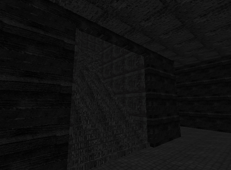
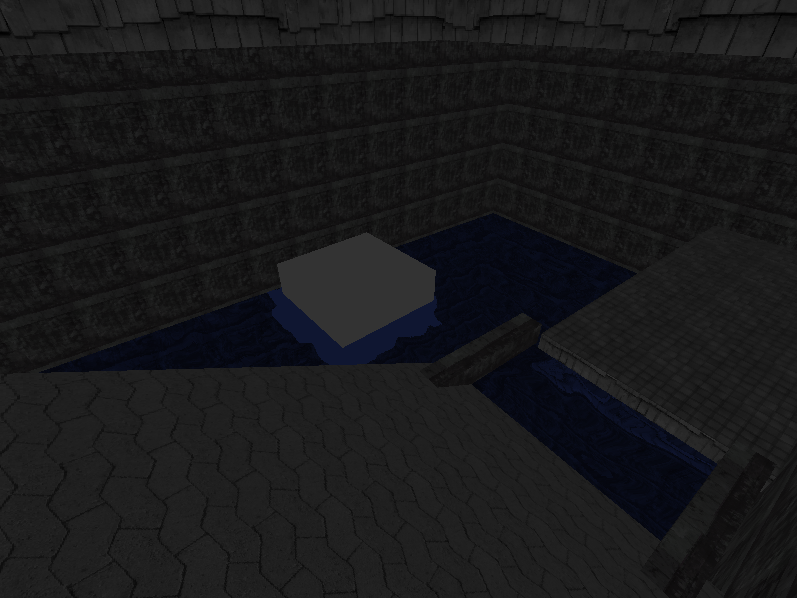
This game is made in Leadwerks and is or will be by next week, a First Person puzzler/explorer. You play as a monster in a surreal "light and darkness" world. In this world, contact with any light results in death... so the whole idea is to manipulate the environment around you (by moving objects and pressing buttons atm.) to affect where the shadows are. As much as I would love to show this gameplay off, I have only done the first level so far; and that happens to be a dark'ish well. More "light" levels will come later on in the week once the engine has been done to satisfaction, hopefully.

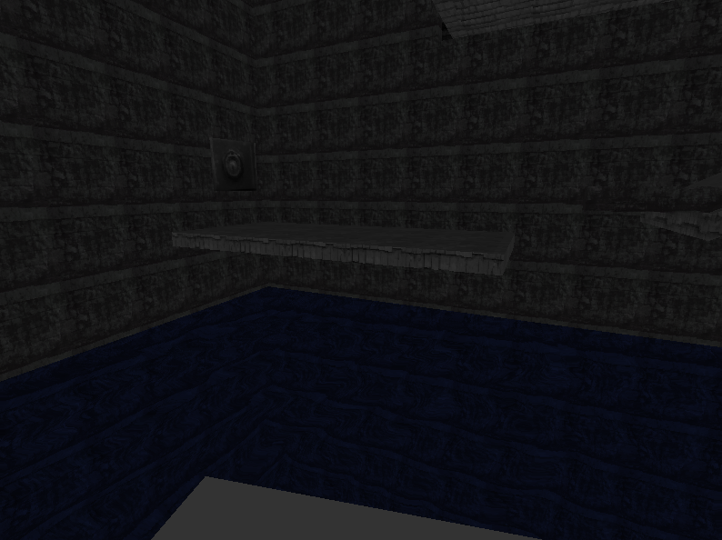
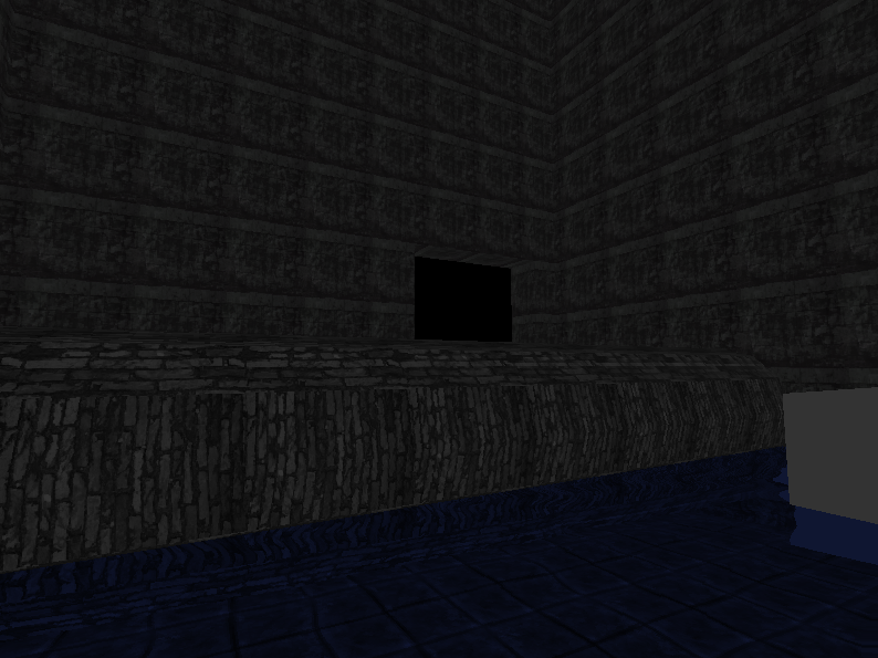
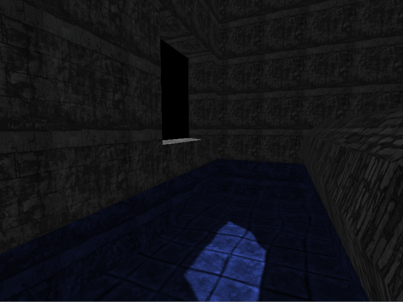
The whole world is desaturated, apart from the water (will also be deadly). Here are some screenies anyway:

Staircase

Water

Standing on floating box

In the water

Light, finally.

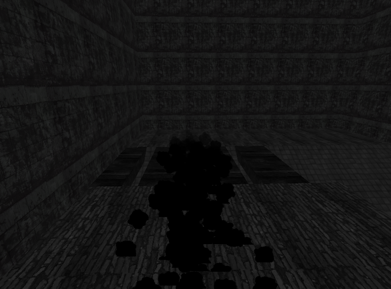
The slimy trail emitted by you as you walk along (particles)

That's it for now, just wait until next week, by which time I will have polished and perfected it, or given up

GDT DEBATES - GO AND CONTRIBUTE [href]http://forum.thegamecreators.com/?m=forum_view&t=142248&b=19[href]
Diggsey
18
Years of Service
User Offline
Joined: 24th Apr 2006
Location: On this web page.
Posted: 23rd Jan 2009 22:02
That is WAY too dark!

It's impossible to pick out any detail in those pictures. I can just about make out some stairs in the first, but they are ridiculously dark.

[b]Yuor signutare was aresed by a deslyxic mud...
BOX2D V2 HAS HELP FILES! AND A WIKI!
Tom J
19
Years of Service
User Offline
Joined: 4th Aug 2005
Location: Essex, England
Posted: 23rd Jan 2009 22:05
It doesn't appear dark for me, you sure it isn't your or my monitor?

GDT DEBATES - GO AND CONTRIBUTE [href]http://forum.thegamecreators.com/?m=forum_view&t=142248&b=19[href]
AndrewT
17
Years of Service
User Offline
Joined: 11th Feb 2007
Location: MI, USA
Posted: 23rd Jan 2009 22:38
Looks nice! I can see it all just about perfectly. Sounds like a pretty good idea, curious to see how it turns out.

Jimpo
19
Years of Service
User Offline
Joined: 9th Apr 2005
Location:
Posted: 23rd Jan 2009 22:41
At first I thought this was a joke topic, considering all the screenshots are solid black! Some monitors simply can't go as bright as others. For example, max brightness on my desktop displays your screenshots just as well as zero brightness on my laptop.

Moody, dark environments in video games are better achieved through tone and color than by making the screen dimmer and harder to see. Rework your lighting and post some new screenshots, because your game concept sounds really clever!

Tom J
19
Years of Service
User Offline
Joined: 4th Aug 2005
Location: Essex, England
Posted: 23rd Jan 2009 22:48 Edited at: 23rd Jan 2009 22:59
Ok then, so it is really an issue with different peoples' monitors. I'll raise the ambient light then and try put more tones of light in. If I put any colour in, I'll probably be quite cautious with how to use it because I like the lifeless "look" the current thing has

As it is a shame that the current level doesn't show much of the light and dark gameplay, I'll quickly whip up a level to show it off I think, so keep watching this thread edit: after all, you two last posters seem keen on seeing the idea in action.

edit 2:

Those people who had trouble seeing the above pictures. Any better?

GDT DEBATES - GO AND CONTRIBUTE [href]http://forum.thegamecreators.com/?m=forum_view&t=142248&b=19[href]
Violent Pigeon
16
Years of Service
User Offline
Joined: 30th Dec 2007
Location: London, Great Britain
Posted: 23rd Jan 2009 23:57
Looks great, my moniter sees it excellently. Good Job


Bozzy
18
Years of Service
User Offline
Joined: 10th Sep 2006
Location: Birmingham, UK
Posted: 24th Jan 2009 00:40
I don't think you have used the engine to it's full potential at all... I mean, for a couple more lines of code, you can introduce many effects that will make this game great

Of course, this is after all gameplay is done... Anyway, I do not doubt your skill, so I'll leave you to it

<a href="http://profile.mygamercard.net/Bozzmister">
<img src="http://card.mygamercard.net/aero/Bozzmister.png" border=0>
</a>
Tom J
19
Years of Service
User Offline
Joined: 4th Aug 2005
Location: Essex, England
Posted: 24th Jan 2009 10:02
Quote: "Of course, this is after all gameplay is done..."


Well that's the whole point, do the gameplay first, then worry about stuff like Bloom, SSAO, motion/gaussian blur, etc. later... if I spent this week trying the make the game as pretty as possible, there would be nothing to play and it would essentially be a tech demo...

GDT DEBATES - GO AND CONTRIBUTE [href]http://forum.thegamecreators.com/?m=forum_view&t=142248&b=19[href]
Jimpo
19
Years of Service
User Offline
Joined: 9th Apr 2005
Location:
Posted: 24th Jan 2009 19:52
New screenshot appears just fine on my monitor! You should try and add some volumetric lighting so the player has a better idea of where not to step.

Something like this: http://gchen.sdf-eu.org/Chengine/Images/Misc/VolumeLight.jpg

Login to post a reply

Server time is: 2024-11-24 08:45:07
Your offset time is: 2024-11-24 08:45:07