Sorry your browser is not supported!

You are using an outdated browser that does not support modern web technologies, in order to use this site please update to a new browser.

Browsers supported include Chrome, FireFox, Safari, Opera, Internet Explorer 10+ or Microsoft Edge.

Work in Progress / Bushido Shuffle (56K warning, and....it's quite violent...)

Author
Message
baxslash
Valued Member
Bronze Codemaster
17
Years of Service
User Offline
Joined: 26th Dec 2006
Location: Duffield
Posted: 3rd Nov 2009 15:38
I'd be happy to do some testing (as much as I can manage anyway!)
Plotinus
15
Years of Service
User Offline
Joined: 28th Mar 2009
Location:
Posted: 3rd Nov 2009 16:02
It's great news that you're taking the project forward in this way and with diverse talents like that. That makes it one of the most exciting things on the WIP board!

I'd be very happy to do some testing if you'll have me. Think of it as a substitute for a .
Butter fingers
18
Years of Service
User Offline
Joined: 20th Mar 2006
Location: Mecca
Posted: 3rd Nov 2009 16:11
Baxslash / Plotinus, that would be amazing.... as I said, I'm going to be in seattle and working on paid projets for a while, and I have to wait for content from other collaborators so there probably wont be anything new and playable until Mid November.

I don't want this thread to turn into a bunch of people saying they will test so PLEASE DONT POST "I want to Test" here, drop me an email at the address in my profile!

Cheers.

Plotinus - I went to a lecture about collaboration recently, and it struck me that all to often here people work on their own... I know I certainly have, it means that I'm usually overwhelmed by the amount of work I need to do, so that in the end I can't finish a project. I'm excited about this one, and so are the rest of the team. I think it's going to be good!

I want robotic legs.
Green Gandalf
VIP Member
19
Years of Service
User Offline
Joined: 3rd Jan 2005
Playing: Malevolence:Sword of Ahkranox, Skyrim, Civ6.
Posted: 4th Nov 2009 14:03 Edited at: 6th Nov 2009 11:59
I've just tried the Bushido Game. It's the sort of game I usually avoid because I'm squeamish about blood, but I have to say it made me laugh out loud.

I particularly liked the moment when a severed enemy wandered around for several seconds gushing blood. I hope I got lots of Chi (?) for that.

It's one of the elite group of games that I've played from the forum that makes me want to play it just a little bit more ().

I did notice a few things though:


I'll play with it a bit more (despite - or because of - the blood??) and let you know if I have any further comments.

Overall it has a very professional feel to it.

Very, very, well done.

[Edited one comment that was unintentionally negative. ]
Jimpo
19
Years of Service
User Offline
Joined: 9th Apr 2005
Location:
Posted: 6th Nov 2009 02:40
I played the demo, and it's pretty neat so far. I loved it the first time I cut some guy in half vertically and he stumbled around for a bit. There was also another cool part where I shoved my sword through the wall just to cut some guy in half (though that was probably wasn't supposed to happen).

As Bizar Guy mentioned, the controls are really loose. The character slides all over the place, especially when attacking. Proper controls are really important for a game like this. Also, I got my head stuck in one of the rooftops and the character just slide around until he found his way out.

Loved how the character got bloodier the more you fought btw

Butter fingers
18
Years of Service
User Offline
Joined: 20th Mar 2006
Location: Mecca
Posted: 26th Nov 2009 15:09
OK! It's update time Y'all !

I've been working really hard on this. The player now has the beginnings of a combo system. It's a simple, High Low Middle attack system, using the up and down keys as power modifiers (light medium and heavy). It's the kind of system where you can get really surgical and plan your combos, or just smash every key and it's still fun!

Visually I've done alot.
-Full screen age overlay
-Cell Shading (with alpha)
-new level textures
-Now 60FPS instead of 30FPS
-1000 Frames of new animation

Code Changes:
-Scaling arrays for active objects
-Changed AI
-New combo system
-altered alot of the jumping code (still needs work)
-Enemies/blood/limbs can now be handled at heights other than y=0

Screens (and video)


I want robotic legs.
baxslash
Valued Member
Bronze Codemaster
17
Years of Service
User Offline
Joined: 26th Dec 2006
Location: Duffield
Posted: 26th Nov 2009 17:26
Looking great BF!!

Like the new style and the animation is much improved! What do you make your characters on Blender/Max/other?

When will the demo be updated?
C0wbox
18
Years of Service
User Offline
Joined: 6th Jun 2006
Location: 0,50,-150
Posted: 26th Nov 2009 17:56 Edited at: 26th Nov 2009 17:58

tONtEPTS.


Attachments

Login to view attachments
Butter fingers
18
Years of Service
User Offline
Joined: 20th Mar 2006
Location: Mecca
Posted: 26th Nov 2009 19:55
COwbox. LOL. I hate you. Don't make me see my branding in that way! It is a C, I promise!

Baxslash, thanks dude. I make all my models in Maya. I've been using it for about 10 years on and off, so I'm quite quick. For animation I rig in maya because you can paint the vertex weight and assignment, so it's quite fast, I do the actual keyframing between Milkshape and Fragmotion. If milkshape could copy sets of keyframes I wouldn't use Fragmo atall! It's not a perfect system, but its one I've used for a long time, so I know what the limitations are, and how to get things done!

Demo-wise... I have *almost* all the new player animations done, its just a case of linking up the new animations to the new combo code. The thing is, for the fighting to flow nicely the enemies are going to need to use a similar system, so I have a fair amount of work on that side. Also there are a few older features, such as the animation function that isn't nearly as efficient as it could be, so there are like 1000line areas of code that need totally re-working. There might be a Dojo demo out soon, which will be a very small level with infinitely spawning enemies where people can try out, and feed back on, the combat system. I'm not going to have a full demo back out until Christmas probably.

I've decided to do something different with the distribution too. The game is written in chapters, with each chapter forming 1 game level. My thinking is that instead of making one big long game that will take another 12 months to finish, I'm going to just finish the working side of the engine( 2 months ), and then release the game in 1 chapter episodes. A bit like TV, each fortnight you will be able to download a new chapter. This should make the workload easier to deal with.

What do you guys think? would that be a cool way of doing it? Basically thinking that Chapters 1 and 2 are free and then each further chapter is like $1.

I want robotic legs.
Bizar Guy
19
Years of Service
User Offline
Joined: 20th Apr 2005
Location: Bostonland
Posted: 26th Nov 2009 20:43
Distribtion meathod sounds good. I like the way it's looking mostly, though with the age thing you should reaaallyy turn down the grey. The whole age thing is great, but there's too much grey. 1/2-3/4 of what you have now might be good.

Can't wait to try a new demo!

Paul112
18
Years of Service
User Offline
Joined: 1st Jan 2006
Location: UK
Posted: 26th Nov 2009 21:15
The new screenshots look good but the video threw me off a little bit. I think the cell shading + old film grain makes it lose too much detail, the character looks really blocky. Maybe tone down the film grain, or just have the film grain without the cell shading?

Impressive stuff anyway, loved the first demo!

Paul

Plotinus
15
Years of Service
User Offline
Joined: 28th Mar 2009
Location:
Posted: 26th Nov 2009 21:50
Looks great. I think the flashes of film imperfection are a lot of fun, although you should make them optional as I'm sure some people would find them distracting.

Everything looks really smooth. I think there's still quite a lot of slippery feet going on, but I'm sure you're aware of that. Your animations really are excellent.

As for the distribution idea of chopping it into chapters, I think that is a good idea although it is hard to tell how well it would work. It's basically following the model of downloadable content, but for the bulk of the game. I know plenty of iPhone games take a similar approach, but in reverse: i.e. they charge you for the initial game, and then provide free updates on a regular basis, containing new levels or other features. I don't know whether making the first level or two free and then charging for the later ones would work, since I suspect many people would think "I got the first one free, why can't I get the others free?" - because people seem to think like that, no matter how irrational it may be. But that's just my initial impression. Perhaps a slightly different method might be to make the initial level or two free (as a standalone game), and then charge people a single, one-off price for the right/ability to download all of the later levels, as and when they become available. I suspect that people might find that model more attractive. Again, I don't really know, though!
baxslash
Valued Member
Bronze Codemaster
17
Years of Service
User Offline
Joined: 26th Dec 2006
Location: Duffield
Posted: 27th Nov 2009 00:57
I agree about the film grain, maybe just tone down the visibility of it a bit?

Chapters for sale is a bit risky, I would charge for the game and then give the rest of the chapters out free as otherwise it just seems like you're cashing in...

If the reason for doing it is for time limitations there's no need to charge extra, just charge a decent amount for the main title.
C0wbox
18
Years of Service
User Offline
Joined: 6th Jun 2006
Location: 0,50,-150
Posted: 27th Nov 2009 18:26
@ Butter fingers
Lolololol everyone hates me on this forum xD

baxslash
Valued Member
Bronze Codemaster
17
Years of Service
User Offline
Joined: 26th Dec 2006
Location: Duffield
Posted: 30th Nov 2009 09:52
@C0wbox, I think you're luvly.

You do have a habit of pointing out things people don't want to notice but that's all part of healthy critisism...
Butter fingers
18
Years of Service
User Offline
Joined: 20th Mar 2006
Location: Mecca
Posted: 30th Nov 2009 10:58
THanks for the comments guys. I've taken the film grain out all together. It's quite a cool effect, but I think it moves away from the "Graphic novel" style and moves further towards "grindhouse" cinema. Needless to say its all alot better now.
NO MORE GREY CRAP ON THE SCREEN!

I've got the combo system fully down and it's pretty sweet now. You have the ability to do counters/reversals and it all flows really nicely with some manga-esque effects in there for fun!

I'll get some screens or a video up later.

I want robotic legs.
Bizar Guy
19
Years of Service
User Offline
Joined: 20th Apr 2005
Location: Bostonland
Posted: 2nd Dec 2009 01:11
sounds sweet

demons breath
21
Years of Service
User Offline
Joined: 4th Oct 2003
Location: Surrey, UK
Posted: 7th Dec 2009 05:24
This is looking great man! And I think the level release idea sounds good, but it depends on how much many levels you will be having? And whether they follow a coherent storyline? If say chapters 1-2 were free like a demo, then you could pay $2 for chapter 3-5, then $3 for 6-10 or something that might be better, depending on how many you have overall and how vital playing it through will be to storyline development. I do think it's a good way to let people decide how much they want to pay and let them try it piece by piece instead of buying it all at once and hoping it's worth it. Also it'll put the pressure on you if you keep releasing chapters to make them good enough that people will buy the next one, not that I'm saying you wouldn't anyway of course...

Butter fingers
18
Years of Service
User Offline
Joined: 20th Mar 2006
Location: Mecca
Posted: 10th Dec 2009 14:13 Edited at: 10th Dec 2009 14:57
Hey Guys!

Sorry that an update has been such a long time coming!

I've been working really hard on developing the graphic novel side of the game, and how it will tie into the game coherently. At the moment I think it's going to be a mixture of "action frames" where the player plays through a section, and story frames, which are story based and use QTEs to determine the outcome.

Anyway Kris Turvey has started to develop the art style for the game (which is going to start guiding the retro-fit of some of the media. Kris will be hand drawing the graphic novel in inks, and then animating them in flash.

I got some of his rough sketches for Ichiro this morning and thought I'd share them with you guys (cuz they look pretty good I think).

Peace out... talk soon!


I want robotic legs.
C0wbox
18
Years of Service
User Offline
Joined: 6th Jun 2006
Location: 0,50,-150
Posted: 10th Dec 2009 19:35 Edited at: 10th Dec 2009 19:35
I was going to do what I did last time and point out that it looks like it says Bushido Shupple but I figured I'd get banned for being so picky or something. xD (Either that or Bushido Shuoole)

Green Gandalf
VIP Member
19
Years of Service
User Offline
Joined: 3rd Jan 2005
Playing: Malevolence:Sword of Ahkranox, Skyrim, Civ6.
Posted: 11th Dec 2009 01:01
Quote: "I was going to do what I did last time and point out that it looks like it says Bushido Shupple"


Now that you mention it I agree. So I'll get banned too.
david w
18
Years of Service
User Offline
Joined: 18th Dec 2005
Location: U.S.A. Michigan
Posted: 22nd Dec 2009 21:52
I really like the look of this project. I can tell you have put alot of hard work into it.
Butter fingers
18
Years of Service
User Offline
Joined: 20th Mar 2006
Location: Mecca
Posted: 19th Jan 2010 15:47 Edited at: 19th Jan 2010 16:04
A quick new years update....


I want robotic legs.

Attachments

Login to view attachments
baxslash
Valued Member
Bronze Codemaster
17
Years of Service
User Offline
Joined: 26th Dec 2006
Location: Duffield
Posted: 19th Jan 2010 15:56
Can't wait! The new style is looking great!!

Plotinus
15
Years of Service
User Offline
Joined: 28th Mar 2009
Location:
Posted: 20th Jan 2010 10:12
Those look brilliant. Definitely looking forward to the beta of this.
Butter fingers
18
Years of Service
User Offline
Joined: 20th Mar 2006
Location: Mecca
Posted: 11th Feb 2010 17:13
Hello game darlings!!

OK, so I know that things haven't been getting posted much recently, but the game has been coming on in leaps and bounds since my last post. I've been getting more and more minimal with Bushido, trying to make the transition between the game and the graphic novel as seamless as possible. As such the graphics are now serious minimal, but somehow it really appeals to my 1980s gaming upbringing. The game is still 2.5D but the camera is hacked to render orthographically, meaning there is no depth channel on the render. I think it gives a really wicked vibe...

Anyway, I've done a little video of a test level I've been using to try the new system. Nothing is final, but this is alot closer to how I want the final game to look.

Let me know what you guys think, feedback/crit/comments/thoughts/love/hate etc all really welcome. I feel like I had alot of people supporting this a few months ago, and I hope that the interest has gone away while I've been developing!

Peace.
Jay.

YOUTUBE LINK:

http://www.youtube.com/watch?v=1qoLIjFm6bw

I want robotic legs.
Gunslinger
17
Years of Service
User Offline
Joined: 29th May 2007
Location:
Posted: 11th Feb 2010 17:28
Haha looking good.
baxslash
Valued Member
Bronze Codemaster
17
Years of Service
User Offline
Joined: 26th Dec 2006
Location: Duffield
Posted: 11th Feb 2010 17:35
That looks amazing!!

Only one question; Why does the blood stick to the air?

It seems to me it would look better if blood only stuck to buildings and trees, other than that it's looking like something I HAVE to play!

Bizar Guy
19
Years of Service
User Offline
Joined: 20th Apr 2005
Location: Bostonland
Posted: 11th Feb 2010 18:59
looking very nice

Mazz426
16
Years of Service
User Offline
Joined: 4th Feb 2008
Location: Edinburgh
Posted: 11th Feb 2010 19:07
i love it

just a thought but mabey to emphasise the drawn style of it you should try using a sort of old parchment looking texture for the backgroud, to make it look like it has been drawn
The Slayer
Forum Vice President
15
Years of Service
User Offline
Joined: 9th Nov 2009
Playing: (Hide and) Seek and Destroy on my guitar!
Posted: 11th Feb 2010 20:31
Nice job, Butter fingers! I love it, especially the graphics style! The blood FX are great, but as baxslash said earlier, it would look better if the blood would stick to the trees, grass, buildings...
And maybe put some Ninja's in the game and some other martial arts weapons? Just a thought...
The sounds (environmental, personal,...) are nice, btw. Maybe add some acoustic japanese music?

Other than that, it looks great!

Cheers

Slayer rules!!! Yeaaah, man!
Plotinus
15
Years of Service
User Offline
Joined: 28th Mar 2009
Location:
Posted: 11th Feb 2010 20:58
It does look really stylish. I hope the gameplay is as compelling in pure 2D like that - I'm sure it is! It's a shame not to see so much detail on the animations as in the earlier versions, but the upside is that it all looks much smoother and you don't have people staggering through walls and so on as before. Will all the levels be silhouettes? It seems to me it might be an idea to vary them a bit - maybe have some where you can see the features of the characters, some pure black and white like this, etc. Just an idea anyway.

Also I agree that the sound is very, very good.
Butter fingers
18
Years of Service
User Offline
Joined: 20th Mar 2006
Location: Mecca
Posted: 12th Feb 2010 10:53 Edited at: 12th Feb 2010 11:04
Quote: "Only one question; Why does the blood stick to the air?
It seems to me it would look better if blood only stuck to buildings and trees, other than that it's looking like something I HAVE to play"

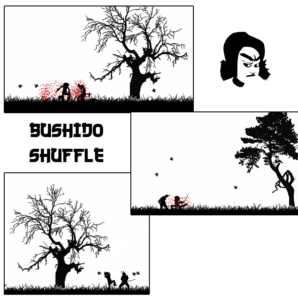
Haha, it was an experiment. I liked the idea that you are playing through comic, and that the blood could stick to the pages. I thought I'd see what people thought... I'm not sure about it myself, I think I agree with everyone else that it looks better just splattering the buildings (it's only 2 lines of code to change it back to doing that!).

Quote: "to emphasise the drawn style of it you should try using a sort of old parchment looking texture for the backgroud"

Thanks, that's an excellent idea! Kris is drawing all the comic book on some special paper, so maybe I'll get some references from that...?

Quote: "And maybe put some Ninja's in the game and some other martial arts weapons? Just a thought...
The sounds (environmental, personal,...) are nice, btw. Maybe add some acoustic japanese music?"

LOLs, yeah I should have said, while I'm coding the game I only ever use one enemy type (although it uses a typed array so adding more is easy). As soon as the engine is more complete I'll start adding more enemies, ninjas, monsters, etc etc.
I'm not going to be adding any other weapons. When you play, you'll see how closely the combat is linked to the player's weapon (and animations), Kenshi is a samurai, and as such he only uses a Katana.
But, yes, I totally agree with the music tip, I'm actually working with a couple of hiphop/dubstep producers to create the sound track, using elements of old kung-fu films, classical japanese and then modern hiphop and dubstep elements. Should be tasty!!

Quote: "I hope the gameplay is as compelling in pure 2D like that - I'm sure it is! "

Somehow I think it's better! The high/mid/low combat system makes much more sense here, and I feel like it has a (quite) unique visual style, so there is less of a feel that I'm trying to rip off another game (obvious comparisons were drawn with AfroSamurai).

Quote: "will all the levels be silhouettes? It seems to me it might be an idea to vary them a bit - maybe have some where you can see the features of the characters, some pure black and white like this, etc. Just an idea anyway."


hmm, well, the map in the video was just a style/media test. I think that some enemys may have some white highlights on their textures, and some of the buildings will have more detailed textures, but yes, I like the challenge of creating something that is monochromatic. Throws up interesting issues of design!! I think that kris will be hand drawing some of the scenery elements too, so this will certainly lend itself to the style, and maybe break the monotony of just black blocks!

Quote: "Also I agree that the sound is very, very good."

Well, thanks! I'm really pleased with it too!

Thanks for the feedback guys, as promised, there will be another demo at the end of this month! fingers crossed...

Peace and Sushi.
J

EDIT!!
Since the youtube video is hella pixelated, I wanted to upload some shots that were a little crisper!

I want robotic legs.

Attachments

Login to view attachments
Plotinus
15
Years of Service
User Offline
Joined: 28th Mar 2009
Location:
Posted: 12th Feb 2010 14:51
Those images look incredibly good.

Probably impossible idea: what if you could chop bits off the trees or other scenery objects?
Mazz426
16
Years of Service
User Offline
Joined: 4th Feb 2008
Location: Edinburgh
Posted: 12th Feb 2010 17:17
i see a lot of potential for inerexting scenarios in this, off the top of my head a play on hokasi's wave might be interesting, it looks superb well done
Butter fingers
18
Years of Service
User Offline
Joined: 20th Mar 2006
Location: Mecca
Posted: 12th Feb 2010 18:31
Quote: "Those images look incredibly good.

Probably impossible idea: what if you could chop bits off the trees or other scenery objects?"

Thanks , I hate how Youtube mutilates any kind of nice graphic work. and no it isn't impossible, I'm working on something like that at the moment!

Quote: "i see a lot of potential for inerexting scenarios in this, off the top of my head a play on hokasi's wave might be interesting, it looks superb well done"


Praise indeed, thank you. It's really funny that you mention that, because my flatmate was looking at this build and saying exactly the same thing. I'm thinking it could be totally awesome to have a "running away from a tsunami" level

I want robotic legs.
Green7
19
Years of Service
User Offline
Joined: 23rd Nov 2005
Location: Switzerland
Posted: 12th Feb 2010 21:20
Its a seldom thing these days, but I have to say that your work is really outstanding in design. its not one of those overused shader bling things, its a step "back" to what games are to me. reduced to the elements of fun with a good sense for detail, but not overloaded with unnecessary crap. just a game, just sit down and have fun.
MORE, PLEASE!

this piece of music came to my mind while I was watching your vid:
http://www.youtube.com/watch?v=Xtj4LhlcdDM

Green Gandalf
VIP Member
19
Years of Service
User Offline
Joined: 3rd Jan 2005
Playing: Malevolence:Sword of Ahkranox, Skyrim, Civ6.
Posted: 16th Feb 2010 12:32
Hi Butter fingers,

It's been a while since I looked at this. Just browsed through some of your videos. Looks like Bushido Shuffle has experienced several transformations in style - and they are all good. Seems a shame to lose them all. I particularly liked the severed bodies peeling apart in one of the demos - but that seems to have been lost now. I also liked the severed heads flying off in one of the other incarnations.

Any way of combining them all into one big game with a series of themes/styles/worlds?
Butter fingers
18
Years of Service
User Offline
Joined: 20th Mar 2006
Location: Mecca
Posted: 16th Feb 2010 15:50 Edited at: 16th Feb 2010 15:51
*head explodes*

Hey GG, thanks for checking in. Well, as usual I was making this with no real design document at all, just making things and generally fiddling. Partly because I've been working with other people on this, and partly because I'm learning my lesson about good design, I've been writing a design doc for the game. I want to release Bushido, and I want it to get finished and that means being realistic with what is going to be in the game. It is still VERY feature rich, and although they aren't neccessarily in the video, all the features and things you mentioned are still present in the current build (heads, splicing etc), and in my opinion, by refining the combat and combo system to make it more skill and rhythm based, pulling off those moves is harder but actually more satisfying. Before, as baxslash and a few others mentioned, the fighting was too loose, the player slid everywhere and it wasn't really clear how to pull off each move.

You guys might just have to trust me on this, I know it's simple, and it (visually) seems very minimal, but really Bushido is all about gameplay now, the graphic style might be super simple now, but the game is very rich in features, and there are loads of moves and abilities to discover and unlock. in terms of moves and deaths and animations and anything, nothing has been cut. Infact, there are more now than ever before, it's just that some of them are harder to pull off. I might do a Youtube video explaining how it works sometime soon...maybe tonight.... we'll see...

Thanks for the feedback though. It's really fantastic to feel like people are supporting/encouraging me to finish this!
Cheers
J

Oh, and Green7, I can't thank you enough for that comment, it was really, um... nice. Exactly how I want people to see the game!

I want robotic legs.
baxslash
Valued Member
Bronze Codemaster
17
Years of Service
User Offline
Joined: 26th Dec 2006
Location: Duffield
Posted: 16th Feb 2010 16:08
I can't wait to play it... I feel kind of like I did when tekken 4 came out and I wanted to learn all the ten hit combos!!

[childlikeglee]
I will become a master of this game when it eventually comes out, oh yes
[/childlikeglee]

Butter fingers
18
Years of Service
User Offline
Joined: 20th Mar 2006
Location: Mecca
Posted: 20th Feb 2010 17:00
*****VIDEO UPDATE*****

Ok, so here's another little update, and I think it's a pretty cool one. My housemate was playing through and was like "could you make it so I could run up the walls?"
So...
I added wall runs and wall jumps. I think it's going to really add alot to the platform side of the game. Lots more possibilities for jumping around.
Also, in Kris' concept art he drew Kenshi with a wicked kinda long cloth belt that flaps around as he moves. I've now added this to the player mesh too, and it moves kinda like cloth should, only without real cloth physics.

Check it out here, and let me know what you think!!


Please note, I build the level in like an hour just to test, so I do know that it looks crap!

I want robotic legs.
Plotinus
15
Years of Service
User Offline
Joined: 28th Mar 2009
Location:
Posted: 20th Feb 2010 18:10
That looks fantastic! Somehow the cloth belt really adds life to the character and makes the animations flow.

I especially like the way he crouches a little when landing from a long jump. Overall the animation of the character is really beautiful.

The wall running looks a lot of fun - I wonder if it might be good to make it only available for short periods, perhaps by requiring the use of some kind of energy that must be replenished, or something like that? That might add a bit of interest to the game.

Also, I know they were in before, but I think the blowing leaves look wonderful.
Butter fingers
18
Years of Service
User Offline
Joined: 20th Mar 2006
Location: Mecca
Posted: 20th Feb 2010 19:57 Edited at: 20th Feb 2010 19:58
Plotinus

Thanks dude. The crouch is new. He used to roll when landing from a long jump, but it was really annoying on small platforms - he kept falling off!

i'm really pleased with the belt too.. I think I'll use a similar effect for thing like flags or headbands on ninja enemies.

Quote: "The wall running looks a lot of fun - I wonder if it might be good to make it only available for short periods,"

ah, it's not evident in the video, because I haven't done a hud yet, but the jumps are limited.

When you are level 1 you have 9 jump points. Each move uses a different amount of that 9 points. Your points recharge to full when you touch the floor.
wall jump = 2 points.
flip/spin = 4 points.
wall run = 8 points.

so there is a fair amount of puzzling to do with navigating the levels.... I just make it look easy.

Quote: "Overall the animation of the character is really beautiful."
Thank you, I've spent alot of time on it, trying to make things look just how I want, and I think it has a consistent style to the movement...

I want robotic legs.
Darth Kiwi
19
Years of Service
User Offline
Joined: 7th Jan 2005
Location: On the brink of insanity.
Posted: 21st Feb 2010 18:22
Wow, I'm really impressed with how this has progressed, the whole thing looks wonderfully fluid. The wall jumps and wall running really add a whole new dimension to the potential of the levels, I think. The cloth belt (though it's a bit hard to see due to youtube) is also a cool addition.

Secretary of Unknowable Knowledge for the Rock/Dink administration '08
Butter fingers
18
Years of Service
User Offline
Joined: 20th Mar 2006
Location: Mecca
Posted: 21st Feb 2010 23:59 Edited at: 22nd Feb 2010 00:00
Thanks DK!
Well... it's been 24hrs since the last video and I pretty much didn't sleep...
so I have ANOTHER VIDEO UPDATE!!!

Yay hurrah!

Anyway, I've been adding alot more things to the game:

1) Loading character positions and checkpoints and spawnpoints from the editor

2) Speech Bubbles!! Only active from angry enemies at the moment, simply because they're the only ones I've made. I intend to have alot more variation and different comments depending on situations... think... "gurgle Gurgle" coming from guys with severed necks "aaaaaarrrrrggggg" from guys falling off ledges etc

3)A color gradient backdrop.. Really want to know what YOU think of this.. I'm still 50/50 on it. I kinda think it really adds to it. Would like to know thoughts. This is THE ABSOLUTE MAXIMUM of color I would have in the game SO PLEASE DONT SUGGEST MORE! but I would like to know if people prefer this or the last version, just B&W

4) Jump puzzles. So you have to look at gaps and alleys and so on and be like - "ok so thats a wall run and a leap and a bounce to get up that", your stamina is limited, so you can only do a certain number of moves before having to land.

Think that that's about it. Would love to hear what you think. I've been working really hard on this for probably about 18 hours in the last 2 days, and I hope it's been worth it!!

FOR ALL THOSE WHO JUST SCROLL LOOKING FOR LINKS:
*******************************************************************
*****************************************************************
***************************************************************
ANOTHER VIDEO UPDATE!!!
***************************************************************
*****************************************************************
*******************************************************************

I want robotic legs.
Hassan
15
Years of Service
User Offline
Joined: 4th May 2009
Location: <script> alert(1); </script>
Posted: 22nd Feb 2010 10:02
hello butter fingers

this game is really cool! i've just seen the vid, pretty awesome

but, i noticed something, in most games, when the character jump, he can move while he is in the air, this is not supposed to happen, it should be like, while you are moving to the right for example, then you jump, the jump's direction should be to the right, and you shouldn't be able to move left while jumping, if you are stand still, and then you jump, your movement in the air should be slight, etc.
also, when you jump at the wall, then move upwards, can the character keep moving forever? if so, this should be limited.

i really like when the character jumps from wall to wall to climb building, reminds me of prince of Persia , and chat bubbles looks cool

and, i noticed some enemies moving while their position isnt changing, they look really stupid, i see that this happens when there is another enemy in front of him, i think you should make a solution for this, for example, he jumps to go to the other side, so they both ( enemies ) can hit you, one from each side?

Jimpo
19
Years of Service
User Offline
Joined: 9th Apr 2005
Location:
Posted: 22nd Feb 2010 20:57
The chat bubbles come and go too slowly, instead of popping up fast. Something like "Get him!" loses its effect when the bubble gradually makes its way to the screen.

Butter fingers
18
Years of Service
User Offline
Joined: 20th Mar 2006
Location: Mecca
Posted: 22nd Feb 2010 21:02
Hey Hassan,

Thanks for the feedback, much appreciated. Glad you found the thread!

so...

Quote: "when you jump at the wall, then move upwards, can the character keep moving forever? if so, this should be limited."

LOL, a few people have asked this, and yes they are limited. In the post above yours is a better description of how it works in point (4)
Like I said, I make it look easy be because I know where to go and what to do, my housemate had a nightmare on some of the trickier bits! It's pretty challenging.

Quote: "when the character jump, he can move while he is in the air, this is not supposed to happen,"

Ok, so this is a good bit of crit, and kind of a tough one to answer, because this has been a part of the movement engine that I keep changing.
First of all, you need to remember that Kenshi is super human, he can run up walls and slow down time, so hey why can't he turn in mid air too?! But that's kind of an easy way out.

In reality, the game is very hard, and very annoying if you can't "turn back" from a bad jump. I've tweaked the system so that you can turn while you are rising, but once you are falling you cannot.
So it's forgiving enough to aim your jump, but a fall out of a wallrun/jump is uncontrollable. I'm still playing with it though. I want to add momentum to the physics so that speed affects distance of jump like you said. I think that'll be really important.

Quote: "i noticed some enemies moving while their position isnt changing, they look really stupid, i see that this happens when there is another enemy in front of him,"

Well spotted. Yes, it's not final. I just haven't done an idle animation for the enemy yet. Once that's in it will look fine. I like the jumping idea, but not with these guys - their armour is too heavy for that - once the engine is more complete I'll add other enemies, like ninjas, and they'll definately do that kind of stuff.

Thanks again for your comments, they're very useful, and well observed.
Cheers
J

I want robotic legs.
Butter fingers
18
Years of Service
User Offline
Joined: 20th Mar 2006
Location: Mecca
Posted: 22nd Feb 2010 21:03
Quote: "The chat bubbles come and go too slowly, instead of popping up fast. Something like "Get him!" loses its effect when the bubble gradually makes its way to the screen."


Agreed, and nice one. I'll add a variable that changes the speed depending on the emotion. (shouts faster, death whimpers slower..)

I want robotic legs.
Happy Cheesecake
15
Years of Service
User Offline
Joined: 16th Jun 2009
Location: My non-vice-presidential refrigerator.
Posted: 22nd Feb 2010 21:43 Edited at: 22nd Feb 2010 21:48
Wow, you really have something great going on here. I have a few things I want to say, though, so bear with me.

1) I noticed when the main character was running his clothes made a ruffling noise. This is an awesome effect but I noticed it pretty quickly, maybe you should make it lower in volume.

2) I noticed that the main character goes from idle > Full speed without hesitation. If you're going to implement jumping distance according to how fast the main character is going, there should be acceleration in there somewhere, don't you think? You're probably already working on this as I type, though.

3) Small thing here, when the enemies were dying, sometimes they shouted something like "Get him!" and there wasn't anybody else on the screen. Looked kind of... awkward.

4) Instantly decapitating enemies is awesome. Please don't change that because it's the coolest thing about the game.

5) Sometimes it was hard to tell in the video whether you were going to jump inside of a corridor or just hit a wall in mid-air. With the black and white stylization you have going on, it's hard to determine openings in the wall that you can jump through for me. I imagine this will be a huge aggravation while playing the game because during a level you could just be moving along, happy as a clam, and just jump right into a wall thinking you'll make it through. Is there some kind of tell-tale sign that warns you whether it's a wall or not? If there isn't then maybe you should think about adding it.

[Edit] Never mind, I noticed small white strips indicating an opening in the wall. These would be very hard to see, though, if you didn't keep the pink backdrop, which I like very well.

6) While there was very few enemies on the screen at once, I noticed that you'd just stand still for a second and they'd start hacking and slashing midair until interrupted by a katana to the face. This is alright during the beginning levels, I think, but the ninjas will be far more precise with their attacks, right?

7) I noticed the camera zoomed in and out depending on what the main character was doing. That's a fantastic effect! Zoomed in on combat and zoomed out on travel - I like it! But, is this automatic or manual? An option to make it manual for more advanced players would probably be a good idea.

8) Sorry for the rant, and please finish this game, I'm excited about seeing this done, polished, and ready for action!

Login to post a reply

Server time is: 2024-11-23 12:22:58
Your offset time is: 2024-11-23 12:22:58