Sorry your browser is not supported!

You are using an outdated browser that does not support modern web technologies, in order to use this site please update to a new browser.

Browsers supported include Chrome, FireFox, Safari, Opera, Internet Explorer 10+ or Microsoft Edge.

Author
Message
Locrian
19
Years of Service
User Offline
Joined: 21st Nov 2005
Location: Burton Mi.
Posted: 18th Sep 2006 02:28
Well I figured I'd start a thread to keep a kind of tally of some of the media(some we wont show till game time) in a game I'm working on along with s4real, at this point. FPSX isn't the title but I didn't want to release the name yet. Though I'm sure this will take him and I and others if we pick them up,a wile it'll be kinda nice to look at the comments and changes along the way.

Well to start this off, I think we'll post s4's and myself first collaborative effort on a character.

Char name is Hiem...Hes the bouncer for the one of the first sections your in which is a strip club.( I promise mods....no girly pics). Had to redo his animations a little to accommodate for his size. Mainly the idle and running. Being a lil overweight as he is the standard idle animation along with others, placed his arms into his sides.

Butter fingers
18
Years of Service
User Offline
Joined: 20th Mar 2006
Location: Mecca
Posted: 18th Sep 2006 02:34
yay. fat ugly dude! Does he have the "chest shove" and "check the guest list" animations yet?! lol

I like the mesh, but I dunno, I think perhaps the line between his vest and his arms is too harsh, perhaps a little darkened shading to the skin underneath?! But seriously, very nice work.

Butters

PS. Dude, I'd be interested in doing something on your project if theres a slot. I could do with a break from my projects!!

Locrian
19
Years of Service
User Offline
Joined: 21st Nov 2005
Location: Burton Mi.
Posted: 18th Sep 2006 03:01 Edited at: 18th Sep 2006 05:15
Thinking about it for a second and looking it up on google only 3 listing come up for the name "SinninSoul", and all were sections of sites I run off the out-lawz server. In an attempt to date my future release so the name isn't scooped out from under me I guess I will release these desk tops that will be distrubuted on the site we make for it. The first is menu screen. The second is the loading screen.

Know that making these public in no way conveys its use in renders or other projects not associated with 3dDesign.out-lawz.com or it's parent www.out-lawz.com. They may be used and are intended to be desktops for the promotion of the Out-lawz product.
All Images are registered to LOCEDOUTCOM 14-613689 with Digimarc Software.


@ButterFingers

Man PM me on my site or contact me on aim on the SN "LOCEDOUT Com"
FredP
Retired Moderator
18
Years of Service
User Offline
Joined: 27th Feb 2006
Location: Indiana
Posted: 18th Sep 2006 04:17
Cut scenes
18
Years of Service
User Offline
Joined: 12th Jul 2006
Location: Never leave your back to a door...
Posted: 18th Sep 2006 04:19
WOW Also these look like perfect dark zero.

"People are easier to search when they're dead."--Captain Barbosa
Cut scenes
18
Years of Service
User Offline
Joined: 12th Jul 2006
Location: Never leave your back to a door...
Posted: 18th Sep 2006 04:20
Hey wait strip club level thats perfect dark zero all right.

"People are easier to search when they're dead."--Captain Barbosa
Candle_
18
Years of Service
User Offline
Joined: 29th May 2006
Location: kindergarten
Posted: 18th Sep 2006 04:30
Locrian
19
Years of Service
User Offline
Joined: 21st Nov 2005
Location: Burton Mi.
Posted: 18th Sep 2006 04:44 Edited at: 18th Sep 2006 05:12
Yeah poser/3dmax. I use poser to make all my faces on my game chars too. I put any poser 6 figure in the face room and morph it till it looks non stock then do a render. I then use that image on my low poly model and blend in the skin tones. This keeps me having different faces without having to take pictures of people to get photo realistic textures. I'm also not using the texture that poser used so it keeps me outta trouble since tone/shape/shadowing is all different. Plus by time stuffs blended it so different from the original there no telling. Oh and the cool skin tones you see in the close up of our star is done with a python script from a guy named FaceOff on Renderocitys forums....think I paid like 15$ for it but it guaranteed there is never ever another body texture like mine in an image because the freznel is calculated off the lights and not any texture.

Oh dark zero has a strip club?...heh oh well...my game will be different I'm sure. Never played dark zero but I looked it up and I can see some comparisons to the first image...the bust kinda deal...I see shes got kinda chopped hair but really this is the same char I did for Weapon Creator with a different outfit. But if you look on my site from 2 years ago I've been using that view where ya see the woman head as allot have for years...thats really where the similarities end.
Candle_
18
Years of Service
User Offline
Joined: 29th May 2006
Location: kindergarten
Posted: 18th Sep 2006 06:05
I use poser too.

Locrian
19
Years of Service
User Offline
Joined: 21st Nov 2005
Location: Burton Mi.
Posted: 18th Sep 2006 10:29 Edited at: 18th Sep 2006 10:31
Well...part of a bathroom got done tonight. Though it looks like the free tubs mesh thats free around here you may notice this one fits inbetween a segments walls. Its also about 1500 tris/polys less then the one around here and has no backs and bottoms. You can also get in this one(not that youd want to), and not to let on to much but later in the game a main NPC is found dead in it. I thought about using the free one then said screw it...its to many polys...so used it for a reference. The texture was done fully by S4real.....by the way s4....as ya see sink and mirror are ready for ya. The sink and mirror act like signs to and attach to the wall at point 0.

FredP
Retired Moderator
18
Years of Service
User Offline
Joined: 27th Feb 2006
Location: Indiana
Posted: 18th Sep 2006 12:12
That looks cool.I'd like to have that sink,too.

Butter fingers
18
Years of Service
User Offline
Joined: 20th Mar 2006
Location: Mecca
Posted: 18th Sep 2006 13:38
can I see a shot of the inside of the bath? Other than that... very nice work.

Jon Fletcher
19
Years of Service
User Offline
Joined: 7th May 2005
Location: Taunton, UK
Posted: 18th Sep 2006 13:57
thats some REALLY nice graphics locrian!


Locrian
19
Years of Service
User Offline
Joined: 21st Nov 2005
Location: Burton Mi.
Posted: 18th Sep 2006 19:22 Edited at: 18th Sep 2006 19:57

@ Butter Fingers
Theres a shot from inside the tub Butter. Also I may note that this is only one uvmap where the other tub was 3 I belive. Not sure if ya seen but contact me on aim or whatever.
@Fred
What Im thinkin fred is If I can ever get this made and sellable Id sell the entities useage as well(market it 2 ways as a game and media). A majority of stuff in heres going to be custom because Im just not satisfied with some things I see. Even the things I do use from the forums or from the stock FPSC are all retextured as nothing is textured how I want it. Even as good as SignsIII is for making overlays I've made up a template for making wall/ceiling/floor overlays that are considerably less weight to the system. This way I can add variations to any surface with more control then with signs. I can place any graphic anywhere unlike signs thats kinda centered and allot more work to position in odd places and I don't get the streching that signs can do. So basically from the floor its all custom media
@Jon
Thanks for the comment but S4 is all that on the tub. I didn't do one thing to his final texture, but I also sent it back twice saying it wasnt right or didnt like this.....Im sure s4 is soooo happy he decided to work with me...lol
Locrian
19
Years of Service
User Offline
Joined: 21st Nov 2005
Location: Burton Mi.
Posted: 23rd Sep 2006 07:54
Well Since ya liked the sink Fred figured we'd give ya a look see with a texture on it......Im thinkin Comet and some elbow grease huh?
Reality Forgotten
FPSC Reloaded TGC Backer
18
Years of Service
User Offline
Joined: 28th Dec 2005
Location: Wichita Falls TX
Posted: 23rd Sep 2006 08:02
very nice!
FredP
Retired Moderator
18
Years of Service
User Offline
Joined: 27th Feb 2006
Location: Indiana
Posted: 23rd Sep 2006 08:19
Very nice indeed...could use a little Comet though...

Reality Forgotten
FPSC Reloaded TGC Backer
18
Years of Service
User Offline
Joined: 28th Dec 2005
Location: Wichita Falls TX
Posted: 23rd Sep 2006 08:20 Edited at: 23rd Sep 2006 08:20
I think a blow torch would have a better chance of cleaning that mess.


RF
Walking Dead Productions
18
Years of Service
User Offline
Joined: 6th Apr 2006
Location: USA
Posted: 23rd Sep 2006 08:20
Wow, looking good!

IxiPRO
18
Years of Service
User Offline
Joined: 24th Jun 2006
Location:
Posted: 23rd Sep 2006 09:06
Wow! Looks fretty good

Hi all, i am IxiPRO. FPS Creator is
Locrian
19
Years of Service
User Offline
Joined: 21st Nov 2005
Location: Burton Mi.
Posted: 23rd Sep 2006 17:56
Thanks for the comments guys. I think the biggest thing for S4 and myself to overcome is the differences in styles and making items seem very continuous and similar.

The tub was all done by S4 and the sink was mainly done by me. In an attempt to make S4 as much a part of the sink as myself I used the product of a tutorial I gave S4 over AIM on how I make old painted wood textures. I used the image he sent me back to look over to see if we were on the same page and doing similar things. So saying this, it's taking us a little time to gel together as a team but I think it's coming out well. This is certainly an exercise in working with others and something neither S4 or myself have ever done.
Steam Assassin
19
Years of Service
User Offline
Joined: 21st Sep 2005
Location: behind you...
Posted: 24th Sep 2006 05:09
Everything looks very good! Keep up the great work, Locrian!


I used to have one of those signs, but then realized how annoying it was...
Butter fingers
18
Years of Service
User Offline
Joined: 20th Mar 2006
Location: Mecca
Posted: 24th Sep 2006 13:51
dude, I could get in touch through your site, it made me make an account then told me I didn't have one. Could you drop me an email, then I 'll be able to get back in touch!

I really like the look af this, and as I said, if you want another pair of hands to get stuff done, "I'm down" as the hiphop posse would say.

butters

Locrian
19
Years of Service
User Offline
Joined: 21st Nov 2005
Location: Burton Mi.
Posted: 24th Sep 2006 19:28
Well I sent ya an email...hope it makes it to ya. We do need to get your site problem worked out though as thats kinda where s4 and myself keep our to do list and game related items in a hidden section. If your having a problem send me an email saing what you want your name and pass and Ill create it then you can change the pass once inside. Only thing I can think of.

Hope the email makes it to ya, my last one was never answered.
Lukeirado
18
Years of Service
User Offline
Joined: 20th Sep 2006
Location:
Posted: 24th Sep 2006 21:36
Looking good, huh!?

Is it going to be free?

"My life flashed through my eyes... It was really boring."
Cut scenes
18
Years of Service
User Offline
Joined: 12th Jul 2006
Location: Never leave your back to a door...
Posted: 24th Sep 2006 22:33
Wow coming along nicely.

"People are easier to search when they're dead."--Captain Barbosa
s4real
VIP Member
18
Years of Service
User Offline
Joined: 22nd Jul 2006
Location:
Posted: 24th Sep 2006 22:35
This is all new for me and loc and we are getting a good working team, im getting to learn new things which i feel is making this project better and better.

@butter fingers : Hope you get ya account sorted on loc site.
Locrian
19
Years of Service
User Offline
Joined: 21st Nov 2005
Location: Burton Mi.
Posted: 24th Sep 2006 22:43
Thanks for comments.

Luke, what I think I'll do is give one version out free that media cant be extracted from easily and another in the folder system used by FPSC thats pay for. This way if your just wanting to play the game it's free...and if you want use of the media it cost. This I feel will fit into everyones wallet. Since the only pay for pack I own is Keiths all I have to do is not use keiths .x files in the pay for version. The rest of the objects are either custom(for the most part) or freebies offered here on this forum with different textures.
Locrian
19
Years of Service
User Offline
Joined: 21st Nov 2005
Location: Burton Mi.
Posted: 25th Sep 2006 09:21
Well. Current project goodie time. Setting being placed slightly in the future but not space age, means pretty much all the weapons that come with FPSC are useless to me. This will be our stars main gun. The Cleric-t30(soon to be renamed) from the movie Equilibrium. Being there's no real good images of this there's enough differences to keep me out of court I believe. Really all that can be confirmed is the slope on the front of the barrel. And even that's probably not 100% accurate.

It weighs in a lil heavy in the 1300 tri range but this is also with 2 hands/the animated slider/animated hammer/magazine/and a shell that's kicked out after each discharge. It's still around character range so I'm not going to really fret the tri count. I could have made the hands allot less polys but all the hands I've seen on the forums really lack a natural look to them. Being there so close to the player and seen so well and up close I've opted for the larger count and have nickel and dimed other things in the game to make up for this.


Locrian
19
Years of Service
User Offline
Joined: 21st Nov 2005
Location: Burton Mi.
Posted: 8th Oct 2006 08:44 Edited at: 8th Oct 2006 08:52
Well been a wile since I posted this thread. Still need to make my pick ups and hud for this but heres a low grade movie of the T30 in action. Video really don't do it justice...oh well. Heh 15 frames a second isn't even catching all the reload or cocking animations......Bahhhhh

http://www.youtube.com/watch?v=d5MfUvdlbto
Errant AI
18
Years of Service
User Offline
Joined: 24th Aug 2006
Location:
Posted: 8th Oct 2006 09:00
Did you shorten up the barrel weight or does it just look that way from FPSCs camera? Machine pistols are fun
Zaibatsu
18
Years of Service
User Offline
Joined: 1st May 2006
Location: Lost in Thought
Posted: 8th Oct 2006 09:04
what happened to your feamle pack?

_Ken sent me
Locrian
19
Years of Service
User Offline
Joined: 21st Nov 2005
Location: Burton Mi.
Posted: 8th Oct 2006 09:05 Edited at: 8th Oct 2006 09:09
@Errant
Nah it's same size as the max views. Im kinda not liking the way it looks when holding it....it lost it's size untill it turns sideways a little.

@Zai
Man so many people have packs out I kinda put it on the back burners. May have been the fact no one ever post unless theres a problem ,but wasn't generating enough interest to be worth my time. I've still got um all and may continue it later but right now I'm more consumed with items for my own games. I don't really need the money but times a little short.
stormboy
19
Years of Service
User Offline
Joined: 8th May 2005
Location:
Posted: 8th Oct 2006 10:59
Nice work and good descriptions of the process.
Locrian
19
Years of Service
User Offline
Joined: 21st Nov 2005
Location: Burton Mi.
Posted: 16th Oct 2006 23:52
Well time to add on to this thread. Here we see 'Stormy' a character from SinninSoul. I may add a dancing animation later but for now I'm just trying to crank out as much media as I can comfortably. For now I used Bond1's sexy bip, for which I'd like to thank him again for releasing.

Heres a front view which is pretty tame. Even bonds bikini girl shows more from the front.


Ahh, but then we have the stripper in her natural enviroment. Parts of this have been covered up for obvious reasons.

bond1
19
Years of Service
User Offline
Joined: 27th Oct 2005
Location:
Posted: 17th Oct 2006 00:09
Nice stuff there Locrian.

One thing though, beware of using that "idle" animation in the sexy biped. When testing my own pack, longer animations REALLY chew up the framerate. So if you end up using the biped just be aware of that if there are lots of other characters around.

I ended up changing it back to the stock idle animation for Model Pack 4, but the longer custom one is still embedded in the female characters, for enterprising/adventurous users.

From reading some white papers on Nvidia's website, vertex transformations factor VERY heavily on framerate, even more so than poly count, so if you do end up using a dance animation, it might be wise to keep the loop short.

----------------------------------------
"Your mom went to college."
My FPSC stuff at http://www.hyrumark.com
Locrian
19
Years of Service
User Offline
Joined: 21st Nov 2005
Location: Burton Mi.
Posted: 17th Oct 2006 00:18 Edited at: 17th Oct 2006 01:26
Yeah for the dance stuff I thought about just leaning her against the pole and 'shakin that thang' back and forth. The fact it's an idle would animate the head looking back and forth.

Yeah I noticed you didn't call for the animations in the fpe. It is quite long(300+ frames). But for now it looks better then the stock idle that makes her look like shes trying to be all "buck". Didn't care for the look of a stripper that looked like she wanted to kick my butt. Take my money fine but don't hurt me......
Jon Fletcher
19
Years of Service
User Offline
Joined: 7th May 2005
Location: Taunton, UK
Posted: 17th Oct 2006 00:34
nice stripper


Errant AI
18
Years of Service
User Offline
Joined: 24th Aug 2006
Location:
Posted: 17th Oct 2006 00:40
ohlala. Very nice, Loc. Well done!

You're makin me want to model character's now. Yargh.
bond1
19
Years of Service
User Offline
Joined: 27th Oct 2005
Location:
Posted: 17th Oct 2006 00:42
Quote: "But for now it looks better then the stock idle that makes he look like shes trying to be all "buck"."


Lol! Yeah you nailed it...

----------------------------------------
"Your mom went to college."
My FPSC stuff at http://www.hyrumark.com
Locrian
19
Years of Service
User Offline
Joined: 21st Nov 2005
Location: Burton Mi.
Posted: 17th Oct 2006 01:30
Errant you stay away from making characters....You hear me?....I've bout had enough of you and your skillz.
Kidding aside:
Thanks for the comments you guys.
Errant AI
18
Years of Service
User Offline
Joined: 24th Aug 2006
Location:
Posted: 17th Oct 2006 01:47
ok ok LOL. Maybe I'll PM you to try to persuade you to horse-trade me a copy of .x for something. I need a sassy opperator to model VWEAPs once I start building them.

This game looks like it's going to be fantastic. Can't wait to see what else you guys come up with!
Locrian
19
Years of Service
User Offline
Joined: 21st Nov 2005
Location: Burton Mi.
Posted: 17th Oct 2006 01:57
Oh yeah that can definitely be done. Set ya up with the uvmap/texture/model. We can work it out when ever the time comes if you still need her.
Errant AI
18
Years of Service
User Offline
Joined: 24th Aug 2006
Location:
Posted: 17th Oct 2006 02:04
Smokin! Das how we roll.
Errant AI
18
Years of Service
User Offline
Joined: 24th Aug 2006
Location:
Posted: 19th Oct 2006 12:45
Loc-

I sent you an email. Might have gotten thrown in the spam pile though so I thought I'd you a heads-up here. I know you're busy, so get back to me when you can.
Locrian
19
Years of Service
User Offline
Joined: 21st Nov 2005
Location: Burton Mi.
Posted: 19th Oct 2006 19:13
Errant I must of checked my email before you sent yours.
You know since this character was never going to hold a weapon as shes more a NPC I'd never actually tested her with anything.

I'm pleasently suprized to say she dose as well if not better the the stock FPC characters. I think you know first off that some of the deformities come from the bip animations that are used. But there are problems that I must note that arent present in my model that are present with the Akio model used here for comparison.

The first image notes many weapons. In the next two images note the areas circled on the akio model then look at the same area on the stripper. You'll notice the verticies are better grouped with the right parts of the bip. I know my model is larger then the stock figures in these images but thats because for my game I'm going to be running models at 100% of their scale. A wall when built is 8'1,1/8". This allows for the 92.5/8" stud and a sole plate(1,1/2") and two top plates(3"). I feel at 100% that it's closer to how a character would look standing next to a wall. This as you know, is easily changed but I didn't do it for this comparison.


As for what I'd want well make me an offer over email. I'm sure I can find it in my heart to trade one of my piece of crap models for your masterpieces if I must.
Mr Love
19
Years of Service
User Offline
Joined: 9th Jun 2005
Playing: MAFIA 2
Posted: 19th Oct 2006 19:18
The second screenie looks really nice, and funny as well...


I want to see a FPSC Professional! And lets make it REALLY expensive this time......
Errant AI
18
Years of Service
User Offline
Joined: 24th Aug 2006
Location:
Posted: 20th Oct 2006 00:02
Nice work Loc! Email inbound in a 20 or 30 mins. Hope we can work something out. Crap model my asp.

I hear ya on the scaling thing. Personally I've been changing characters to 90% so they feel in scale relative to the player. Like you imply its a 2 sec alteration.

Deformation is definately MUCH nicer in those two "problem" poses. I'm also diggin the thumbs in lieu of the nubbins. Poor Aiko looks like she was in a car accident when holding a pistol or rifle.
Locrian
19
Years of Service
User Offline
Joined: 21st Nov 2005
Location: Burton Mi.
Posted: 14th Nov 2006 18:35 Edited at: 14th Nov 2006 19:32
Well, time to post something so this thread dose not die a horrible death of inactivity.

It's hard to post much with the upcoming contest cause who wants to show off their wares and give people ideas. I guess posting my W.I.P of this gun is a safe bet cause I'm sure most are using Jons pack or they're making guns themselves.

Well, 207 layers of 100% hand painted, no cropping, work later and 2 days time, all I have to show for it is the frame and the slide textured with much more to go. Any comments are welcome. Tear it apart if it's your opinion. Being this is going to be the gun in my game that all the variants are based off of( like having a light, scope,laser, etc as she finds them in the game) it's important I get it right.

So with saying all that: Blast away at the comments!
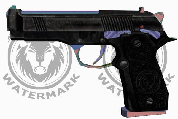


*note* the type on the slide notes this as the 3DD-Berletta to get me out of any copyright infringement. Also wanna note that I use no lighting/specular/bumpmaps, in any of my images to try and get a "better look" to the renders. I hit F9 and let it flow so you can see it in it's most raw form.
Loc
Luke314pi
18
Years of Service
User Offline
Joined: 11th Apr 2006
Location: Minneapolis, MN
Posted: 14th Nov 2006 18:39
Excellent model and texture work!

Login to post a reply

Server time is: 2024-11-25 20:26:54
Your offset time is: 2024-11-25 20:26:54