Sorry your browser is not supported!

You are using an outdated browser that does not support modern web technologies, in order to use this site please update to a new browser.

Browsers supported include Chrome, FireFox, Safari, Opera, Internet Explorer 10+ or Microsoft Edge.

Work in Progress / Meteor Showdown

Author
Message
The Nerd
20
Years of Service
User Offline
Joined: 5th Jun 2004
Location: Denmark
Posted: 1st Dec 2007 03:34 Edited at: 13th Dec 2007 22:46
Hi all!

Small update

The games name have been changed to Meteor Strike

----------

So it's been a while since my last game project(see my signature for more details), and I figured it was that time again where a new one had to be done

I've been working for this little game now for a week or so. Anyway, moving on to the game. So as the thread-title suggests, the game is called Meteor Showdown, and luckily for a reason.

Quick overview of the current most important features and game mechanics:
New models for each cannon upgrade so you'll be able to see your new purchase visually!
The game will increase the difficulty as you play along(faster meteors, bigger meteors and smaller meteors included)
Two different upgrades for your tank, cannon speed and tank speed
The use of DarkPhysics. When you destroy a meteor debris will be sucked down towards the planet
Effects such as explosions added

Concept
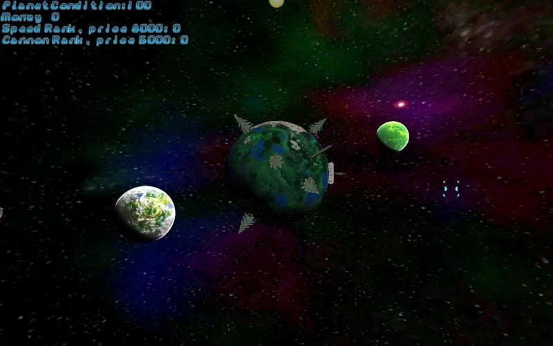
The concept of the game is pretty straight forward... you have an overview of a planet, and on the planet there's a tank that you can control around in 2D style movement. If you're not quite sure what I mean the screenshots should give you an idea Anyway, so you drive around on this planet with the tank and basically you have to shoot down incoming meteors before they hit the planet and do damage to it. Too much damage, and you lose. As you progress the game will become increasingly harder, meaning more meteoers, faster meteors, smaller meteors, bigger meteors.

But of course you wanna be able to have a chance of surviving as long as possible to get a high score, so far the game has 2 different upgrades to your tank to help this problem. There's a different number of ranks to each upgrade, and so far the two different upgrades to your tank can either make your cannon shoot faster(really helps in situations with a big number of incoming meteors! Also, there's a new cannon model for each upgrade!), and then there's an upgrade to get your tank moving faster(really useful with meteors going faster and faster, you want to be able to make it all around the planet to shoot down them all!). This also adds another aspect to the game, which is that through the progress you'll have to balance your upgrading... if you only upgrade your cannons speed sure it'll shoot fast, but with faster meteors you'll never be able to make it all around the planet to shoot down them all, and on the other hand if you have a fast tank but a slow cannon you won't be able to keep up the shooting as an increasingly army of meteors will strike down. You purchase new ranks of the upgrades through money earned by shooting down meteors. Also, if a meteor hits earth it'll cost you money, too.

Also, when you destroy a meteor debris will fly from it and be sucked down towards the planets graviation field.

Here's some screenshots of the game:

Updated graphics
Here's screenshots showing the new graphics as the development progress goes. Thanks to tha_rami for planets, menu buttons and planet textures and thanks to Scraggle for the font:

Just a small render:


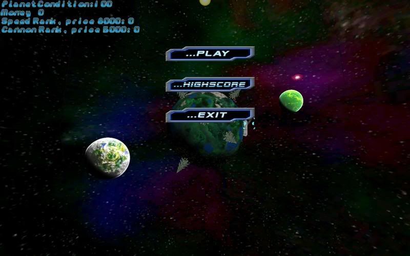
The menu

Actual gameplay

Logo render(thanks to tha_rami):


If you want to see screenshots of the older versions of the game, here's some direct links to them:
http://i20.photobucket.com/albums/b201/catnerd/Rank5.jpg
http://i20.photobucket.com/albums/b201/catnerd/incoming1.jpg

Here's a video of the gameplay that I recorded a while back, please note that this recording is of early gameplay and things have changed since then, such as adding models for bullets etc. The quality is pretty bad, but you should be able to get the whole idea of the gameplay through it:
http://www.youtube.com/watch?v=sSjLqhIHzCA

So far there's no demo out, I still have to tweak and fix a few things Balancing a game like this really takes some effort!

I hope you like what you see so far, and I'll update this thread with changes and addition to the game as I progress.

Feel free to leave a comment

Also, I would like to thank Scraggle for the wonderful fonts, and I also want to thank Aura for the music that is used in the game.

Cheers.

Satchmo
19
Years of Service
User Offline
Joined: 29th May 2005
Location:
Posted: 1st Dec 2007 04:22
I like it, really cash n' slash type of a game.

tha_rami
18
Years of Service
User Offline
Joined: 25th Mar 2006
Location: Netherlands
Posted: 1st Dec 2007 05:53
I indeed do like what I see, although I think either the background looks too real for the rest or the planet looks to cartoony for the background.

Besides that, it looks like a fun, playable pull-your-hairs out game. Nice .


A mod has been erased by your signature because it was larger than 600x120
The Nerd
20
Years of Service
User Offline
Joined: 5th Jun 2004
Location: Denmark
Posted: 1st Dec 2007 11:21
Thanks for the comments

Quote: "although I think either the background looks too real for the rest"


Yeah, I really think it's the background as I've found that the meteors fits nicely, so I'll have to change that.

Mnemonix
21
Years of Service
User Offline
Joined: 2nd Dec 2002
Location: Skaro
Posted: 1st Dec 2007 13:16
Do you get a shotgun in this game?

TheSturgeon(playing me at chess) : I will use my powers of the horse and pwnzor you.
The Nerd
20
Years of Service
User Offline
Joined: 5th Jun 2004
Location: Denmark
Posted: 1st Dec 2007 13:21 Edited at: 1st Dec 2007 13:47
Quote: "Do you get a shotgun in this game?"


As I've told you countless of times over MSN, you will never be able to hold or have a shotgun It's illusion(for others.. this is an internal thing... so don't bother)

Anyway, so I've been working a bit on the game and I've thrown in some planets in the background, hehe:


And another sceenshot of me in some more trouble:


I've also been tweaking the difficulty a bit so it's harder to get your hands on the upgrades(you now get less money when shooting a meteor, and the price for the ugprades have been increased). Altough it still is possible to get a fully upgraded tank, but now there's a bit more excitement in between that

And the thank goes to Scraggle again for the wonderful background planets.

Mnemonix
21
Years of Service
User Offline
Joined: 2nd Dec 2002
Location: Skaro
Posted: 1st Dec 2007 13:25
Why is every shotgun I find an illusion

TheSturgeon(playing me at chess) : I will use my powers of the horse and pwnzor you.
Zotoaster
19
Years of Service
User Offline
Joined: 20th Dec 2004
Location: Scotland
Posted: 1st Dec 2007 14:53
This is really coming together quite well, and I love the style!

"It's like floating a boat on a liquid that I don't know, but I'm quite happy to drink it if I'm thirsty enough" - Me being a good programmer but sucking at computers
Mr Tank
21
Years of Service
User Offline
Joined: 25th Nov 2002
Location: United Kingdom
Posted: 1st Dec 2007 15:12
This looks really cool. Wish i could play it now.

SUPER BADASS SPACESHIP X: WEBSITE
FORUM TOPIC
The Nerd
20
Years of Service
User Offline
Joined: 5th Jun 2004
Location: Denmark
Posted: 1st Dec 2007 15:33
Thanks for the comments all Hopefully I'll be able to have a demo out later today.

tha_rami
18
Years of Service
User Offline
Joined: 25th Mar 2006
Location: Netherlands
Posted: 1st Dec 2007 16:23
Lol. I hate LunarCell stock planets. They always look the same, heck.

Know what, if you're interested, I could do you some planets and a nebula. Why are you using a skysphere for the background, BTW?


A mod has been erased by your signature because it was larger than 600x120
The Nerd
20
Years of Service
User Offline
Joined: 5th Jun 2004
Location: Denmark
Posted: 1st Dec 2007 16:26 Edited at: 1st Dec 2007 16:29
Quote: "
Know what, if you're interested, I could do you some planets and a nebula"


Sure, wouldn't say no to that hehe.

Quote: "Why are you using a skysphere for the background, BTW?"


Skysphere in a 3D space makes sense I think. Besides, I like skyspheres better than skyboxes when it comes to things like this.

The Grim Reaper
17
Years of Service
User Offline
Joined: 29th Sep 2007
Location: USA
Posted: 1st Dec 2007 16:46
Looks awesome
tha_rami
18
Years of Service
User Offline
Joined: 25th Mar 2006
Location: Netherlands
Posted: 1st Dec 2007 16:54 Edited at: 1st Dec 2007 16:55
But they are far harder to create, and as I'm getting the feeling your camera and angle are static, a plain could do as well - and that's much easier to make, lol.

Want me to do the front planet too? I think that one looks rather good. Although I just noticed a transparency artefact. And get the lightning correct - lol, there's one sun most likely, and it'll light all planets from the same direction.


A mod has been erased by your signature because it was larger than 600x120
The Nerd
20
Years of Service
User Offline
Joined: 5th Jun 2004
Location: Denmark
Posted: 1st Dec 2007 17:00 Edited at: 1st Dec 2007 17:01
Quote: "But they are far harder to create, and as I'm getting the feeling your camera and angle are static, a plain could do as well - and that's much easier to make"


Yes, but luckily I didn't spend any time making the sky sphere, I just borrowed one from an included darkmatter modelpack

Quote: "Want me to do the front planet too? I think that one looks rather good. Although I just noticed a transparency artefact. And get the lightning correct - lol, there's one sun most likely, and it'll light all planets from the same direction."


Depends. If you're able to make a planet that fits that style exactly then sure, no problem Another solution would be to give the background planets the same kind of lighting as the main planet the player is located on, that way I could keep the current planet and you would only have to focus on the planets for the background.

tha_rami
18
Years of Service
User Offline
Joined: 25th Mar 2006
Location: Netherlands
Posted: 1st Dec 2007 17:09 Edited at: 1st Dec 2007 17:11
Well, you can look through the planet in the lower left corner. I could simply make a similar planet, though.

Do you want flat textures to wrap around a sphere, or images to use as plains/sprites?


A mod has been erased by your signature because it was larger than 600x120
The Nerd
20
Years of Service
User Offline
Joined: 5th Jun 2004
Location: Denmark
Posted: 1st Dec 2007 17:14 Edited at: 1st Dec 2007 17:18
Quote: "Well, you can look through the planet in the lower right corner."


Actually I think what you're seeing is some of the dark flower decorations that just look like stars Because the planet and the decoration is two different models. The planet is really just a lightmapped sphere, and then the decoration is put ontop of that model, so of course the earth model doesn't use any kind of transparency or blend mode, only the decoration model. It's much clearer when you play the actual game.

Quote: "Do you want flat textures to wrap around a sphere, or images to use as plains/sprites?"


Plains would be nice No reason really to have 3D models as the background planets, better to just spare some polycount.

And thanks for the comment The Grim Reaper!

Zeus
18
Years of Service
User Offline
Joined: 8th Jul 2006
Location: Atop Mount Olympus
Posted: 1st Dec 2007 17:22
It looks good. Can't wait to play.

tha_rami
18
Years of Service
User Offline
Joined: 25th Mar 2006
Location: Netherlands
Posted: 1st Dec 2007 17:45
Something along these lines? (PNG with alpha channel, 512x512)


A mod has been erased by your signature because it was larger than 600x120

Attachments

Login to view attachments
The Nerd
20
Years of Service
User Offline
Joined: 5th Jun 2004
Location: Denmark
Posted: 1st Dec 2007 17:51 Edited at: 1st Dec 2007 18:05
Looks freaking awesome mate! That's exactly what I'm talking about Cheers. Love the style.

Here's a screenshot of the planet in action:


If you're still up for making a 3D planet to go with the game then that would be great. Now that the other planets are getting a make-over the main planet will need one too, to fit in.

tha_rami
18
Years of Service
User Offline
Joined: 25th Mar 2006
Location: Netherlands
Posted: 1st Dec 2007 18:48
Sure, so, any color guidelines? I guess the front planet cannot have an atmosphere and should be wrapable around a sphere, right? Want another background planet too?

And if you switch the background to plain or skybox, I can make you a background too.


A mod has been erased by your signature because it was larger than 600x120
The Nerd
20
Years of Service
User Offline
Joined: 5th Jun 2004
Location: Denmark
Posted: 1st Dec 2007 19:04
Quote: "Sure, so, any color guidelines? I guess the front planet cannot have an atmosphere and should be wrapable around a sphere, right?"


hmm... color guidelines. I think it would fit best if it was of some sort of bright green color Would look neat I think, in what way is up to you. And about the atmosphere... I actually think it would look cool if there was an atmosphere around the planet, as long as it is transparant enough not to distract the vision on the ground where the player drives around. But yes, the texture should be wrapable around a sphere

Thank you for your help, a programmer like me with no artistic skills really appriaciate it!

tha_rami
18
Years of Service
User Offline
Joined: 25th Mar 2006
Location: Netherlands
Posted: 1st Dec 2007 19:25
I'll try and have them done in an hour or so. Can't promise, if my girlfriend pages me I'm gone till tomorrow.


A mod has been erased by your signature because it was larger than 600x120
The Nerd
20
Years of Service
User Offline
Joined: 5th Jun 2004
Location: Denmark
Posted: 1st Dec 2007 19:26
Quote: "I'll try and have them done in an hour or so. Can't promise, if my girlfriend pages me I'm gone till tomorrow"


No worries Take the time you need.

Drew Cameron
20
Years of Service
User Offline
Joined: 30th Jan 2004
Location: Scotland
Posted: 2nd Dec 2007 00:31
This is looking awesome; I'd love to see it with the new planet.

I love the detail of the debris getting sucked to the planet

Awesome man. Truly awesome.

Check out the WIP boards for "Schmump Go-Karting" - screens & videos
The Nerd
20
Years of Service
User Offline
Joined: 5th Jun 2004
Location: Denmark
Posted: 2nd Dec 2007 21:29
Thanks for the comment mate

So I've been on some bug hunting and have squashed quite a few now And I would also dare to say that the balance of the game is actually quite complete now But I will do some extra work on it to make sure it's just right.

tha_rami
18
Years of Service
User Offline
Joined: 25th Mar 2006
Location: Netherlands
Posted: 2nd Dec 2007 21:41 Edited at: 2nd Dec 2007 21:42
And this?


I think the Bas Relief filter on the noise that represents the mountains might be slightly overdone. Let me know what you think .


A mod has been erased by your signature because it was larger than 600x120

Attachments

Login to view attachments
The Nerd
20
Years of Service
User Offline
Joined: 5th Jun 2004
Location: Denmark
Posted: 2nd Dec 2007 22:05 Edited at: 2nd Dec 2007 22:11
It's awesome hehe, will deffinately be used! Thanks a bunch.

How's the main 3D planet coming along by the way? If you want anymore guidelines for it then just ask!

[EDIT]

Screenshot of both planets up and running:


tha_rami
18
Years of Service
User Offline
Joined: 25th Mar 2006
Location: Netherlands
Posted: 2nd Dec 2007 22:51
Okay, hard one. The texture takes some work, but I've ran some particle generators and brushed them over... it now looks like... I feel it's too dark.


A mod has been erased by your signature because it was larger than 600x120

Attachments

Login to view attachments
The Nerd
20
Years of Service
User Offline
Joined: 5th Jun 2004
Location: Denmark
Posted: 2nd Dec 2007 22:56
Quote: "I feel it's too dark"


hmm, yeah I see what you mean. IMO it would look best if the main planet kept the same bright theme as the other planets.

But really, I appriaciate the work and time you spend doing this! So thanks yet again hehe.

Just use all the time you need and I'm sure you'll come up with something wonderful hehe.

The admiral
22
Years of Service
User Offline
Joined: 29th Aug 2002
Location:
Posted: 3rd Dec 2007 02:40
This looks like a fun little game to play I really like stuff like this. Cant wait till you get the main planet looking improved.

The admiral
tha_rami
18
Years of Service
User Offline
Joined: 25th Mar 2006
Location: Netherlands
Posted: 3rd Dec 2007 04:21
Try this one. Map it to your planet object and let me know how it looks.


A mod has been erased by your signature because it was larger than 600x120

Attachments

Login to view attachments
The Nerd
20
Years of Service
User Offline
Joined: 5th Jun 2004
Location: Denmark
Posted: 3rd Dec 2007 16:44
@The admiral:

Thanks for the kind words

@tha_rami:

Here's the result:


I think it looks neat It adds some variaty to the different visible planets, and actually the tree decorations kinda fits in with the overall alpine kinda look.

Great work! Although how do you think it would fit in if the planet got the same kind of shadow as the other planets in the system?

tha_rami
18
Years of Service
User Offline
Joined: 25th Mar 2006
Location: Netherlands
Posted: 3rd Dec 2007 17:24
Hmmm... I think it might need some additional work, I guess. I'll try and kill the weird patches and lol, take some time to create the right cresent. As alternative, you might consider trying using light commands.

You'll have to do an eventual atmosphere with a plain rotated towards the camera.


A mod has been erased by your signature because it was larger than 600x120
The Nerd
20
Years of Service
User Offline
Joined: 5th Jun 2004
Location: Denmark
Posted: 3rd Dec 2007 17:36
Quote: "You'll have to do an eventual atmosphere with a plain rotated towards the camera."


Yes, already got that one planned hehe.

The Nerd
20
Years of Service
User Offline
Joined: 5th Jun 2004
Location: Denmark
Posted: 5th Dec 2007 16:50 Edited at: 5th Dec 2007 16:51
Okay so just a small update here. I've been play testing the game for a while now and so far so good. I won't be touching more of the games difficulty balance as I think it's really good right now. Now all there's left to do with the actual game is some minor tweaking and fixing with the cannon and bullets, and then of course as the last there's a whole menu/highscore setup to do hehe. Maybe you're the man to make the menu graphics tha_rami? Don't hope I'm asking of too much, hehe. But if you feel like doing it that would be great, if you don't, I'm totally fine with that.

tha_rami
18
Years of Service
User Offline
Joined: 25th Mar 2006
Location: Netherlands
Posted: 5th Dec 2007 19:01 Edited at: 5th Dec 2007 19:06
Heh, well, tell me what you need, I can do front-end graphics. I was wondering if you can't just play the game in the background, with a semi-transperant black plain in front of it. You could overlay some buttons and the logo and be done with it, and it looks stylish too.

I've not had time to make those touchups as I just got hired for a big project, and combined with Seadome, TGC Heroes and Organized Crime (not to mention a webdesign project, looking for work ect) - well, you get my point. Luckily, I'm totally insane and still have time to work this out, so expect that touched up version today.

Let me add this:


Did you want me to add the cresent on the texture? I can do that. Will take some time as I'll need to nicely figure out where the cresent goes.


A mod has been erased by your signature because it was larger than 600x120

Attachments

Login to view attachments
The Nerd
20
Years of Service
User Offline
Joined: 5th Jun 2004
Location: Denmark
Posted: 5th Dec 2007 20:41 Edited at: 5th Dec 2007 20:42
Quote: "Heh, well, tell me what you need, I can do front-end graphics. I was wondering if you can't just play the game in the background, with a semi-transperant black plain in front of it. You could overlay some buttons and the logo and be done with it, and it looks stylish too."


Actually, that is along the lines of what I had thought of So it would require nothing more than a few buttons. The buttons should have a blue, sharp and clean futurealistic look if you know what I mean hehe.

Oh, and the texture you just gave me looks wonderful, and I don't think it will require any more work. I also applied the lighting effect myself:


Also fits with the style of the trees hehe.

tha_rami
18
Years of Service
User Offline
Joined: 25th Mar 2006
Location: Netherlands
Posted: 5th Dec 2007 21:52 Edited at: 5th Dec 2007 21:52
Perfect . Glad it came out as I had planned it too - I wanted it to fit with the trees and the background, while still clearly being a planet. Some atmosphere would work, though.

I assume that you want the nebula to remain this one, since you seem to have no intention to switch to a flat background.

I can do the buttons, which buttons do you need? New Game and Exit? And you already have a logo?


A mod has been erased by your signature because it was larger than 600x120
The Nerd
20
Years of Service
User Offline
Joined: 5th Jun 2004
Location: Denmark
Posted: 5th Dec 2007 23:31
I've sent an invitation to your MSN, don't know how much you use it, but I thouhgt it would be easier to discuss from there.

The Nerd
20
Years of Service
User Offline
Joined: 5th Jun 2004
Location: Denmark
Posted: 7th Dec 2007 21:01 Edited at: 7th Dec 2007 21:01
yey, weekend! Finally some time to sit back and work some more Anyway, so this evening I've started putting together the menu system, this is what there is so far:


Blends wonderfully with the rest of the style And yet again the thanks for those buttons goes to tha_rami.

So for this game I've decided to make more of a lightweight menu, as more really isn't needed for this type of game. What that means is, that when you start up the game you get directly into the actual gameplay, no menus. If you want to open the menu(to check out highscores, credits, etc) all you do is press the escape button and the menu will pop up.

The Nerd
20
Years of Service
User Offline
Joined: 5th Jun 2004
Location: Denmark
Posted: 13th Dec 2007 22:39
Sorry for the slow progress right now, been a busy week. Although this weekend I'll finally be able to get some time to hopefully get the game done. I also think it is worth noticing that the game have been giving a name change to Meteor Strike

Also, tha_rami have made a very cool logo for the game hehe, here's the first example of it:


The logo in the intro of the game will have a blue shade to the letters.

demons breath
21
Years of Service
User Offline
Joined: 4th Oct 2003
Location: Surrey, UK
Posted: 17th Dec 2007 19:02
This looks awesome. 2 things though: The background planets look way brighter than the foreground one; possibly tone them down a bit? They look good, but they also draw attention away from the planet you're playing on. Secondly, no matter how easy to play the game is, having a "controls" option on the menu is basically a must, if only for the special cases like me...

Oh yeah, one more thing, why not just have it open into the menu? It would look slightly more professional than just jumping straight in, and should be easily accessible so that you can find the controls to open it again and suchlike...


Just my 2 cents...

The Nerd
20
Years of Service
User Offline
Joined: 5th Jun 2004
Location: Denmark
Posted: 17th Dec 2007 19:21 Edited at: 17th Dec 2007 19:22
Thanks for the comment demons breaht

Quote: "This looks awesome. 2 things though: The background planets look way brighter than the foreground one; possibly tone them down a bit? They look good, but they also draw attention away from the planet you're playing on. Secondly, no matter how easy to play the game is, having a "controls" option on the menu is basically a must, if only for the special cases like me..."


The screenshots is toned down a bit in brightness, when you play the game there really is no problem with this. About the controls option for the menu, I can put in an option for this.

Quote: "Oh yeah, one more thing, why not just have it open into the menu? It would look slightly more professional than just jumping straight in, and should be easily accessible so that you can find the controls to open it again and suchlike...
"


I could do that aswell, might be a good idea.

The Nerd
20
Years of Service
User Offline
Joined: 5th Jun 2004
Location: Denmark
Posted: 1st Jan 2008 21:29 Edited at: 1st Jan 2008 21:29
Hi all, been a while since last post eh?

Anyway, I haven't stopped working on the project if that's what you should be thinking Just been running into some busy times lately, but I've still got some work done. So here's a small update.

Update

So first of I've got the highscore system into the game, and looks something like this:


Nice and simple All works out great and haven't been able to find any issues with it.

Besides that I've also implemented a small option in a lua script which makes you able to turn the use of DarkPhysics on and off. This simply mean that if you can't be bothered downloading and installing the PhysX driver, then you can simply turn it off


There really isn't much left to do now. Some small tweaking and adjustments should do it really

Login to post a reply

Server time is: 2024-11-24 05:09:15
Your offset time is: 2024-11-24 05:09:15