Sorry your browser is not supported!

You are using an outdated browser that does not support modern web technologies, in order to use this site please update to a new browser.

Browsers supported include Chrome, FireFox, Safari, Opera, Internet Explorer 10+ or Microsoft Edge.

3 Dimensional Chat / Official 'What are you working on?' 2012

Author
Message
Pincho Paxton
21
Years of Service
User Offline
Joined: 8th Dec 2002
Location:
Posted: 6th Jul 2012 14:46
It's an Indian Toilet. You can see the toilet roll.

Design Runner
14
Years of Service
User Offline
Joined: 16th Oct 2010
Location: In my own little world.
Posted: 6th Jul 2012 17:55
Somehow I don't think that's right. It is some kind of quick shelter for nomads or something.

The Zoq2
15
Years of Service
User Offline
Joined: 4th Nov 2009
Location: Linköping, Sweden
Posted: 7th Jul 2012 12:52 Edited at: 7th Jul 2012 12:54
This is what I have been working on in today, it's not textured yet, I just aplied some colors to make it look a bit better Hopefully I will manage to make a good texture for it.

Attachments

Login to view attachments
Travis Gatlin
15
Years of Service
User Offline
Joined: 14th May 2009
Location: Oxford, Alabama
Posted: 7th Jul 2012 23:55
Does nobody have any comments on my guitar? ._.

http://www.3dartistonline.com/user/Travis%20Gatlin
You can find my latest work here. Please comment on my work and tell me what you think!
Pincho Paxton
21
Years of Service
User Offline
Joined: 8th Dec 2002
Location:
Posted: 8th Jul 2012 14:10
The guitar looks great, but the white needs some AA.

The Zoq2
15
Years of Service
User Offline
Joined: 4th Nov 2009
Location: Linköping, Sweden
Posted: 8th Jul 2012 23:37 Edited at: 8th Jul 2012 23:38
The guitar looks awesome!

Anyway, that boat was way to hard to UV map for my taste, so I started this model instead. I have been working on it for a day now and so far im realy happy with the result. Im currently working on the texture.

Also, this was my first model in wings 3d ever. I think it went faster than it would have if I made it in anim8or which I have been working in for 5 years or so .

Attachments

Login to view attachments
Travis Gatlin
15
Years of Service
User Offline
Joined: 14th May 2009
Location: Oxford, Alabama
Posted: 9th Jul 2012 01:13
Wow man, for a first model that's REALLY nice.
Good job!
and thanks for the compliment!
@Pincho Paxton
I have it set on 16x Anti-aliasing. It's the best I'm gonna get it.

http://www.3dartistonline.com/user/Travis%20Gatlin
You can find my latest work here. Please comment on my work and tell me what you think!
The Zoq2
15
Years of Service
User Offline
Joined: 4th Nov 2009
Location: Linköping, Sweden
Posted: 9th Jul 2012 15:49
Thanks

It's not really first model, but first model in wings
Pincho Paxton
21
Years of Service
User Offline
Joined: 8th Dec 2002
Location:
Posted: 10th Jul 2012 15:34
Quote: "Anyway, that boat was way to hard to UV map for my taste..."


The best UV map modellers strip apart the UV into separate parts that UV map easily. But I cheat. I strip apart my model instead. Just select some faces, and detach them. Then copy paste this as a new object on another screen. The position of the object should stay where it is, so that you can copy/paste it back to the boat, and it will be where it is supposed to be. Then you join the objects together with merge points.

The model can then be uv mapped easily as lots of separate objects. Some parts you can box model, and some parts you can cylinder wrap. You merge the models in the UV mapper to get a single UV map for all of the parts.

I find that easier than trying to break apart the overlapping uv parts. I don't get many overlapping uv's. If you get some just detach those faces, and do them separately.

It might sound complicated, but it's a cinch.

JLMoondog
Moderator
15
Years of Service
User Offline
Joined: 18th Jan 2009
Location: Paradox
Posted: 10th Jul 2012 16:24 Edited at: 10th Jul 2012 16:24
Quick screen of 1/30 hex pieces I recently built for work:


Attachments

Login to view attachments
MrValentine
AGK Backer
13
Years of Service
User Offline
Joined: 5th Dec 2010
Playing: FFVII
Posted: 10th Jul 2012 16:33
Josh bloomin heck thats so SWEEEEEEEEEEEET!!!

The Zoq2
15
Years of Service
User Offline
Joined: 4th Nov 2009
Location: Linköping, Sweden
Posted: 10th Jul 2012 20:27
That looks awesome, but are the top leaves suposed to be missing?
Quik
16
Years of Service
User Offline
Joined: 3rd Jul 2008
Location: Equestria!
Posted: 11th Jul 2012 13:41
So, started this now - which eventually HOPEFULLY will turn into the silent hill Nurse.

first try at making a female in a LOOONG time..


Whose eyes are those eyes?
Seppuku Arts
Moderator
20
Years of Service
User Offline
Joined: 18th Aug 2004
Location: Cambridgeshire, England
Posted: 11th Jul 2012 15:34 Edited at: 11th Jul 2012 19:46
Nice start! But some constructive crit:
I think there needs to be improvements on the edgeflow of the shoulders and breasts. Generally the edge flow should work in the direction of the muscles. For the breasts as they kinda 'extrude' in real life, it'll probably help on a 3D model, for example, on this WIP I did years ago, it's by no means perfect, but the edgeflow on the breasts is more or less what they should be.

As for the shoulders, the edge flow in the above wip might be suitable, but the muscle line should really follow from the pecks, even if the pecks aren't defined. For example, this guy:
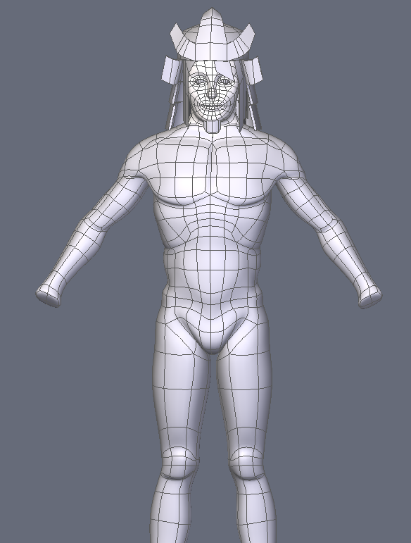
Also, you'll see in the above image the edge flow for his ribs and abs, which might also be a useful reference.

Once you've got the edge flow, it's actually a lot easier to shape the proportions of your character and you're less likely to run into anomolies.

[edit]
Additional notes. If you've got a sub divided mesh, then you don't need to worry so much about creating so many polygons on your control mesh, it becomes a lot easier to control - if you want to add finer details, that can come after. But on a human body, you wouldn't need a huge amount of detail anyway - with the right edge flow and usage of polies, you can have an effective looking model without an insane number of polies on your control mesh.

Here I'll draw an overlay for how I think the polygon flow should go. I've not done the anatomy because I'm not very good at drawing. But with an edgeflow similar to this (as it's not perfectly drawn) should make it easier to get the anatomy more accurate. I've used different colours to represent different groups.
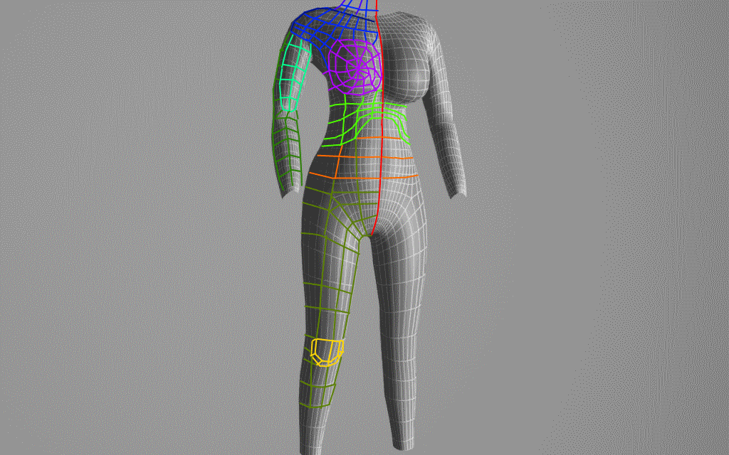


One last thing, I have a write-up on character modelling techniques too.


http://seppukuarts.wordpress.com/2012/05/01/3d-modelling-character-modelling-methods/


I hope this is useful dude.

Vent
FPSC Master
15
Years of Service
User Offline
Joined: 3rd Apr 2009
Location: BC
Posted: 12th Jul 2012 05:25


SKS


JLMoondog
Moderator
15
Years of Service
User Offline
Joined: 18th Jan 2009
Location: Paradox
Posted: 13th Jul 2012 03:36 Edited at: 13th Jul 2012 03:37
funfun:


Attachments

Login to view attachments
Travis Gatlin
15
Years of Service
User Offline
Joined: 14th May 2009
Location: Oxford, Alabama
Posted: 13th Jul 2012 03:49 Edited at: 13th Jul 2012 05:14


Another attempt at a human face.
(Images not showing up is fixed, uploaded them to photobucket)

http://www.3dartistonline.com/user/Travis%20Gatlin
You can find my latest work here. Please comment on my work and tell me what you think!
MrValentine
AGK Backer
13
Years of Service
User Offline
Joined: 5th Dec 2010
Playing: FFVII
Posted: 13th Jul 2012 03:53
Quote: "travis gatlin "


we cannot see those images, use a different service other than Facebook... or make the album publically viewable... maybe that might work...

JLMoondog
Moderator
15
Years of Service
User Offline
Joined: 18th Jan 2009
Location: Paradox
Posted: 13th Jul 2012 08:04 Edited at: 13th Jul 2012 08:05
fun^3:


Attachments

Login to view attachments
Travis Gatlin
15
Years of Service
User Offline
Joined: 14th May 2009
Location: Oxford, Alabama
Posted: 13th Jul 2012 17:55
Josh, I like the style you have going on there. Did you do those in 2D or 3D?

http://www.3dartistonline.com/user/Travis%20Gatlin
You can find my latest work here. Please comment on my work and tell me what you think!
JLMoondog
Moderator
15
Years of Service
User Offline
Joined: 18th Jan 2009
Location: Paradox
Posted: 13th Jul 2012 20:42
3D models with custom chrome shader.

anayar
15
Years of Service
User Offline
Joined: 19th Aug 2009
Location: Minneapolis, MN
Posted: 14th Jul 2012 21:11 Edited at: 14th Jul 2012 21:12
Working on an Airport themed MP... just gettin started


Cheers,
Anayar

[EDIT]All models are textured except check in counter (left). The lighting really washed them out [/EDIT]


For KeithC
Ortu
DBPro Master
17
Years of Service
User Offline
Joined: 21st Nov 2007
Location: Austin, TX
Posted: 15th Jul 2012 01:42
So I've really been struggling with cloth lately. It's continually one of my biggest failings, so I've decided to focus my attention towards it specifically for a while.

A small effort today, perhaps an hour:


It doesn't quite have the weight that it should, but I'm getting a better handle on the creasing I think. Definately still needs improvement.

Quik
16
Years of Service
User Offline
Joined: 3rd Jul 2008
Location: Equestria!
Posted: 15th Jul 2012 03:16
the creases or w/e looks way to sharp :I Otherwise it looks kinnda good


Whose eyes are those eyes?
MrValentine
AGK Backer
13
Years of Service
User Offline
Joined: 5th Dec 2010
Playing: FFVII
Posted: 15th Jul 2012 06:20 Edited at: 23rd Jul 2012 05:29
Ortu you never cease to amaze

EDIT

typo

Ortu
DBPro Master
17
Years of Service
User Offline
Joined: 21st Nov 2007
Location: Austin, TX
Posted: 16th Jul 2012 01:45
ok, smoothed out some of the sharpness and I think gave it more weight


and today, a new one: thrown over a couple of boxes


Poloflece
14
Years of Service
User Offline
Joined: 14th May 2010
Location: Australia
Posted: 16th Jul 2012 09:21
been working on some new weapons, the first that I've handpainted


All the surface detail on the sks is from the normal map, hence why it is so harsh (it needs to be visible in fpsc)

Poloflece

Design Runner
14
Years of Service
User Offline
Joined: 16th Oct 2010
Location: In my own little world.
Posted: 16th Jul 2012 15:04
Looks like a good start polo. Keep looking at texturing tutorials, and keep practicing. Also take a look at some specular map tutorials, I found those really helpful.

Poloflece
14
Years of Service
User Offline
Joined: 14th May 2010
Location: Australia
Posted: 16th Jul 2012 16:21 Edited at: 16th Jul 2012 17:34
Thanks, I just had a look at the tutorial by bond1 and got a whole load of ideas on what I can do to the spec maps. Unfortunately my holidays are up so I'll have less time to model.
What makes matter worse is that it seems like I have some catching up to do

Poloflece


Edit: Also, gamecreatingcommunity.net is dead, so you might want to make a new sig which better shows of the awesome stuff you've been making lately.

kingofmk98
13
Years of Service
User Offline
Joined: 30th Jul 2011
Location: Everywhere
Posted: 16th Jul 2012 18:20 Edited at: 16th Jul 2012 19:26
I just started my first project with out a teachers help. Im working on a Walther PPk


......UPDATE......


Get My FPSC Media at http://fpscfree.webs.com/

Attachments

Login to view attachments
Vent
FPSC Master
15
Years of Service
User Offline
Joined: 3rd Apr 2009
Location: BC
Posted: 17th Jul 2012 23:03
Quote: "Poloflece"


I really like the SKS, though I prefer the wooden furniture to the Tapco one . Nice work on both models there. You're getting pretty good.


rolfy
18
Years of Service
User Offline
Joined: 23rd Jun 2006
Location:
Posted: 18th Jul 2012 03:44 Edited at: 18th Jul 2012 07:09
Some nice stuff going on in here

Dryad tree, finished the model and just farfing around with painting it, far from finished but getting there.


Flat shader used so all highlight and shadow detail is painted into the texture.

Stone figure. Finished painting this one, its sculpted from a 1024 poly plane.
.

Will eventually be used in Deep Dark Woods level design after painting and final baking.


Awesome! Its one of those threads.
JLMoondog
Moderator
15
Years of Service
User Offline
Joined: 18th Jan 2009
Location: Paradox
Posted: 18th Jul 2012 04:42
Quote: "Flat shader used so all highlight and shadow detail is painted into the texture."

Great work, the texture just 'pops' out at your face.

Pincho Paxton
21
Years of Service
User Offline
Joined: 8th Dec 2002
Location:
Posted: 18th Jul 2012 10:35 Edited at: 18th Jul 2012 10:36
Quote: "Stone figure. Finished painting this one, its sculpted from a 1024 poly plane."


Very nice models. Is Deep Dark Woods a game you are working on?

rolfy
18
Years of Service
User Offline
Joined: 23rd Jun 2006
Location:
Posted: 18th Jul 2012 23:30
Thanks, its more of a single level with as much detail as I can squeeze in there, wip thread is
here

Awesome! Its one of those threads.
Travis Gatlin
15
Years of Service
User Offline
Joined: 14th May 2009
Location: Oxford, Alabama
Posted: 23rd Jul 2012 00:36 Edited at: 23rd Jul 2012 00:53


I've been experimenting with the creation of cartoony characters as of late. I made these in sequential order.

The first one is of a metalhead sort of. It actually reminds me of Nathan Explosion from Dethklok (or Metalocalypse)

Image of him:
http://images.wikia.com/metalocalypse/images/5/50/Swap.jpg

The second one is based off of My Chemical Romance's general style, and the hair style is based off of their lead singer Gerard Way.

Image of him:
http://images5.fanpop.com/image/photos/29100000/Gee-Way-I-m-Not-Okay-gerard-way-29161187-500-375.png

Though I did both off of memory, no references whatsoever!

http://www.3dartistonline.com/user/Travis%20Gatlin
You can find my latest work here. Please comment on my work and tell me what you think!
JLMoondog
Moderator
15
Years of Service
User Offline
Joined: 18th Jan 2009
Location: Paradox
Posted: 23rd Jul 2012 22:33 Edited at: 23rd Jul 2012 22:34
yup, it is:


Attachments

Login to view attachments
NIlooc223
14
Years of Service
User Offline
Joined: 27th Aug 2010
Location: Heaven
Posted: 24th Jul 2012 21:45
A little space scene I made with blender and gimp.


Your signature has been erased by a mod - Please reduce it to (600x120) maximum size
Quik
16
Years of Service
User Offline
Joined: 3rd Jul 2008
Location: Equestria!
Posted: 26th Jul 2012 04:42


would love critisism on this! Hand for my "Silent hill Nurse". 396 polies


Whose eyes are those eyes?
unfamillia
14
Years of Service
User Offline
Joined: 26th Jul 2010
Location: Preston, Lancashire
Posted: 26th Jul 2012 14:12
Hey Quik,

You have achieved a nice shape with the hand, however,

The thumb looks slightly out of proportion to the rest of the fingers, but, this could be because the fingers themselves look a little out of proportion to the size of the hand.

Keep the main 'base' of he hand (palm) as i think the shape, size and detail is great. But, scale the fingers up to match.

Also, when creating hands, what i do is create the index finger, then duplicate it for the other fingers, scaling as appropriate.
This helps to keep the fingers 'uniformed' and cuts out any anomalies that occur when creating each finger individually. (such as crookedness and scaling issues)

Anyway, that's just my two cents

Unfamillia

[url=www.touchoffear.webs.com][/url]
JLMoondog
Moderator
15
Years of Service
User Offline
Joined: 18th Jan 2009
Location: Paradox
Posted: 27th Jul 2012 22:46 Edited at: 27th Jul 2012 22:46
Insanity rig complex...


Attachments

Login to view attachments
Camouflage Studios
15
Years of Service
User Offline
Joined: 11th Aug 2009
Location:
Posted: 28th Jul 2012 07:51


mp5k

banner.jpg
Design Runner
14
Years of Service
User Offline
Joined: 16th Oct 2010
Location: In my own little world.
Posted: 28th Jul 2012 18:42
Camo, long time no see! Beautiful looking HP there. Are you gunna do a bake?

Daniel wright 2311
User Banned
Posted: 29th Jul 2012 08:48
Just a start for a troll,its coming along.


my signature keeps being erased by a mod So this is my new signature.
Daniel wright 2311
User Banned
Posted: 30th Jul 2012 00:23
And the update


my signature keeps being erased by a mod So this is my new signature.
Daniel wright 2311
User Banned
Posted: 30th Jul 2012 10:33
Here is how the club looks now


my signature keeps being erased by a mod So this is my new signature.
Daniel wright 2311
User Banned
Posted: 30th Jul 2012 23:12
Here is this guy all finished,last post on him.


my signature keeps being erased by a mod So this is my new signature.
The Zoq2
15
Years of Service
User Offline
Joined: 4th Nov 2009
Location: Linköping, Sweden
Posted: 31st Jul 2012 00:12
Looks awesome, I like the way the texture looks!
Camouflage Studios
15
Years of Service
User Offline
Joined: 11th Aug 2009
Location:
Posted: 31st Jul 2012 01:38
hey design runner! yeah actually I just finished the baking today. Here's a pic of it it currently rests at just under 5000 triangles.

[URL="http://cubeupload.com/im/b2W3R8.png"][/URL]

daniel wright - If I could just comment on the texture, I would say that you focused way to much on smaller scale details. If I were you, I would go in and paint some large scale forms in like muscles exc. and then overlay those textures over the muscles, it'll be way less cluttered and read better. And plus on the textures, the scales are different size and shape in different areas, and certain parts are blurrier than others, it just doesn't blend nicely together.

http://www.polycount.com/forum/showthread.php?t=87355

look at that thread, obviously thats a strech, being a sculpt and all, but there is a defined and set structure to his scales, his actually tend to follow to muscles, you might want to play around with things like that

banner.jpg
Daniel wright 2311
User Banned
Posted: 31st Jul 2012 02:35
Quote: "daniel wright - If I could just comment on the texture, I would say that you focused way to much on smaller scale details. If I were you, I would go in and paint some large scale forms in like muscles exc. and then overlay those textures over the muscles, it'll be way less cluttered and read better. And plus on the textures, the scales are different size and shape in different areas, and certain parts are blurrier than others, it just doesn't blend nicely together."


Thank you for the critic, I will look into it, I myself did not like the texture I gave him all in all and was wanting to change it.

my signature keeps being erased by a mod So this is my new signature.

Login to post a reply

Server time is: 2024-11-23 11:13:28
Your offset time is: 2024-11-23 11:13:28