Sorry your browser is not supported!

You are using an outdated browser that does not support modern web technologies, in order to use this site please update to a new browser.

Browsers supported include Chrome, FireFox, Safari, Opera, Internet Explorer 10+ or Microsoft Edge.

3 Dimensional Chat / Official 'What are you working on?' 2012

Author
Message
Travis Gatlin
15
Years of Service
User Offline
Joined: 14th May 2009
Location: Oxford, Alabama
Posted: 31st Jul 2012 03:11
@ Camouflage Studios
Your work is beautiful O_o Nice job!

http://www.3dartistonline.com/user/Travis%20Gatlin
You can find my latest work here. Please comment on my work and tell me what you think!
defiler
15
Years of Service
User Offline
Joined: 4th Apr 2009
Location: Canada
Posted: 31st Jul 2012 05:25
Have not posted anything in a while, I decided since the Source Film Maker got released, and I wanted a custom train model so I took it upon myself to do it.


I have started to texture it, but its more base colours then anything, as TF2 artstyle is weird...

Current Project: The Underground: Awakening
Travis Gatlin
15
Years of Service
User Offline
Joined: 14th May 2009
Location: Oxford, Alabama
Posted: 5th Aug 2012 22:52

Any Kingdom Hearts fans here?
This is the Oblivion Keyblade from the first one. I'd say it turned out quite well!

http://www.3dartistonline.com/user/Travis%20Gatlin
You can find my latest work here. Please comment on my work and tell me what you think!
Daniel wright 2311
User Banned
Posted: 5th Aug 2012 23:37
I would say that turned out real good, I love it, good job.

my signature keeps being erased by a mod So this is my new signature.
Design Runner
14
Years of Service
User Offline
Joined: 16th Oct 2010
Location: In my own little world.
Posted: 5th Aug 2012 23:44
Camo that looks like an ace bake. can't wait to see the textures. You gunna do any streams soon?

Travis Gatlin
15
Years of Service
User Offline
Joined: 14th May 2009
Location: Oxford, Alabama
Posted: 6th Aug 2012 01:55 Edited at: 6th Aug 2012 06:17
Quote: "I would say that turned out real good, I love it, good job."

Thank you! I worked for a good 5 hours on it. It turned out with just over 24,000 polygons. I didn't make it for game use, though. The main reason I made it is because I've never seen anyone actually make a model of that keyblade, mainly it's the Kingdom Key getting modeled, so I decided to be different and take a shot at the Oblivion. ^_^

New one: The Soul Eater


http://www.3dartistonline.com/user/Travis%20Gatlin
You can find my latest work here. Please comment on my work and tell me what you think!
Quik
16
Years of Service
User Offline
Joined: 3rd Jul 2008
Location: Equestria!
Posted: 8th Aug 2012 02:51
this is gonna be a couple pics


SOMETHING looks VERY WEIRDLY around the chest-neck-shoulder area... I just cant put my finger on it >_<'

9000polies atm, a lot will be deleted once she gets her clothes on :3


Whose eyes are those eyes?
Design Runner
14
Years of Service
User Offline
Joined: 16th Oct 2010
Location: In my own little world.
Posted: 9th Aug 2012 06:37
I'm working on an m1 garand right now and have a smoothing error I can't find a way around. I'm hoping some of you have suggestions on how to re-arrange the topology so I can keep the needed shape there while getting rid of the deformity. First shot shows the smoothed version, second shows the unsmoothed topo. Would appreciate any insight on the error (on my part, I see why it is doing it but I need the loop)


Daniel wright 2311
User Banned
Posted: 9th Aug 2012 10:43
Well, after many many many tutts, I finaly got it just about right, All I was missing was 2 things, imagination and textures or texturing,even if I learned how to pelt map, I still was messing around with textures like a mad man,but,after a couple more tutts, I finaly understand it all. here is my tutt model.


my signature keeps being erased by a mod So this is my new signature.
Travis Gatlin
15
Years of Service
User Offline
Joined: 14th May 2009
Location: Oxford, Alabama
Posted: 9th Aug 2012 19:53
@Design runner, The thing causing that error is those 2 polygons being so close together. I would suggest taking each one of them and merging it with the corresponding bigger polygon to produce a smoother flow.

http://www.3dartistonline.com/user/Travis%20Gatlin
You can find my latest work here. Please comment on my work and tell me what you think!
Design Runner
14
Years of Service
User Offline
Joined: 16th Oct 2010
Location: In my own little world.
Posted: 9th Aug 2012 20:26
I need all three loops, which is the main problem. I might move them further apart and hope it works out. I could also get rid of the line using photoshop but I would prefer to avoid that.

Daniel wright 2311
User Banned
Posted: 10th Aug 2012 01:16
Here is a little in game update, still working out his hand and sandel textures.


my signature keeps being erased by a mod So this is my new signature.
Design Runner
14
Years of Service
User Offline
Joined: 16th Oct 2010
Location: In my own little world.
Posted: 12th Aug 2012 21:24
Update on my M1-Garand high poly, still very much a w.i.p. obviously.


Would love crits.

Daniel wright 2311
User Banned
Posted: 13th Aug 2012 00:36
Quote: "Update on my M1-Garand high poly, still very much a w.i.p. obviously. "


So far it has a real good shape, the top of the gun is not like the refrence, other then this, I like it, good job so far.

my signature keeps being erased by a mod So this is my new signature.
Design Runner
14
Years of Service
User Offline
Joined: 16th Oct 2010
Location: In my own little world.
Posted: 13th Aug 2012 01:00
Quote: " the top of the gun is not like the refrence"


Which part and in what way? If you mean the wooden part at the front, it is because the top will be modeled as a separate object. If not, please elaborate more so I can fix it.

Quik
16
Years of Service
User Offline
Joined: 3rd Jul 2008
Location: Equestria!
Posted: 13th Aug 2012 02:10
The trigger wood area(?) where your hand will rest seems too sharp


Whose eyes are those eyes?
Design Runner
14
Years of Service
User Offline
Joined: 16th Oct 2010
Location: In my own little world.
Posted: 13th Aug 2012 02:17
That will definitely not be as sharp in the normal map, the angle of the screenshot was just right so all the light focused on that. It isn't as sharp as it looks. But I appreciate the crits guys. Maybe I'll see about lowering the sharpness if it ends up too high.

Camouflage Studios
15
Years of Service
User Offline
Joined: 11th Aug 2009
Location:
Posted: 13th Aug 2012 03:21
@design runner - you run into a very common problem for begginners of subdivision modeling. It's pretty simple, you just didn't use enough polygons in the base mesh, if you started with a more dense mesh, you wouldn't have even need to really add the support edges, getting rid of the error, here's an example below.


the one on the left started with 12 segments, so I had to add supporting edges to harden it up, but in turn, I get the hardened cylinder edges as well, which I obviously don't want. But the one of the right starts with 48, so I don't need to add any extra supporting edges to the sides and it retains it's smoothness.

hope that helped.

and now, time for my art


banner.jpg
The Zoq2
15
Years of Service
User Offline
Joined: 4th Nov 2009
Location: Linköping, Sweden
Posted: 13th Aug 2012 11:17
Wow, that cannon looks awesome!
Poloflece
14
Years of Service
User Offline
Joined: 14th May 2010
Location: Australia
Posted: 13th Aug 2012 15:22
Nothing flash, but I've done another hand painted weapon, trying to once again have a crack at the Ak. I've also been messing around with different effects, hence the very sharp looking texture.


Also, not too fancy, nor well done, but for a psychology assignment I decided to 3d model(instead of draw by hand) 2 different views of the human brain.


Poloflece

Camouflage Studios
15
Years of Service
User Offline
Joined: 11th Aug 2009
Location:
Posted: 14th Aug 2012 01:20
thanks zoq, although that last texture was kinda garbage, so here's the updated one.


banner.jpg
Design Runner
14
Years of Service
User Offline
Joined: 16th Oct 2010
Location: In my own little world.
Posted: 14th Aug 2012 01:43
Thanks for that tip camo, makes sense and I can see where I went wrong. Will beveling the current model work or would I need to start over to get it right?

Cannon in looking good, but you have some harsh normals on the barrel itself.

Camouflage Studios
15
Years of Service
User Offline
Joined: 11th Aug 2009
Location:
Posted: 14th Aug 2012 03:22
nah, you would pretty much have to start over with the right amount of segments. and thanks, but I am doing this intentionally, many of these cannons are very bumpy

banner.jpg
Quik
16
Years of Service
User Offline
Joined: 3rd Jul 2008
Location: Equestria!
Posted: 14th Aug 2012 03:36
I dont care so much of the normals as to how low res the barrel seems to be compared to the wood, the wood is very easy to read, but the barrel seems very... It could use a few more pixels in the texture size ~~


Whose eyes are those eyes?
Camouflage Studios
15
Years of Service
User Offline
Joined: 11th Aug 2009
Location:
Posted: 14th Aug 2012 04:05
it's already at 2048, this is about as high as I'm gonna get for that :/

banner.jpg
Quik
16
Years of Service
User Offline
Joined: 3rd Jul 2008
Location: Equestria!
Posted: 14th Aug 2012 06:58
Do you have the wood and metal on different textures? If theyre on the same then you could definitly make the wood smaller to make place for the metal, as the wood is hardly important in this case


Whose eyes are those eyes?
PaulGiambra
12
Years of Service
User Offline
Joined: 4th Aug 2012
Location:
Posted: 18th Aug 2012 07:32
I like all of these models they are good

Seppuku Arts
Moderator
20
Years of Service
User Offline
Joined: 18th Aug 2004
Location: Cambridgeshire, England
Posted: 19th Aug 2012 18:59
My man Keats, rigged and ready to go.


Camouflage Studios
15
Years of Service
User Offline
Joined: 11th Aug 2009
Location:
Posted: 27th Aug 2012 18:02


more arts, this is just a rough test house

banner.jpg
Vent
FPSC Master
15
Years of Service
User Offline
Joined: 3rd Apr 2009
Location: BC
Posted: 28th Aug 2012 00:40 Edited at: 28th Aug 2012 00:42
You've come a long way... I need to catch up.

Looks good.


JLMoondog
Moderator
15
Years of Service
User Offline
Joined: 18th Jan 2009
Location: Paradox
Posted: 3rd Sep 2012 22:07 Edited at: 3rd Sep 2012 22:10
Redoing my Skull-Candle for a short CG Animation:

First time I've ever worked on two separate objects in sculptris.

Attachments

Login to view attachments
MrValentine
AGK Backer
13
Years of Service
User Offline
Joined: 5th Dec 2010
Playing: FFVII
Posted: 3rd Sep 2012 22:44
Somebodies been playing with Sculptris

Nice!

Quik
16
Years of Service
User Offline
Joined: 3rd Jul 2008
Location: Equestria!
Posted: 8th Sep 2012 05:11
Actually fairly happy with this:


although,the basemesh's edgeflow is HORRIBLE >_<


Whose eyes are those eyes?
Poloflece
14
Years of Service
User Offline
Joined: 14th May 2010
Location: Australia
Posted: 9th Sep 2012 05:33 Edited at: 9th Sep 2012 05:34
My first animation, made in Cinema 4D
It's not great and does have some problems but it was intented for me to learn the basics of keyframing and camera movement in C4D.


MrValentine
AGK Backer
13
Years of Service
User Offline
Joined: 5th Dec 2010
Playing: FFVII
Posted: 9th Sep 2012 05:47
Poloflece - EPIC!

Quik
16
Years of Service
User Offline
Joined: 3rd Jul 2008
Location: Equestria!
Posted: 10th Sep 2012 17:07
Lowpoly mesh, ears attached, refined the eyes. Or well, the eye area.


Whose eyes are those eyes?
Ortu
DBPro Master
17
Years of Service
User Offline
Joined: 21st Nov 2007
Location: Austin, TX
Posted: 10th Sep 2012 21:36 Edited at: 10th Sep 2012 21:38
It's looking good quik, I would just say that the neck is somewhat flat across the front. Pushing the musculature joining neck to shouler back a bit and defining the collarbone would help build the depth.

I like the edge flow on the forehead/skull

defiler
15
Years of Service
User Offline
Joined: 4th Apr 2009
Location: Canada
Posted: 15th Sep 2012 11:14 Edited at: 15th Sep 2012 11:17
Since FPSC does not accept any custom made stuff I do any more, I have strayed from these neck of the woods. That is when I forgot to show you guys what it looks like completed and in Source Engine.


Getting it into Source was tricky, mainly because I wanted there to be bones.

Another thing I also did which I did not have to do any position editing to get the bones to line up.


If you are wondering what these are for in case I never said, its for a Source Film Maker competition that Valve is hosting.

Current Project: The Underground: Awakening
Quik
16
Years of Service
User Offline
Joined: 3rd Jul 2008
Location: Equestria!
Posted: 22nd Sep 2012 01:57


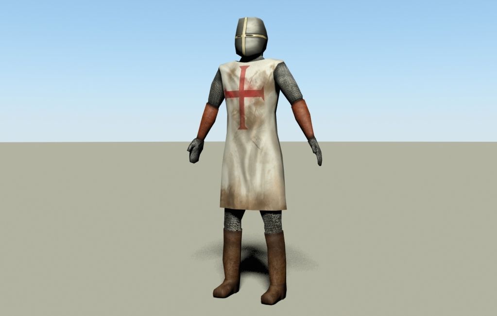
Finished! Now I just need to start with his scabbard, sword and possibly a shield - not sure..

Might add some ingravings to the helmet, maybe..

Got tired of face excersize - I never get around to texture them, thus, I felt like making somthing that I could texture.

I did use sculpting to get the creases in the "tabard" thingy
And as said above, i will make a scabbard and a sword, but that will have to wait until next week, sort of.

Oh, and the texture is 2048 x 2048, I know, a tad much but..
and it does use specular map.

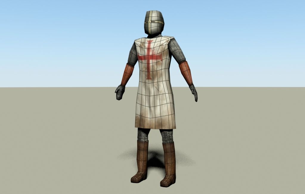
it is 844 polygons., not shabby if you as me!



Whose eyes are those eyes?
Ortu
DBPro Master
17
Years of Service
User Offline
Joined: 21st Nov 2007
Location: Austin, TX
Posted: 22nd Sep 2012 05:10
The wrinkles in the surcoat are looking good, he bottom edge is too flat across though, vary it up a bit in vert heights to let it flow with the wrinkles

Quik
16
Years of Service
User Offline
Joined: 3rd Jul 2008
Location: Equestria!
Posted: 22nd Sep 2012 11:47
Quote: "vary it up a bit in vert heights to let it flow with the wrinkles"


I will either do that, or apply a opacity map and make some damage there Thanks.


Whose eyes are those eyes?
That Guy John
14
Years of Service
User Offline
Joined: 30th Apr 2010
Location: United States
Posted: 23rd Sep 2012 17:25
Sat down with a couple cups of coffee and browsed each page and image of this thread.

Really nice work. (Everyone)

And Here Is A Penguin:
FPSC OneSource [DeskTop App] - Bringing everything together into one.
Wolf
17
Years of Service
User Offline
Joined: 8th Nov 2007
Location: Luxemburg
Posted: 24th Sep 2012 14:17
@rolfy: You own us all here when it comes to artistic style! You don't happen to sell these models later, do you?
I know, asking to buy things like this feels like I would underappreciate the art, but quite the contrary is the case. These are some of the best designs/models I have seen in quite some time! They are downright beautiful.


@Josh: What inspired you to model a box of highly detailed toiletpaper?

Now some heavy WIP stuff from me


"This thread has been locked for the following reason: Too much EPIC" - Thraxas
The Nerevar
14
Years of Service
User Offline
Joined: 19th May 2010
Location: Vvardenfell
Posted: 25th Sep 2012 06:10
I'm currently making a sword for FPSC, I'm halfway done animating it!

If I can I'll post it here, but by the looks of it here, it may not be worthy showing here...

Fulfilling the Nerevarine Prophecy, one trial at a time, because I... Am... The Nerevar!
The Zoq2
15
Years of Service
User Offline
Joined: 4th Nov 2009
Location: Linköping, Sweden
Posted: 25th Sep 2012 23:24
Show it, at the very least we could give you some tips on how to inprove it more
The Nerevar
14
Years of Service
User Offline
Joined: 19th May 2010
Location: Vvardenfell
Posted: 26th Sep 2012 00:23 Edited at: 26th Sep 2012 00:24
Alright, here it is:


Please note, that this is pretty much my first real model that I'm proud of.
I was never good at texturing so excuse the non professional look, I'm still a beginner.
Also, this isn't the animation file, I'm using Jon Fletcher's fantasy hands for that, and I'm planning on re-texturing that too!

Fulfilling the Nerevarine Prophecy, one trial at a time, because I... Am... The Nerevar!
Quik
16
Years of Service
User Offline
Joined: 3rd Jul 2008
Location: Equestria!
Posted: 29th Sep 2012 01:05

final render
however the belts are supposed to be darker, no matter how much I turned down the specular and texture they just wouldnt become any darker >_<' oh well


Whose eyes are those eyes?
Ortu
DBPro Master
17
Years of Service
User Offline
Joined: 21st Nov 2007
Location: Austin, TX
Posted: 29th Sep 2012 05:51 Edited at: 29th Sep 2012 22:34
I like the sword. For the heaume they usually have some holes around the mouth area. They could be added through the texture maps pretty easy without having to mess with the model.

Here's some ref http://images.google.com/search?hl=en&tbo=d&biw=1024&bih=672&tbm=isch&sa=1&q=heaume&oq=heaume&gs_l=img.1.0.0j0i10i24j0i24l5j0i5i24l3.3619.7701.0.9485.9.9.0.0.0.0.866.2306.0j2j2j5-1j1.6.0...0.0...1ac.1.toGAIJKdlQs

edit: I'll just add to this post instead of doubling. I haven't really done much modelling lately but had a bit of free time today so I thought I'd do up a quick bust for proportions practice:


The shape of the skull should be quite a bit more accurate than my previous characters. I hadn't realized how off I was until I started studying the underlying bones instead of just full heads. Hair in the refs throws things off a good bit if you are not careful.

Compared to the most recent one before this, I see that the whole lower half in particular was way off:


Camouflage Studios
15
Years of Service
User Offline
Joined: 11th Aug 2009
Location:
Posted: 1st Oct 2012 05:28
@Vent wow that made me cringe lol, and hey man you've improved a ton to! just keep working

And now for some more art, I'm not sure if I posted the original WIP on here or not, but I decided to redo my old attempt at this environment, now with double the knowledge. This is just a base facade I made with my modular pieces.


banner.jpg
Camouflage Studios
15
Years of Service
User Offline
Joined: 11th Aug 2009
Location:
Posted: 7th Oct 2012 01:29


texturing update

banner.jpg

Login to post a reply

Server time is: 2024-11-23 10:45:17
Your offset time is: 2024-11-23 10:45:17