Sorry your browser is not supported!

You are using an outdated browser that does not support modern web technologies, in order to use this site please update to a new browser.

Browsers supported include Chrome, FireFox, Safari, Opera, Internet Explorer 10+ or Microsoft Edge.

3 Dimensional Chat / z brush works, Q & A's, free models and tutorials

Author
Message
Mazz426
16
Years of Service
User Offline
Joined: 4th Feb 2008
Location: Edinburgh
Posted: 13th May 2010 18:36
well heres an update, tried to correct a few things
-


Mazz426
16
Years of Service
User Offline
Joined: 4th Feb 2008
Location: Edinburgh
Posted: 13th May 2010 21:09
i've started detailing, hope someone posts soon, im back onto triple posts
-


zeroSlave
15
Years of Service
User Offline
Joined: 13th Jun 2009
Location: Springfield
Posted: 13th May 2010 21:55 Edited at: 13th May 2010 21:56
Hey there, Mazz! It's a very nice bust, but I would suggest working on the lips a bit more. It seems that there is too much seperation between the lips and the rest of the face. The bottom lip might be fine, but the top lip needs to be flush with the rest of the skin. I photoshopped an example of what I am talking about:


My green thumb grew the tree my Trojan War horse was crafted from. With roses in our pockets we rally round the tombstones. Ashes to ashes, we all fall down.

Attachments

Login to view attachments
Ortu
DBPro Master
17
Years of Service
User Offline
Joined: 21st Nov 2007
Location: Austin, TX
Posted: 14th May 2010 02:53
the nose looked better before. you narrowed the bridge way too much and the nostrils look about the same, the change should have been the other way around


Mazz426
16
Years of Service
User Offline
Joined: 4th Feb 2008
Location: Edinburgh
Posted: 14th May 2010 13:05
thanks for the advice, done those corrections and i've been doing more dteail work, started non-symmetrical detailing this morning and i think i'm close to finished, tell me what you think
-


Mazz426
16
Years of Service
User Offline
Joined: 4th Feb 2008
Location: Edinburgh
Posted: 14th May 2010 14:43
done a turntable so that you can see it in the all around: http://www.youtube.com/watch?v=erbeebtI2tA

Woolfman
17
Years of Service
User Offline
Joined: 19th Sep 2007
Location: Cave
Posted: 14th May 2010 17:12 Edited at: 14th May 2010 17:18
Well I have a few ideas. You can use none or all doesn't really matter. Just a few suggestions to look at. But over all it's a really neat bust of a fat guy.
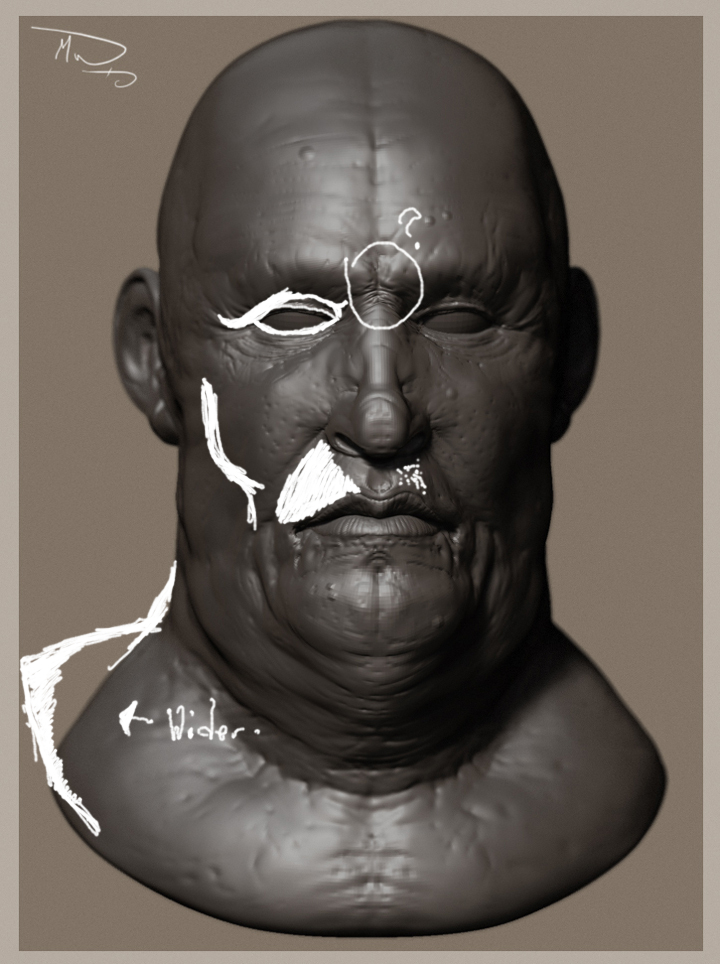
-He needs a upper eye lid. As it is now it blends/almost fades into the eye brow fat.
So when you make the upper eye lid more prominent you can then add a bit of eye fat over the top of it like hanging fat.
Also maybe adding some puffiness to the bottom lid might add for a fatter effect.
-At the ? I don't know whats going on it like it was pinched but his face is in a relaxed pose.
-His check bone seems to far in for the shape of his skull. Which would mean his upper lip would need to be a little wider and not so thin in that spot.
Also he could use some facial hair pores might look neat but it's a toss up because he's not really fat but has some fatness to his face.
So skin pores and stuff that that wouldn't show up that much but since it's a bit thinner it would look alright.
-Also his shoulder/neck base would be a little bigger to give off that fatter look.

Attachments

Login to view attachments
Mazz426
16
Years of Service
User Offline
Joined: 4th Feb 2008
Location: Edinburgh
Posted: 14th May 2010 18:22
thanks for the pointers, they helped, heres an update. also i'd planned on adding facial hair but i lack a proper hair generating program and i struggle to model it in zbrush, but i'll give it a go.
-


and heres an image illustrating what i'm trying to do
-


Woolfman
17
Years of Service
User Offline
Joined: 19th Sep 2007
Location: Cave
Posted: 14th May 2010 18:43
lazy mouse with a small white alpha line?
Mazz426
16
Years of Service
User Offline
Joined: 4th Feb 2008
Location: Edinburgh
Posted: 14th May 2010 19:47
i plan to model them seperately, that'll work for the eyebrows but not the beard unfortunately

Hassan
15
Years of Service
User Offline
Joined: 4th May 2009
Location: <script> alert(1); </script>
Posted: 14th May 2010 20:06
Nice, you're really skilled at this

Mazz426
16
Years of Service
User Offline
Joined: 4th Feb 2008
Location: Edinburgh
Posted: 15th May 2010 15:51
hers a test, its all done in zbrush, each strand of hair is manually modeled... sigh, its hell, tell me what you think
-


Asteric
16
Years of Service
User Offline
Joined: 1st Jan 2008
Location: Geordie Land
Posted: 15th May 2010 16:30
The matcap is sorta making him look a bit like metal.

Mazz426
16
Years of Service
User Offline
Joined: 4th Feb 2008
Location: Edinburgh
Posted: 15th May 2010 17:30
Mazz426
16
Years of Service
User Offline
Joined: 4th Feb 2008
Location: Edinburgh
Posted: 15th May 2010 18:38 Edited at: 15th May 2010 18:38
heres a quick tex test, its very wip, i'm going for an unhealthy, almost dead look. like a decadent man who's eaten too much of a bad thing
-


lazerus
16
Years of Service
User Offline
Joined: 30th Apr 2008
Location:
Posted: 15th May 2010 19:51
The progress youv made in zbrush is phononimal. I have been watching your work progress alot and i must say its excellent!

Not much to say like usual other than keep it up. I only have knit
picks so i havnt really critted your work that much.

-Con

Mazz426
16
Years of Service
User Offline
Joined: 4th Feb 2008
Location: Edinburgh
Posted: 15th May 2010 21:53
lazerus@

thanks, thats nice to hear, i'm always impressed with your work and what you manage with so little polies

heres another update, been thinking that someone as unhealthy and powerful as this guy would have to have some kind of life support system, kinda thinking of a future buisness tycoon, C&C welcome, and remember this is very WIP, so be kind
-


lazerus
16
Years of Service
User Offline
Joined: 30th Apr 2008
Location:
Posted: 15th May 2010 22:53
I had the urge to try and guess what you were going to do so;


Hope you dont mind ^__^" If its completely off ohh well lol

-Con

Mazz426
16
Years of Service
User Offline
Joined: 4th Feb 2008
Location: Edinburgh
Posted: 16th May 2010 00:59
Laerus@

throw in some plugs in his temples and you have it perfect, it's like you read my mind...

Mazz426
16
Years of Service
User Offline
Joined: 4th Feb 2008
Location: Edinburgh
Posted: 16th May 2010 02:58
heres an update, done some refinements using reto and have split it into two, it'll mkae it easier when it comes around to modeling the, lifejacket style collar, C&C welcome
-


Mazz426
16
Years of Service
User Offline
Joined: 4th Feb 2008
Location: Edinburgh
Posted: 16th May 2010 15:08 Edited at: 16th May 2010 15:10
lazerus@

just a question out of curiosity, was that done in paintshop, looks like something that comes out of there

well guess what, i decided to redesign it, again, still gonna have a bunch of wires and pipes but for now i'm blocking out the structures, tell me what you think, back onto triple posts
-


mike5424
15
Years of Service
User Offline
Joined: 30th Mar 2009
Location:
Posted: 16th May 2010 15:17
Nice work there mate!

---
lazerus
16
Years of Service
User Offline
Joined: 30th Apr 2008
Location:
Posted: 16th May 2010 15:35
Nope its PS CS4 mate ^_^

An im loving the design so far. Cant wait to see this finished.

On a related note, the reason i dont keep a constant thread like yours is the fact i make alot of progress in a short time so triple posts are invetibale. As long as it has a purpose triple posts are okay as far as i know.

-Laz

Scope
17
Years of Service
User Offline
Joined: 14th Nov 2007
Location:
Posted: 16th May 2010 21:27
Your work is excellent i wish i was able to texture like that just learning.
Scope.
Azunaki
15
Years of Service
User Offline
Joined: 11th Feb 2009
Location:
Posted: 17th May 2010 00:25
im loving the look of it, its looking very Darth Vader-Ish.

[url]http://myportfolio.x10hosting.com/[url]
visit my site.(still in progress)
Mazz426
16
Years of Service
User Offline
Joined: 4th Feb 2008
Location: Edinburgh
Posted: 17th May 2010 01:29
thanks guys

lazerus@

i'm stuck with CS3, what are the differences between it and CS4?

heres an update, done quite a bit of work on the collar, it was pretty difficult to find something that worked, tell me what you think
-


lazerus
16
Years of Service
User Offline
Joined: 30th Apr 2008
Location:
Posted: 17th May 2010 02:10
A few layout changes, the brush tools and some other fancier settings. A few hot keys moved about. Honestly other than the tweaks and extra power nothing really speical. I should have waited till cs5 before i upgraded, discounts kick ass though.

The collar texture is more like skin than the actual person lol. might need hue swapping or toning down.

Mazz426
16
Years of Service
User Offline
Joined: 4th Feb 2008
Location: Edinburgh
Posted: 17th May 2010 13:18
thanks for the feedback, did a few changes to make it look more medical and textured the metal/ platic components, at the moment they look pretty poor but i think that'll change when i apply a reflective matcap, feed back welcome
-


and i decided to show you what the flat colour (texture) looks with out any matcaps (also sorry about the size, if i have the time i'll adjust it)


CSGames94
16
Years of Service
User Offline
Joined: 27th Dec 2007
Location:
Posted: 17th May 2010 23:38 Edited at: 17th May 2010 23:39
@Mazz426,
Man your work is incredible! Every time I look at this thread I'm impressed!

* Do you know anybody else that knows how to character model? Because I still haven't found someone to model a football player for me. Thanks A lot !

The Pokemon Engine is still alive.
Mazz426
16
Years of Service
User Offline
Joined: 4th Feb 2008
Location: Edinburgh
Posted: 17th May 2010 23:45
Master13@

if you can wait till... After the 28th of may I could have another crack at it

DarkJames
15
Years of Service
User Offline
Joined: 11th Aug 2009
Location:
Posted: 18th May 2010 02:46
Ill tell you, i just...its fun to be in this thread, i love looking at them, when i mean keep it up...i mean KEEP IT UP :-<

Azunaki
15
Years of Service
User Offline
Joined: 11th Feb 2009
Location:
Posted: 18th May 2010 04:28
yea master most people that could model a character are more then likly pre-occupied with the comp.

the model is looking great mazz. and yea the metal just isn't fitting right there its to bland compared to the rest of the model. although that will likely change with your next update.

[url]http://myportfolio.x10hosting.com/[url]
visit my site.(still in progress)
Camouflage Studios
15
Years of Service
User Offline
Joined: 11th Aug 2009
Location:
Posted: 18th May 2010 04:32
Are you ever going to make something game-ready? Otherwise good work

banner.jpg
Mazz426
16
Years of Service
User Offline
Joined: 4th Feb 2008
Location: Edinburgh
Posted: 18th May 2010 20:20 Edited at: 18th May 2010 20:21
Camouflage Studios@

all the low poly work i do i import into FPSC, i used to do a lot but haven't recently, i'm getting back into it though

thanks for the comments guys, i did some work on a reflective matcap, at the moment i'm pleased with it, let me know what you guys think, in case anyones wondering, its a reflection of a space shutles main fuel tank, also i went back to the orange as i personally prefered it but if people think otherwise i could change it back
-


mike5424
15
Years of Service
User Offline
Joined: 30th Mar 2009
Location:
Posted: 18th May 2010 20:45
This guy is just spectacular!

A little off-topic, Can you reccomend any tutorials? Preferably free?

---
SJHooks
15
Years of Service
User Offline
Joined: 13th Aug 2009
Location: Where you least expect me...
Posted: 19th May 2010 01:58 Edited at: 19th May 2010 01:58
Oh, after studying the model forever, and just because I'm a jerk, here's a crit. The top front of his forehead up to his scalp has a line dug in to his head, if you get what I mean

Shadowtroid
14
Years of Service
User Offline
Joined: 23rd Dec 2009
Location: nope
Posted: 19th May 2010 03:09
Eh, I don't like the reflectiveness. Try just the old one. I liked it better.

As for the model...Amazing! Really good. No way I could ever do that.

CSGames94
16
Years of Service
User Offline
Joined: 27th Dec 2007
Location:
Posted: 19th May 2010 03:43
Quote: "Master13@

if you can wait till... After the 28th of may I could have another crack at it"

Alright! Thanks man!

The Pokemon Engine is still alive.
Mazz426
16
Years of Service
User Offline
Joined: 4th Feb 2008
Location: Edinburgh
Posted: 19th May 2010 17:17 Edited at: 19th May 2010 17:19
SJHooks@

thanks for pointing that out, it was acctually on purpose, i was thinking that he'd at some point had some kind of brain surgery, like a bit of a futuristic Frankenstein's monster (hate when people refer to it as just frankenstein) and that thats his scar

did a rework of the reflective texture, heres a preview of it, i'll upload the origional later so that you can see the difference
-


and heres it applied to the model, also i have an alternative texture with higher contrast which helps emphasise some of the changes in colour in the head texture, if anyone wants to see that then let me know
-


Mazz426
16
Years of Service
User Offline
Joined: 4th Feb 2008
Location: Edinburgh
Posted: 19th May 2010 21:09
heres another update, added some eyepieces, tell me what you think
-


CSGames94
16
Years of Service
User Offline
Joined: 27th Dec 2007
Location:
Posted: 19th May 2010 22:51
Just keeps getting better and better! Try changing the suit color from orange to black, I think it will look better.

The Pokemon Engine is still alive.
Woolfman
17
Years of Service
User Offline
Joined: 19th Sep 2007
Location: Cave
Posted: 20th May 2010 01:50
The reflection of the building doesn't really work for the eye lenses. It makes it look like a fuel gauge. I personally don't like the eye things being so small. But that's just nit picking.
Do you have a concept that your going for with this guy or are you just adding things that you think would look neat?
CSGames94
16
Years of Service
User Offline
Joined: 27th Dec 2007
Location:
Posted: 20th May 2010 07:37
It does make it look like fuel gauges when you look close, but everything else is excellent!

The Pokemon Engine is still alive.
Mazz426
16
Years of Service
User Offline
Joined: 4th Feb 2008
Location: Edinburgh
Posted: 20th May 2010 17:21 Edited at: 20th May 2010 17:24
woolfman@

im not working off of a concept, even though i should i just do what i want to see really

well took both of yours advice and eiminated the eye pieces, i too thought they didn't work all that well, may however add some Riddick style goggles later, if i can be bothered or have the time , i've changed the reflective matcap for the life support thing, its a lot clearer now and i've added a diluted reflection to the eyes, tell me what you think
-


lazerus
16
Years of Service
User Offline
Joined: 30th Apr 2008
Location:
Posted: 20th May 2010 18:55
scary? yep you hit it on the nail.

waiting on the next update

Woolfman
17
Years of Service
User Offline
Joined: 19th Sep 2007
Location: Cave
Posted: 20th May 2010 21:38
Here's a good reference for the eyes. But I don't know if that would work because the rest of him is so dark. You might be better off just making normal eyes.

Attachments

Login to view attachments
Isocadia
15
Years of Service
User Offline
Joined: 24th Jul 2009
Location:
Posted: 21st May 2010 16:43
Well, I have a question for you, how does ZBrush react when you tell it to create a texture map where identical faces are placed over each other, because I made a crate ( how original ) and now I want to texture it in ZBrush and create a normal map. But because a crate is symetrical on each axis, I overlayed like half of the UV map. Will ZBrush use the upper face to create the normal/texture map, or do I need to separate them?

Isocadia

Mazz426
16
Years of Service
User Offline
Joined: 4th Feb 2008
Location: Edinburgh
Posted: 22nd May 2010 16:12
woolfman@

thanks for the reference

isocadia@
i'm not quite sure what your asking but what i think you mean is if you overlay UV'd faces in a uv map will zbrush during polypainting register that as one replicated face and addjust the sculpting/ texture to compensate, in other words no it won't during polypainting it'll treat them all as seperate faces but when you press the new texture from polypaint button it'll take, as you said, the data on the upper face and apply it to all the other faces, this is the same for normal maps and disp maps, i'd recommend that you never do this for a model that you intend to texture or sculpt in zbrush as it'll often produce poor and glitch textures, normal maps and disp maps that, commonly won't match the sculpts polies.

thanks for the comments guys, i don't have any updates, i was just answering a question, i will have one soon, wasn't able to do anything yesterday as i had an exam that i'd been worrying about for a while

mike5424
15
Years of Service
User Offline
Joined: 30th Mar 2009
Location:
Posted: 22nd May 2010 19:10 Edited at: 22nd May 2010 19:11
Awesome as allways!

Off-Topic:
Could you help me pick a book? I was looking at http://www.amazon.co.uk/gp/product/0470262796/ref=sib_rdr_dp http://www.amazon.co.uk/gp/product/047024996X/ref=sib_rdr_dp and http://www.amazon.co.uk/gp/product/0470450266/ref=sib_rdr_dp

The last one looks the most intresting as it looks like it shows how to make a super hero character aswell as teaching anatomy. I think it would be the best choice but i don't want to waste money on something that will not help.

---
Mazz426
16
Years of Service
User Offline
Joined: 4th Feb 2008
Location: Edinburgh
Posted: 22nd May 2010 19:45
mike5454@

the 3rd one looks good for anatomical modelling, i've seen the thread that the person who made it posted on zcenteral and his stuff looked good, that could help, i've also seen the thread of the person who did the 1st one and his stuff also looks good, if i recall there's a good section on matcaps in there, the 2nd i'm not familiar with, not sure how good it is, however before you spend a penny go onto here: http://www.thegnomonworkshop.com/store/category/12/ZBrush, if i recall you have to make an account but thats simple, there's a lot of free ones there and probably the best tutorial DVDs money can buy, hope this helped

Login to post a reply

Server time is: 2024-11-24 06:36:23
Your offset time is: 2024-11-24 06:36:23